Configuring a Pie & Donut Chart
In the example configuration below, we are using a SharePoint List as our Data Source Provider, with the Data Source set to a Sales by Manager List, containing the following columns: Manager, Sales, Customer, Invoice Date. The columns can be selected on the Columns tab. In our example, we are going to display a Pie chart that shows the total percentage of sales per manager.

Slices and Values
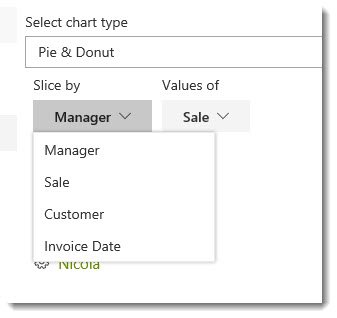
On the Display tab, select Pie & Donut from the drop down menu. We are then given two drop down menus for Slice by and Values of, which contain columns from our Data Source list. After selecting Manager for our Slice, we can then choose the Value for the slices, which in this case will have to be Sales.
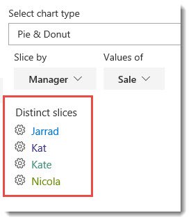
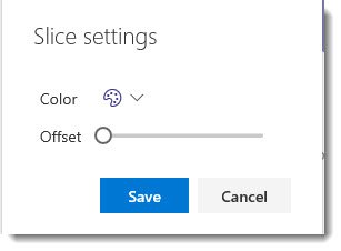
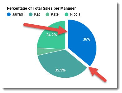
Below our Slice by and Values of drop down menus, you will see Distinct slices, which lists the fields that fall under the Manager column in the Data Source list. Each distinct slice has a settings cog , which allows you to modify the color of the slice, and whether the slice is offset from the rest of the pie.
If you choose to offset any slice, move the sliding bar to the preferred offset position. The further right you move the bar, the further the slice will move away from the center of the pie.
Additional Pie Settings
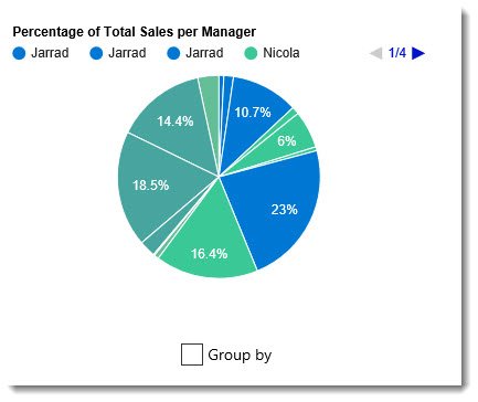
Below the Pie you will see a Group by checkbox.
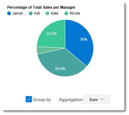
In our example, we will want to consolidate the slices by checking this box, which will reduce the number of slices by allowing us to aggregate the sales into one slice per manager.
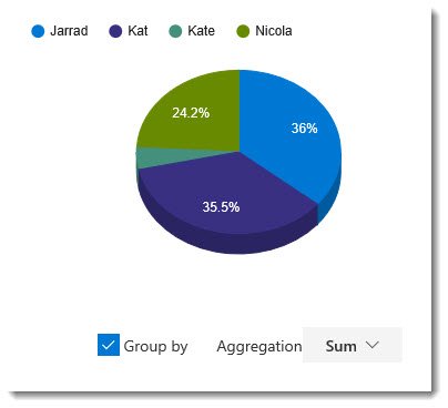
When Group by is selected, you can choose the aggregate function type via the Aggregation drop down box. In our example, we want to aggregate by the Sum.
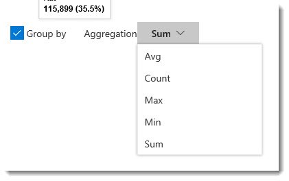
Chart Settings
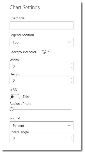
- Title – Similar to the Combo chart, you can add a title to your Pie Chart
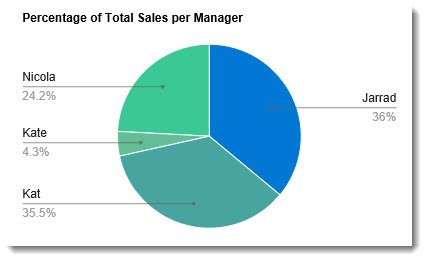
- Legend position – Top (Default), Right, Bottom, Left, In, Labeled (Shown below)
- Background color – No Color is the default. Can alternatively choose the Theme color, or select a Custom color for the background of the chart.
- Width – Define the width of the chart
- Height – Define the height of the chart
- Is 3D – True/False switch to make the chart display in 3D. The default setting is False. The image below shows the True setting.
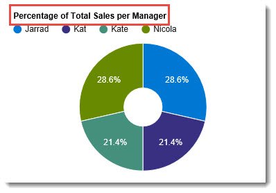
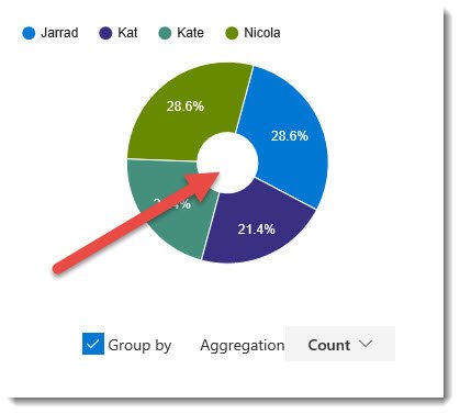
- Radius of hole – This is a slide bar that allows you to create a Dount chart. Sliding the bar to the right creates a hole, which gets larger the further the slider is moved to the right.
- Format – This menu allows you to choose what format the value of the slice will take.
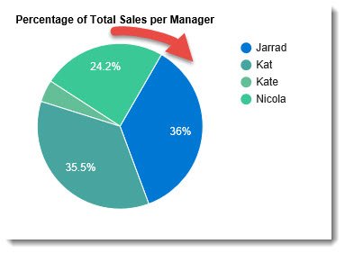
- Percent – Sets the slice value to a percentage.
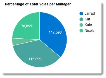
- Value – This displays the exact value calculated from the list. In our example, Sales will display as the total dollar amount.
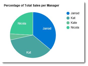
- Slice label – The slices will be labelled with the distinct slice names.
- None – No label on the slice.
- Percent – Sets the slice value to a percentage.
- Rotate angle – Default is 0. Any integer greater than 0 will rotate the chart to the degree entered.



Post your comment on this topic.