Configuring a Combo (Line, Column, Area, Scatter) Chart
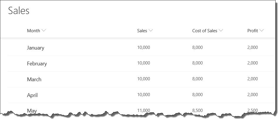
In the example configuration below, we are using a SharePoint List as our Data Source Provider, with the Data Source set to a Sales List, containing the following columns: Month, Sales, Cost of Sales, Profit. The columns can be selected on the Columns tab.
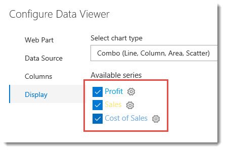
Available Series
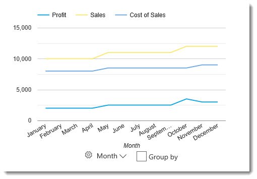
On the Display tab, we will first choose the Combo chart type. We are then shown the Available Series, which includes the columns selected on the previous tab. In our example, we have Profit, Sales, and Cost of Sales. Only the first column is selected by default, but we can check whichever columns we want to be included in our chart. In this case, we will want to include all data columns to see how they change each month, so we have checked each box. The chart has already determined that the Month column (not visible in image below), which was selected on the Columns tab, will be the X axis in the chart, where Profit, Sales, and Cost of Sales can be plotted for each month.
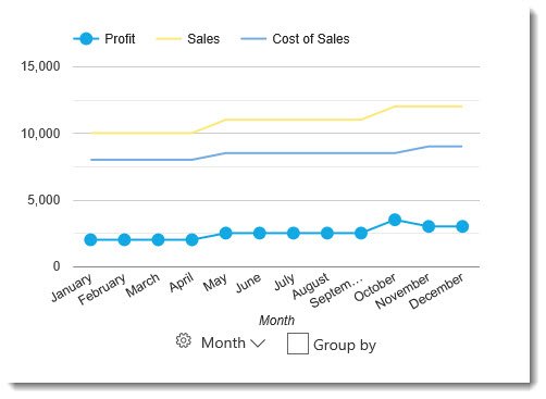
Once the columns have been selected, you will see them appear in the graph as lines.
Each item in the Available Series can be configured separately by clicking on the cog icon next the the column name. For example, you may want to change the color of the line, or choose to display the data as an area instead of a line. Clicking on the cog wheel will provide the following options when using the Combo chart.
- Category Type – Choose between Line, Column, Area, Scatter.
- Color – This is the color of the line, column, area or scatter points.
- Curve line – If the Category Type is set to Line, you can choose to have a sharp line (default) or curved line.
- Point Size – Each data point that is plotted on the chart has a dot, which when viewing as a Line, does not appear by default, as the dots are the same size as the default line width. Changing the point size higher will show the exact point that is plotted along the line. When choosing Scatter category type, you will only see the data points with no line. Point Size can be used with Line, Area, or Scatter. For example, the image below shows Profit as a Line category type, with Point Size set to 10.
- Point Shape – The shape of the data point can be set to either Circle (default), Triangle, Square, Diamond, Star, or Polygon. Point Shape can be used with Line, Area, and Scatter, and will appear as long as the Point Size is higher than zero.
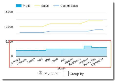
- Is stepped – Only shows when Area is selected for the category type. Changes in Y axis data is stepped vertically, and there are no diagonal lines.
- Trendline – A trendline is a line superimposed on a chart revealing the overall direction of the data. It can be visible only on continuous and numeric horizontal axis. By default, this is not enabled. By enabling this setting, more specific options will appear below.
- Trendline Type – Linear or Exponential. Linear uses straight lines, while exponential uses curved lines.
- Trendline Color – Change the color of the trendline. By default, this is set to the theme color, but can be configured to No color, or Custom color. Then the color can be either selected on a color picker, or defined in Hexidecimal or RGBA.
- Trendline Width – Set the width of the trendline.
- Trendline Opacity – The transparency level of the trendline
- Trendline Type – Linear or Exponential. Linear uses straight lines, while exponential uses curved lines.
Horozontal (X) Axis Settings
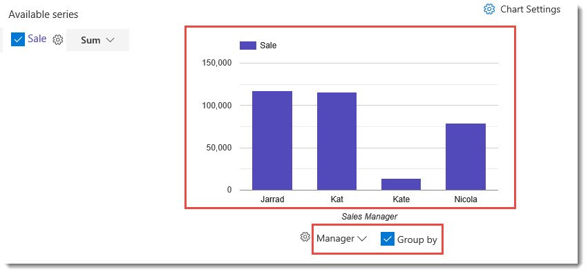
While still on the Display tab, below the graph, you will notice three options related to the horozontal (X) axis: Horozontal settings , a column drop down menu, and an option to Group By the selected column.
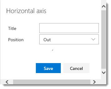
- Horozontal Axis Settings
- Title – Define a title for the horozontal axis, or leave blank to use the column title.
- Position – This is the position of the labels. None (no label), In (Displays in the graph), or Out (Default, displays below the X axis)
- Title – Define a title for the horozontal axis, or leave blank to use the column title.
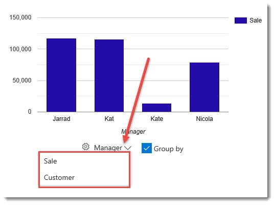
- Column Drop Down Menu – Choose the column to be displayed along the X Axis
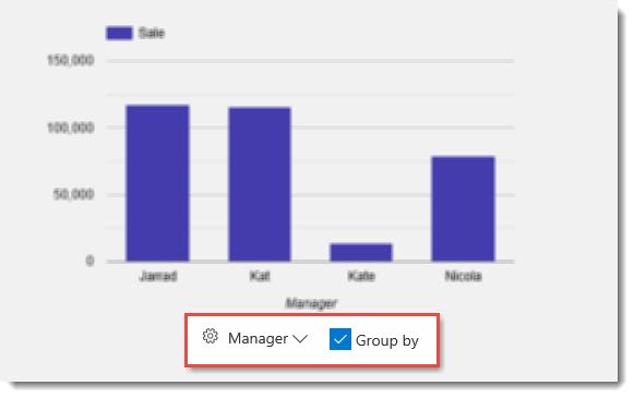
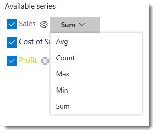
- Group By – If applicable, you can group by data within the selected column. When Grouped By is selected, you will notice that in the available series list, a drop down menu will appear for each column allowing you to select an aggregate function. For example, you may want to display the total number of sales invoices (Count), as opposed to the total amount of sales revenue (Sum).
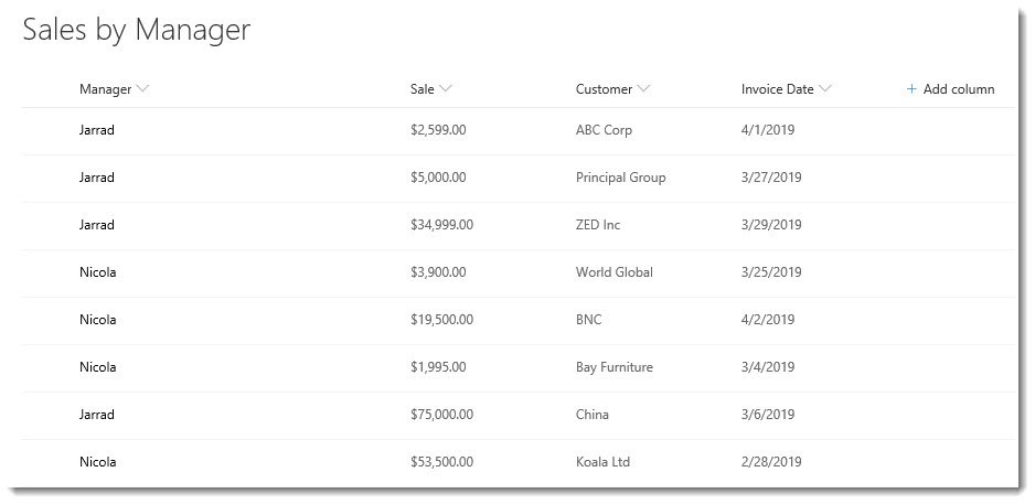
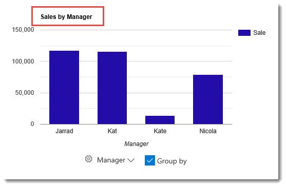
The example below shows the Sales Revenue by Manager, which is displayed by selecting the Sum aggregate function for the Sale column and checking the box to Group By Manager. This data is being retrieved from a list which includes the columns Sale, Manager, Customer, and Invoice Date.
Chart Settings
Additional settings for the Combo Chart can be found by clicking on the Chart Settings icon.
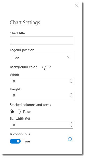
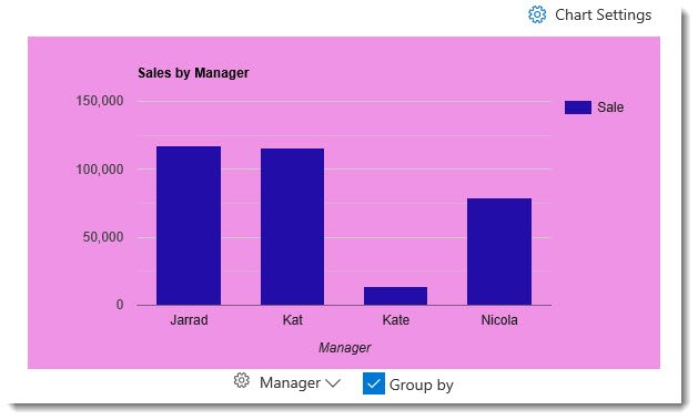
- Chart Title – Add a title at the top of the chart
- Legend Position – Top (Default), Right, Bottom, Left, In, Labeled
- Background Color – No Color is the default. Can alternatively choose the Theme color, or select a Custom color for the background of the chart.
- Width – Define the width of the chart
- Height – Define the height of the chart
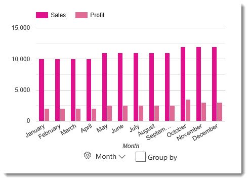
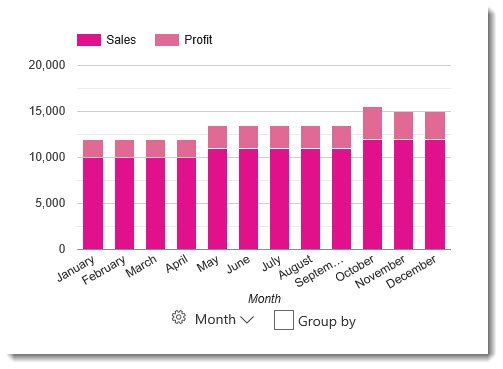
- Stacked columns and areas – True or False (Default). If your chart contains multiple series with at least one as a Column (bar) and one as Area, this setting affects how the columns and area are displayed. When True, the columns and areas will be displayed on top of each other. The images below show a chart displaying two columns, the first image of the default False setting, while the second shows the setting set to True, or stacked.
- Bar width (%) – When the column chart type is selected, this defines the width of the bars.
- Is Continuous – True (Default) or False



Post your comment on this topic.