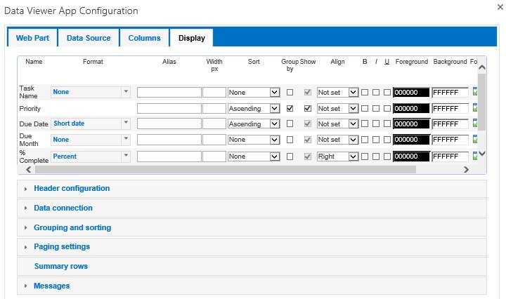
The Display tab is the last tab on the Data Viewer Web Part Configuration dialog. Use this tab to configure how the column data should be displayed by the Data Viewer App Part.
This section of the documentation describes how to use the Display tab when the GridView display provider is selected on the Web Part tab. Only those columns you selected on the Column tab are displayed in this tab.
- Display Format: Select from the Format list the format for the column, for example:
- For a text column type, such as a Single line of text, you can select: None (default) or Hyperlink.
- For a Boolean column type, you can select: None (default), Yes/No, True/False or Checkbox.
- For numerical columns you can select, None (default), Currency, Decimal, Fixed Point, General, Hexadecimal, Number, Percent and Scientific.
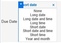
- For Date/Time columns, you can select None (default), Long Date, Long Data and Time, Long Time, Short Date, Short Date and Time, Short Time and Year And Month. You can also type a custom date format.
Note: The column Name and Alias name are only displayed when the Show header check box is selected in the Header configuration section on the Display tab.
Column width: Type in the Width, px text box the width of the column in pixels.
Grouping: Select the Group By check box to group items by that column. If you wish to group using multiple columns, you can change the order of the grouping, using the Grouping and sorting section. Under Fields to group by drag columns in group order. The column at the top is the first column used to group the returned items.

By default groups are expanded. To collapse groups when the Data Viewer App Part is first displayed, in the Grouping and sorting section, select Initially collapse groups checkbox. You can also display how many items are in a group by selecting Show count of items in groups check box in the Grouping and sorting section.
Show: You can select whether to show column values. When you use the Group By check box for a column, you many not wish to display the column as values from the column are they are displayed in the group heading.
Column Alignment. From the Align list, select, Not set (default), Left, Center, Right, or Justify.
Bold, Italic, Underline check boxes.
Foreground and Background colors
Conditional Formatting. Conditional formatting can be set per value or per row allowing you to change formatting options only if a condition is true, for example, you could highlight any Products that have a Units in Stock less than 10 or Tasks assigned to you. Click the formatting icon
Summarizing data. Column values can be summarised, for example, counting the number tasks displayed within the app part. Click the summary
Header Configuration, Data Connection, Grouping and Sorting, Paging Settings, Summary rows and Messages are covered in subsequent topics.


Post your comment on this topic.