
Overview of KPIS
This page provides an high-level overview of Profit & Loss categories, intended for the needs of top management, presented in the form of charts and several KPI visuals
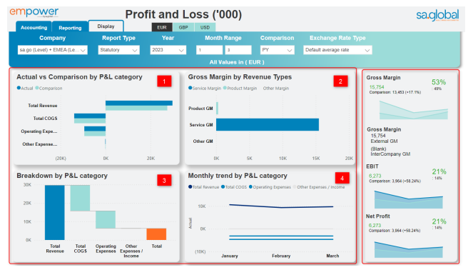
1. bar chart compares Actual and selected Comparison for major P&L categories (Total Revenue, Total COGS, Operating Expenses and Other Expenses / Income).
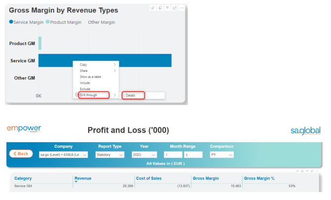
2. bar chart shows the Gross Margin split by general revenue types (Product, Service and Other). If you right click on the particular type and select Drill through > Details, you can see the amounts of revenue and cost which made up that margin
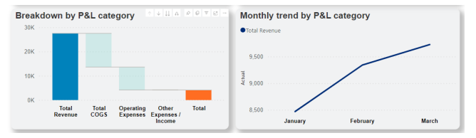
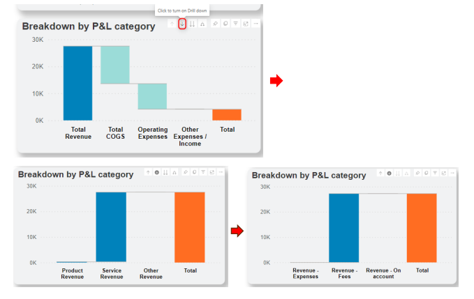
3. waterfall chart helps analyse drivers of profitability at different levels by using categorisation.
4. line chart shows the monthly trend of the selected P&L category.
The two charts together (3 and 4) can help us understand what contributed to company’s revenue and its historical trend. If you select Total Revenue on the waterfall chart, the line chart will automatically re-draw to show monthly trend of the selected category, in this case Total Revenue:
If we drill two levels down, we can find out what was the main component of Total Revenue. In this case, it is Revenue-Fees:
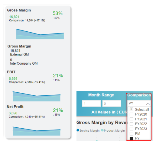
On the right-hand side of the page, there are Gross Margin, Gross Margin split into External GM and Inter Company GM, EBIT and Net Profit. This visual also shows a comparison number, which dynamically changes depending on what is selected in the Comparison slicer, e.g. PY, relevant budget or forecast.
Post your comment on this topic.