
In our ongoing commitment to optimizing the user experience with the Training application, we have implemented a series of enhancements aimed at elevating its interface.
Changes in this latest release include:
- Streamlined Navigation & Structure
To enhance user experience, we have streamlined navigation to and within the Training application, simplifying the overall platform structure. This effort involved removing redundant categories, resulting in fewer steps needed to access the application and its modules.
- For example, although the Training application remains a part of the QMS application suite, it is no longer nested under the QMS category.
![]()
- Similarly, a range of modules within the Training application, such as New Training and Training List, are now readily available on the first-level category under Training.
![]()


- Enhanced Iconography
We have also updated the icons used to represent the Training application and its modules, achieving three key objectives:
- Distinct Application Identity: We have changed the Training application’s icon to make it more distinguishable and align it better with its intended purpose.
![]()
- Consistent Icon Styles: To create a more cohesive visual experience both within the application and across the QMS suite, we have standardized icon styles for modules with similar functions.
- For example, modules presenting lists, such as Training List, now share the same List icon. Modules for creating new items, such as New Training, use the same Add icon.
![]()
- For example, modules presenting lists, such as Training List, now share the same List icon. Modules for creating new items, such as New Training, use the same Add icon.
- Modern Design: As part of our design evolution, demonstrated in the above graphics, we have adopted a thinner icon style, embracing a sleeker and more modern aesthetic.
- Improved Form Design & Layout
We have redesigned our forms to make them more intuitive and space-efficient. This includes reordering fields to ensure a logical flow, improving field labels for clarity and comprehension, and removing unnecessary elements to simplify and declutter the interface.
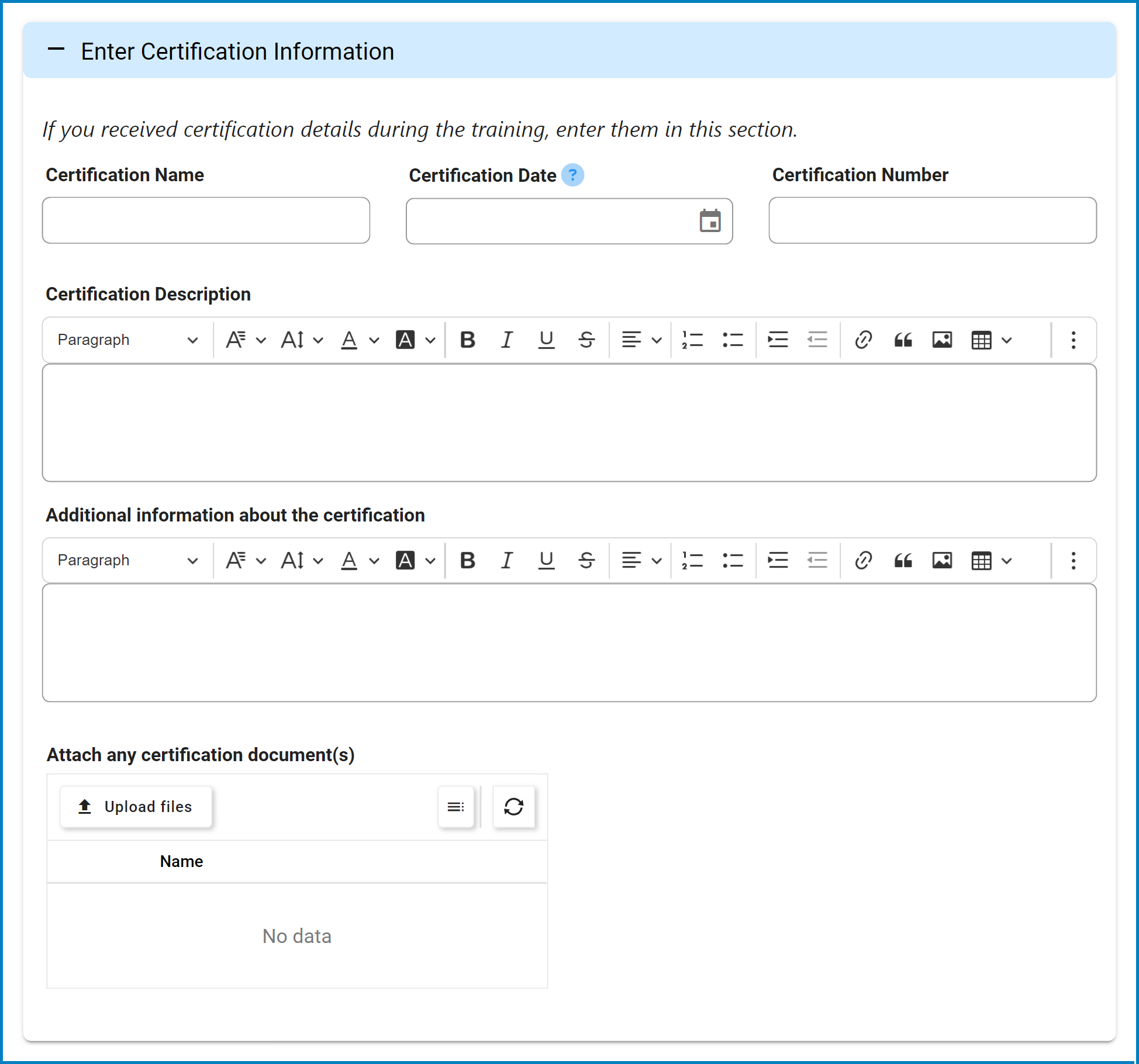
We have also transitioned from tabs to accordions, a change which not only enhances aesthetics and readability but also enables a more focused interaction with content. Users can now smoothly navigate through forms, progressively revealing information as needed.
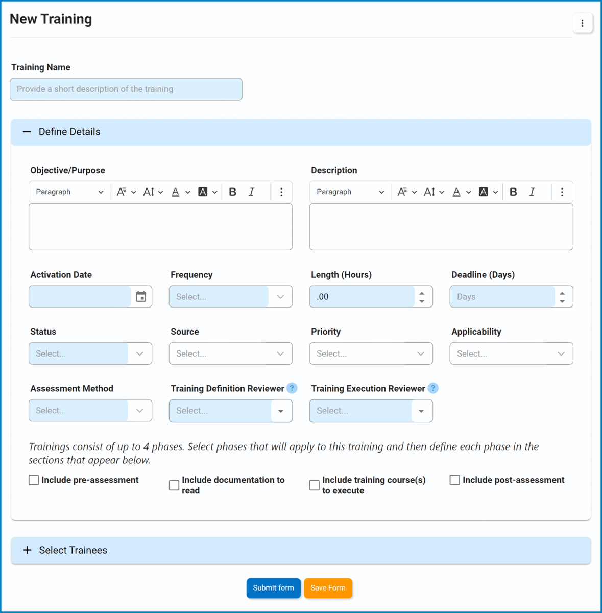
- Certification Information
We have relocated the section for entering certification information from the New Training form to the Execute Training form. This change was made to better align with its relevance and appropriateness within the training workflow.
Post your comment on this topic.