
All forms are listed in the forms view. Administrators can create new forms or modify existing ones.
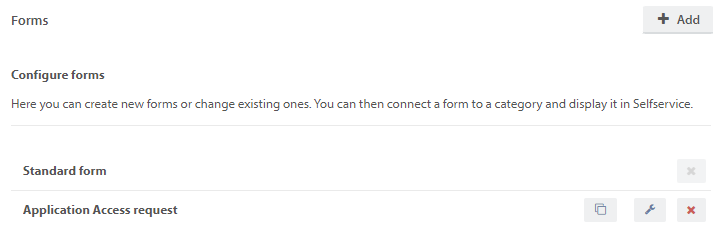
There will always be at least one form listed, the Standard form. You cannot delete this form, as it is the default form. The Standard form is used when there are no other forms available in Selfservice.
Self-made forms are listed in alphabetic order below the standard form.
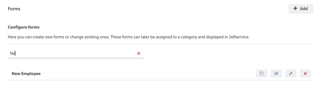
You can search for a specific form by title, or narrow the list by starting to type.
To add a new form, click  .
.
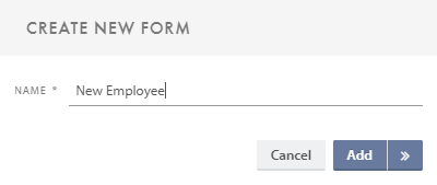
The form name has to be unique. Click Add to edit the form later or Create & open  to start editing the form right away.
The  button allows you to copy an existing form. This can then either be used in a different category, or changed to fit a different purpose. This can save time when multiple similar forms needs to be made.
The  button opens the form bulder for the specified form, and allows you to edit its content.
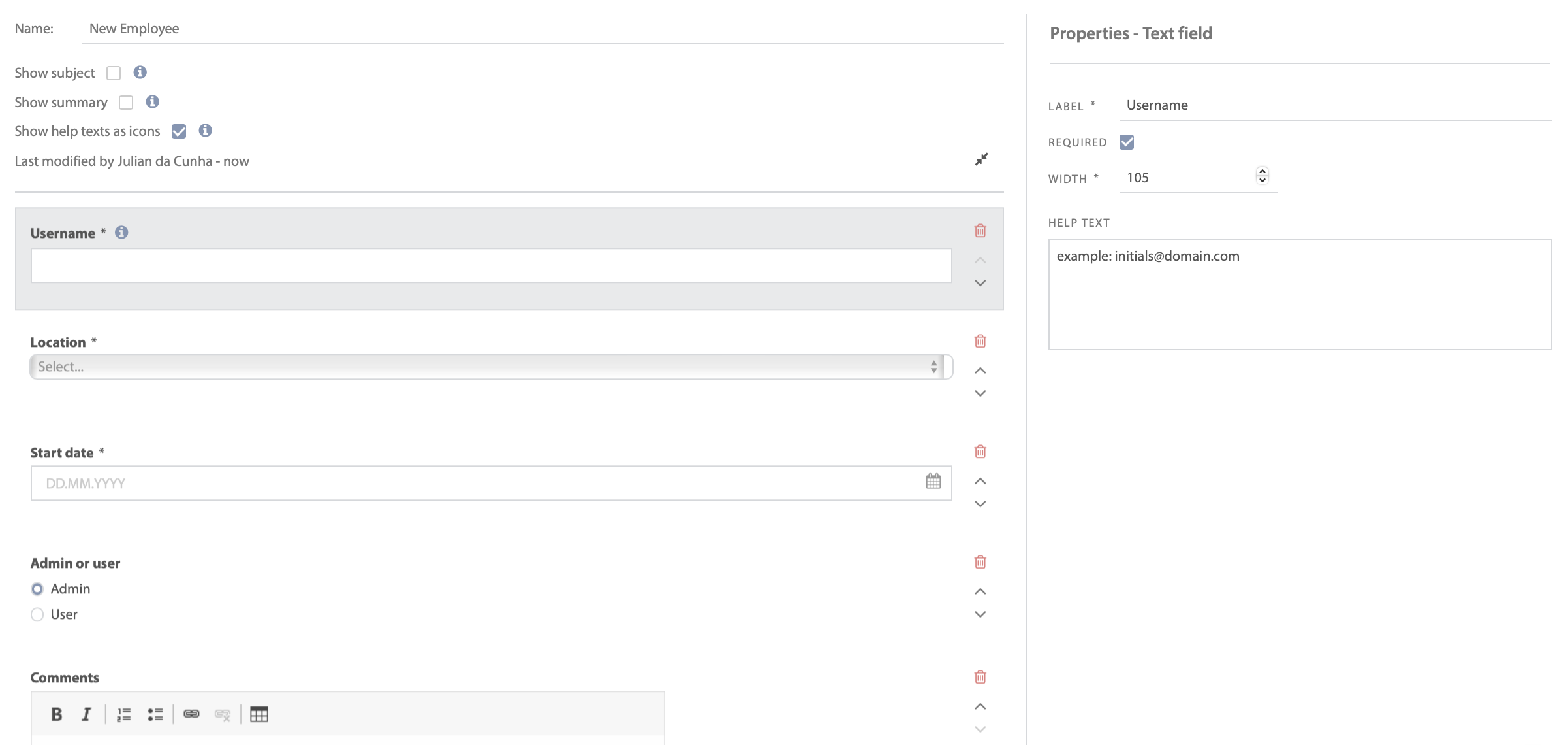
The form builder
Below is an example of a “New employee” form.
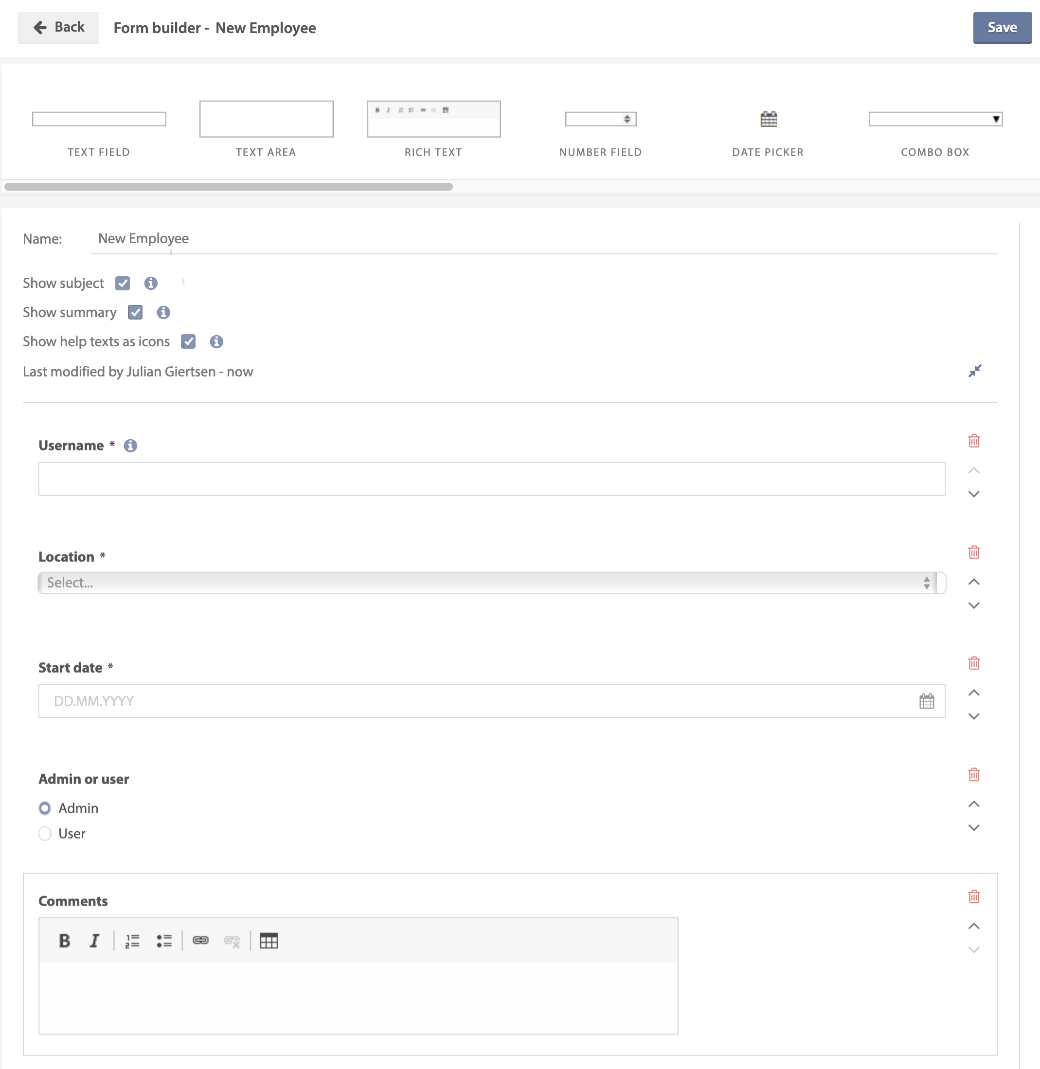
The form builder is divided into three main areas: Tool box, Form area & Sidebar
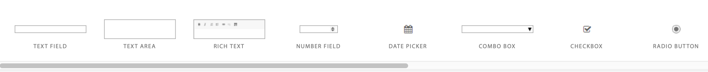
Tool box
The tool box contains all the elements that you can add to a form. You can either double click on an element or use the drag and drop functionality to add it to the form. If you double click on an element, it will be added at the bottom of the form. Please note that it is not possible to place elements next to each other. An element is either placed above or below another element.

Map element allows users to select a location in a map, by placing a marker, typing an address or clicking on the find my location button.
Asset element allows end users to select assets within the selected asset type. You can enable the option which create a relationship between the ticket and the asset selected by the end user when a form is submitted.
Person element allows end users to select other users within the same company. The selection can be further limited by adding department, location or both.
The elements combo box, checkbox and radio button can be used to create a conditional form. This is further explained in the sub topic Conditional forms
Form area
The form area allows you to structure your form and toggle display options on or off.
Show subject – If enabled it allows end users to give the ticket a title/subject. Otherwise the category path in Selfservice will be used.
Show summary – Allows the end user to see a summary of the filled out form before submitting it in Selfservice.
Show help text as icons – If enabled help text will be hidden inside tooltip icons. To view the information, the user must hover the mouse pointer over the icon.
To edit an element you must first click on it. A sidebar will appear to the right, with available options for the selected element.
Click Up  to move a element in the form area up.
Click Down  to move a element in the form area down.
Click Delete  to delete a element in the form area.
Sidebar
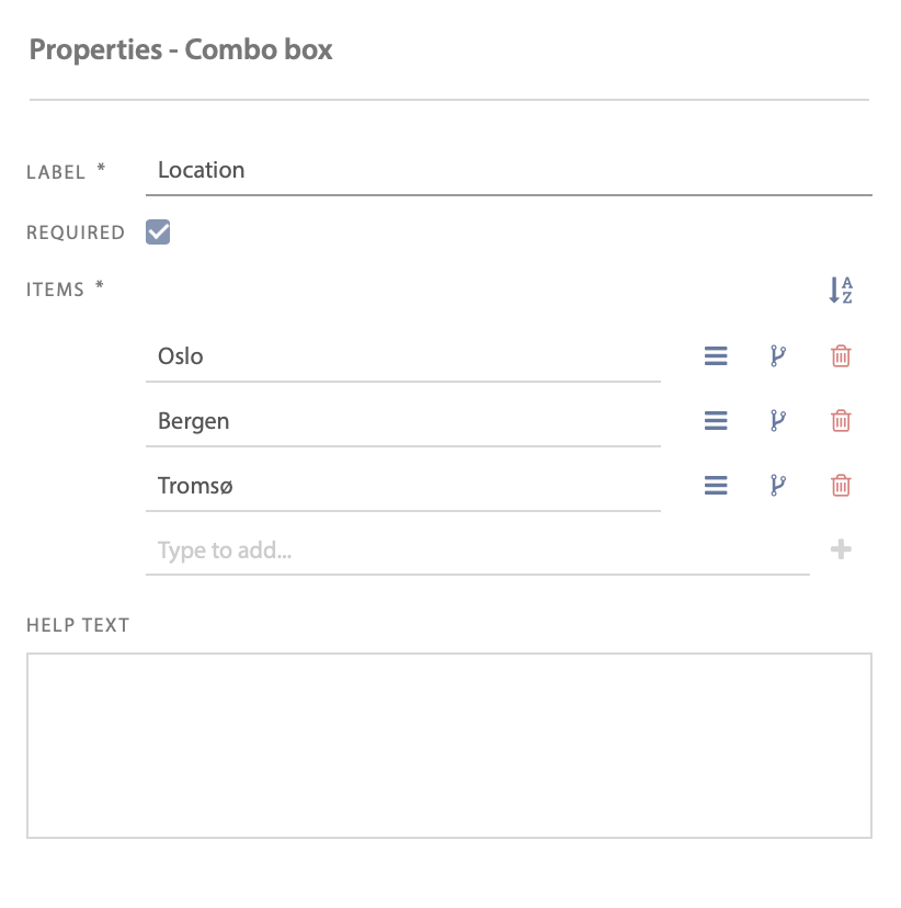
When you mark an element in the form area, its configurable properties are displayed in the sidebar. Below is an example of the configurable properties for a combo box.
Click Drag  to drag and drop elements in the list.
Click Sort  to sort elements in the list from A to Z ascending.
The properties in the sidebar will vary depending on which element you have chosen in the form area.
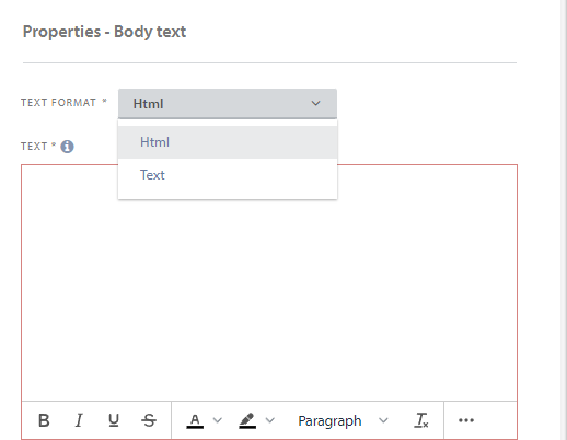
Html-Text format and how to insert image in a form
By selecting Body text from the toolbox, you have the opportunity to choose between two text formats: Text and HTML
By using HTML format, you have several options to edit the form text as you wish.
By clicking the more button at the bottom right of the form, you will get a number of options

Here you get the opportunity to align the text to where you want it, create a list, insert/edit a link, create a table and insert/edit a image.
Please note that the maximum file size is 1 MB per image.
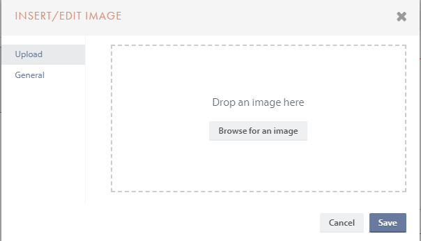
By pressing insert/edit image, you can easily drag and drop an image or upload an image that you have saved on your computer.
Need more help with this?
Ta kontakt med oss for videre spørsmål her!