
Rich Forms Ribbon Tab Features
Rich Forms tab contains controls for adding, editing, and customizing content of the form. Once you open your form in design mode, it will appear after standard SharePoint tabs.
 Rich Forms Tab
1. Reset to Version
Reset to Version action provides the ability to reset the form content to any saved version.
Whenever you need to go back to an older version of your form, rest assured Lightning Forms editor will automatically keep old versions and let you restore them easily.
2. Reset to Default
Reset Form action resets the form content to the initial form template.
3. Uncustomize Form
Uncustomize Form action removes Lightning Forms customization of the current form and reverts to the standard SharePoint form.
4. Field
Field is a custom action in the ribbon toolbar to add fields into the content editor web part. It allows to add any field available for the current form.
It also provides an ability to add new fields directly from the current page: clicking Add New button initiates opening of Create Column dialog. New field is immediately added to the form.
 Add a Field
5. Group
Group is a custom action in the ribbon toolbar to add groups into the content editor web part.
Since positioning of fields is essential for designing your forms to match the structure of the data represented, Lightning Forms provides Groups functionality that allows to manipulate form field positions, flexibly combine different group types to create the layout you want. You can even embed groups inside other groups, allowing for even the most complex layouts.
There are 3 available group types: vertical, horizontal and group with header.
 Lightning Forms Group
Vertical group allows to place form fields in vertical stack one below another.
 Vertical Group
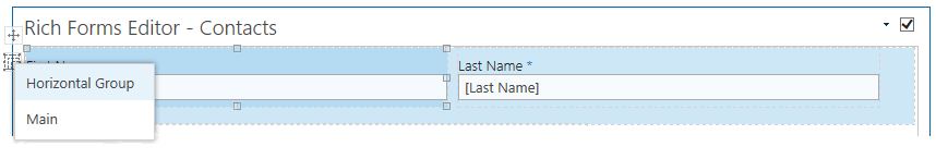
Horizontal group allows to place form fields in horizontal stack one after another.
Group with header allows to place form fields in vertical stack one below another and to display a header for it. Group with header follows the layout rules of vertical group. There is a setting on the ribbon to define if it will be collapsible: Collapsible checkbox allows to specify if an icon should appear to collapse/expand the content of this group.
 Group with Header
6. Table
Table is a custom action in the ribbon toolbar to add table layout into the content editor web part. Table layout allows placing fields or other elements in a familiar table grid even more easily and user-friendly. Making designing your forms as you want even faster.
Table can be inserted by selecting the needed number of rows and columns. When table is inserted, the additional ribbon tab appears with standard table options.
 Table
Table Table Layout
7. Tabs
Tabs is a custom action in the ribbon toolbar to add tabs into the content editor web part.
Tabs are styled by default to fit well for forms in SharePoint 2013 look, therefore they appear natural in your forms design. This group is very handy to use: tabs can be easily reordered, fields are moved to the tabs by simple drag & dropping. Each tab follows the layout rules of vertical group.
 Tabs
Tabs8. Toolbar
Toolbar is a custom action in the ribbon toolbar to add the form toolbar into the content editor web part. You can manage buttons separately in ungrouped toolbar.
 Toolbar
9. Rich Text Box
Rich Text Box is a custom action in the ribbon toolbar to add rich text box into the form. Rich Text Box is generally used for displaying, entering and manipulating text with formatting. Now your form can be extended with the freely editable text, hyperlinks, tables or media. Fields are moved to the editable area by simple drag & dropping.
 Rich Text Box
10. Button and Link
Button is a custom action in the ribbon toolbar to add the different buttons into the content editor web part. Actions executed on buttons click can be configured in Actions section of Behaviour tab.
 Button and Link
11. Insert Sublist
Related list view can be inserted as editable grid on new and edit form, and as non-editable grid – on display form. Available sub lists are displayed as the options of Insert sub list custom action in the ribbon toolbar. Related items are displayed based on the lookup column in the inserted list or document library.
 Insert Sublist
12. Insert Sublibrary
Insert Sublibrary allows providing a document library view with folders and drag and drop functionality anywhere inside your form. The sub library is editable and can be used on display and edit forms. Available sublibraries are displayed as the options of Insert Sublibrary custom action in the ribbon toolbar.
 Insert Sublibrary
13. Reordering and delete actions
Lightning Forms provides an easy way of moving and deleting any UI element on the form. The following options on the ribbon allows to move a form field, as well as remove it in the design mode.
 Reordering and Deleting Actions
p(banner tip).Note: In a horizontal group Move Up moves element to the left and Move Down to the right.
14. Select Element
Select Element option provides a drop-down list of all elements on the form. Selecting the option in the drop-down highlights the corresponding element on the form.
 Select Element
15. Lock Contents
Rich Forms editor provides ability to lock / unlock grouped contents. This can be done by clicking one of the options under Lock Contents section. Lock action locks the selected element content: disables editing ability.
Field row is a horizontal group of field label and vertical group of field input and field description. Field row unlocking allows to manage its elements (field label, field input, field description) independently.
 Lock Contents
16. Show grid lines
Show grid lines is a custom action in the ribbon toolbar to show/hide grid lines in the design display mode. It is turned on by default.
 Show Grid Lines
17. Label
Label is a custom action in the ribbon toolbar to align field labels into the content editor web part. In addition to simple editing of field label text and label resizing, labels also can be placed in different positions: to the left / to the right of the field, at the top / at the bottom of the field. Setting Align Default specifies alignment of the field label according to the context of the field row:
Horizontal / Vertical group: align setting applied to the horizontal group determines alignment of nested elements (field rows, groups, tabs).
Any non-default alignment setting overrides the default one.
 Label
Label18. Only Display
Only Display action is used to set the selected form field to only display mode, so it cannot be edited. It is useful on Edit form to have some field values in read only mode.
 Only Display
19. Collapsible
Collapsible checkbox allows to defines if Group with header will be collapsible: if an icon should appear to collapse/expand the content of this group.
20. Height, Width
Formatting actions allows to set height and width of the element, as well as of the group of elements.
21. Margin, Padding
Margin and Padding values can be set in more visual way using the Edit dialog.
 Margin, Padding
22. Export, Import
Allows exporting customized forms to a file which can be imported on the same or any other site. Export produces a .RFF file that contains the schema of all web parts on the form page and some additional metadata. This file can be saved and imported into another form. This is the quickest way to backup your forms and restore them on another environment.
Feedback
Post your comment on this topic.