
In the Home Setup form, users can manage the display settings for applications—specifically how applications are displayed in the home page of the DBP.
To access the settings for an application, select the application from the Menu Items list. It will display the Menu Item Settings field:
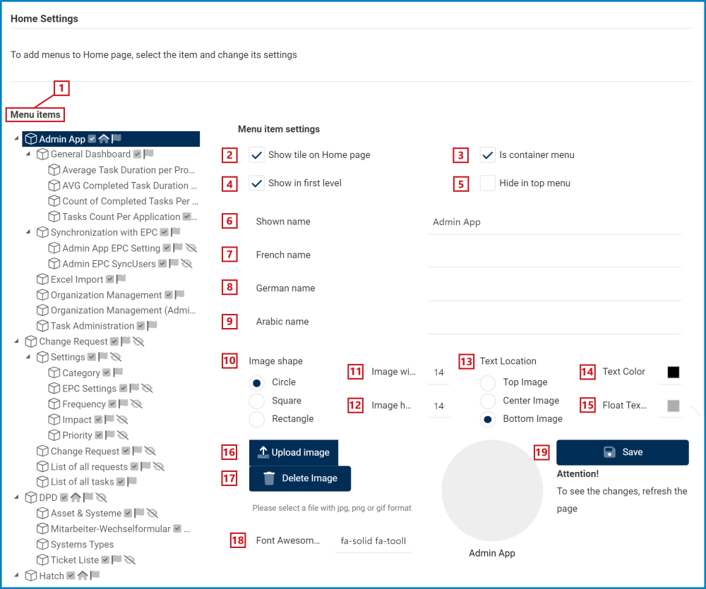
- Menu Items: This tab lists the different applications available to a DBP server. When an item is selected, its settings are displayed on the right side of the screen.
- If an item has a checkmark next to it, it is an indication that the item is currently being displayed on the home page.
![]()
- If an item has a checkmark next to it, it is an indication that the item is currently being displayed on the home page.
- Show Tile on Home Page: This is a checkbox which, if selected, allows for the application to be shown as a tile on the home page.
- If this checkbox is not selected, some fields in this form will be disabled.
- Is Container Menu: This is a checkbox which, if selected, allows for the item to act as a container menu.
- A container menu holds within it other items/folders.
- Show in First Level: This is a checkbox which, if selected, allows for the item to be shown in the first level of the application.
- In this context, the first level means that the item will act as the main icon for the application. This icon is displayed as a tile on the home page.
- Hide in Top Menu: This is a checkbox which, if selected, allows for the item to be hidden in the top menu of the application.
- Shown Name: This is a text field that allows users to input the name of the item. This name will be displayed alongside the tile in the DBP.
- French Name: This is a text field that allows users to input the French name for the item.
- German Name: This is a text field that allows users to input the German name for the item.
- Arabic Name: This is a text field that allows users to input the Arabic name for the item.
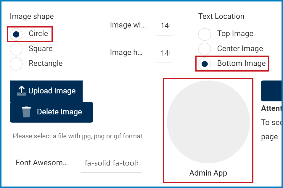
- Image Shape: This is a radio button that allows users to select only one option from a set of mutually exclusive options. These options pertain to the shape of the tile. Users can choose to set the shape as a circle, a square, or a rectangle.
- Image Width: This is a numeric field that allows users to input the width of the tile.
- Image Height: This is a numeric field that allows users to input the height of the tile.

- Text Location: This is a radio button that allows users to select only one option from a set of mutually exclusive options. These options pertain to the location of the tile’s name. Users can choose to place the name either on top, at center with, or below the image.
- Text Color: This is a color picker that allows users to select the text color.
- Float Text Color: This is a color picker that allows users to select the float text color.
- Upload Image: This button allows users to upload an image from their computer.
- Delete Image: This button allows users to delete an uploaded image.
- Font Awesome Icon: This is a text field that allows users to input the unique Font Awesome Icon code.
- Save: This button allows users to save their changes.