
In the Training Dashboard module (located in the QMS Dashboard application), users can access visual representations of training metrics.
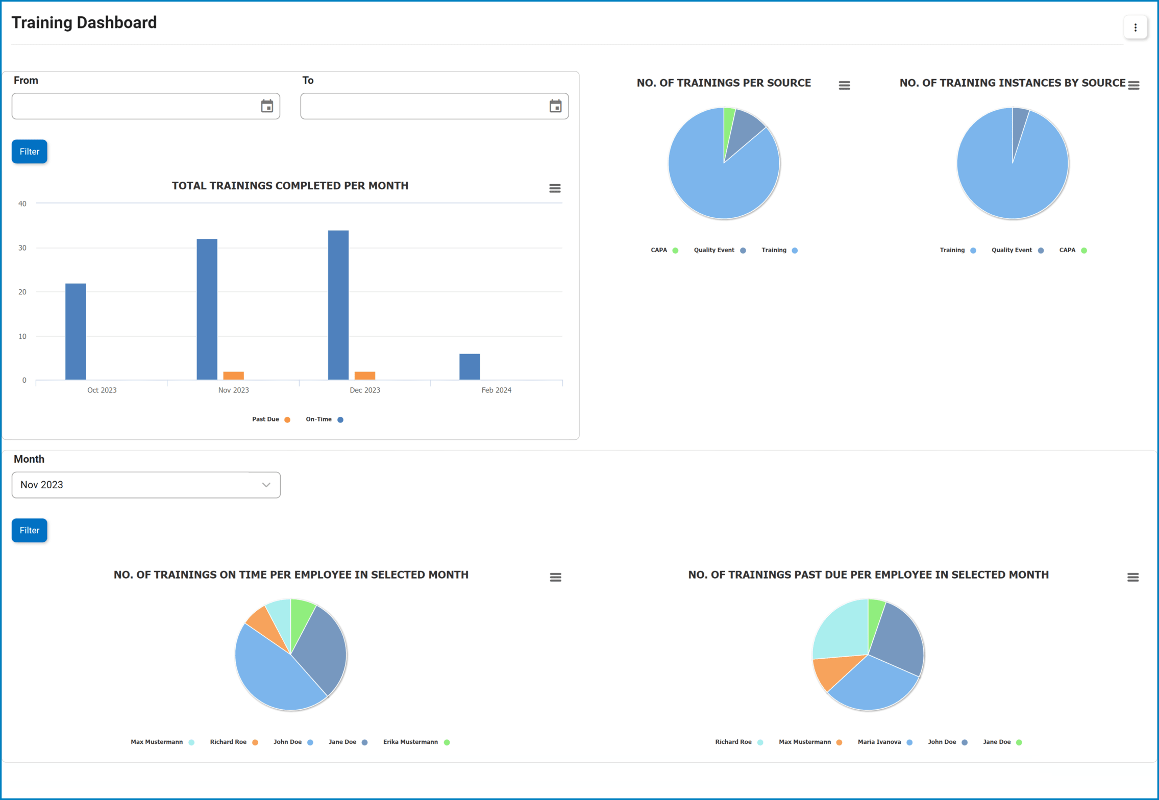
- Filter Options: These options enable users to refine the displayed data according to their specific needs.
- For the Total Trainings Completed per Month graph, utilize the Date Range Filter to specify the timeframe of interest.
- For the Employee Training Performance graphs, utilize the Month Filter to focus on data for a particular month.
- After selecting the appropriate filter option(s), click the Filter button to tailor the displayed metrics to desired criteria.
- For the Total Trainings Completed per Month graph, utilize the Date Range Filter to specify the timeframe of interest.
- Chart Context Menus: These are hamburger buttons which, when collapsed, display a list of options that allow users to either print or download the chart.
- Training Count: This is quantitative data that users can access by hovering their cursor over the different symbols in the charts (i.e., bars of bar chart, slices of pie chart). It represents the number of trainings per category.
![]()
- Drilldown Reports: These are data reports that users can access by double-clicking on the different symbols in the charts.
- Examples:
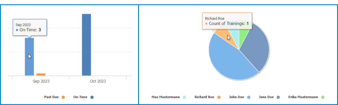
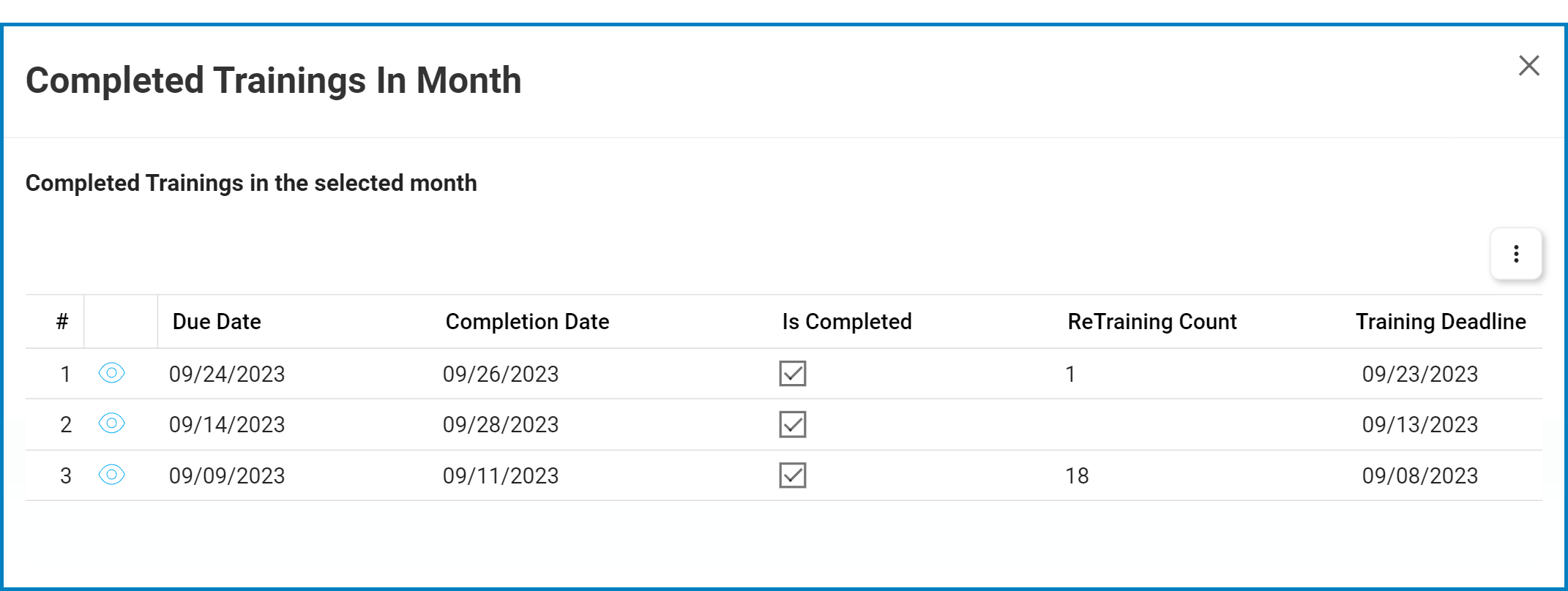
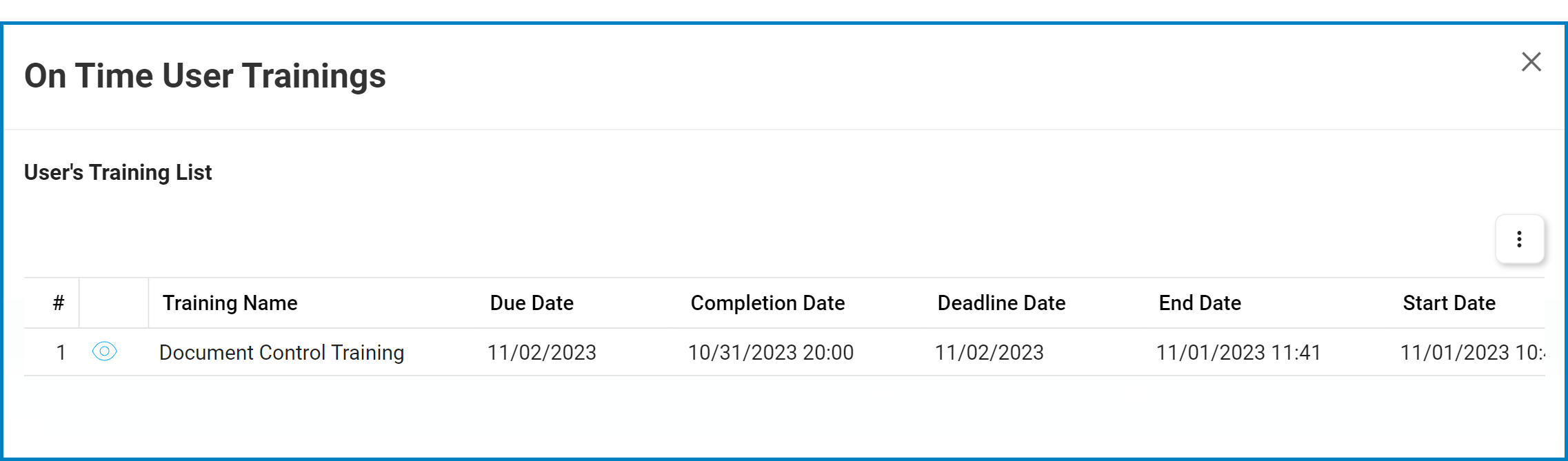
- Double-clicking the bar for trainings that have been completed on time in Sep 2023 reveals the following modal window:
![]()
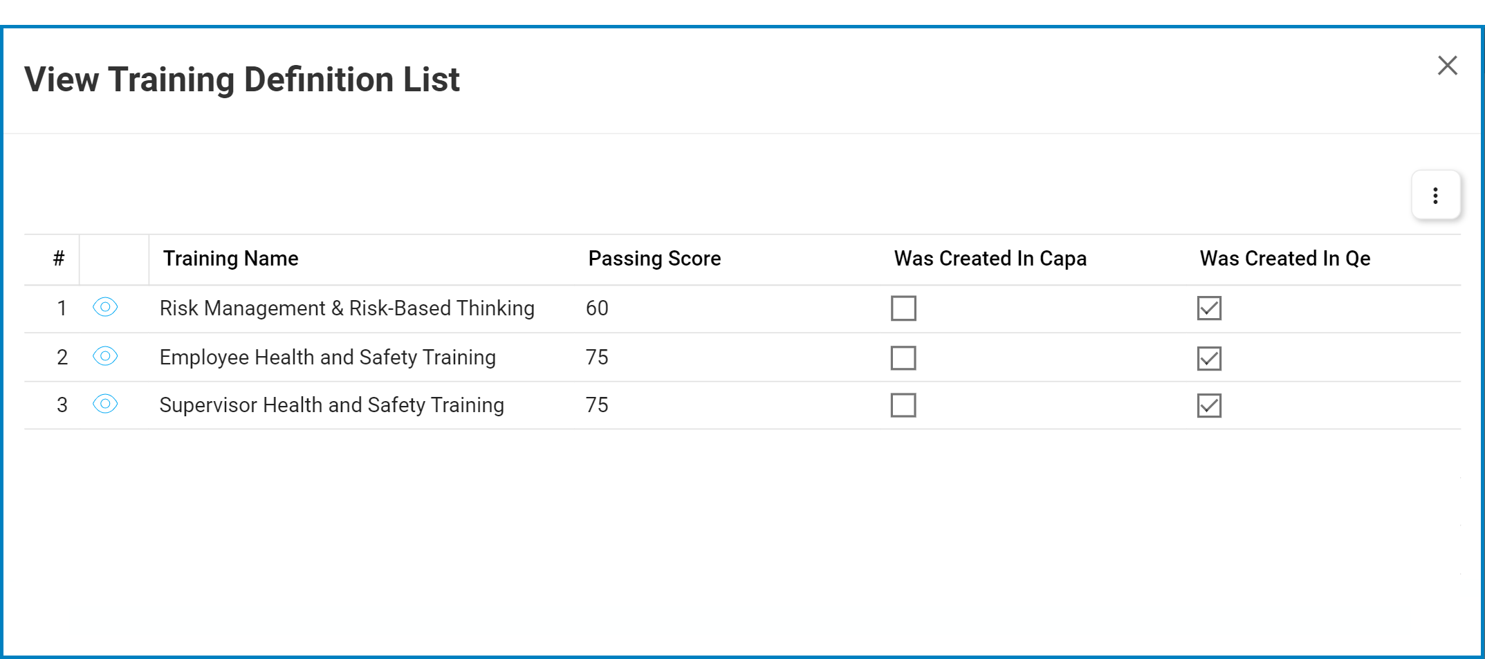
- Double-clicking the sector for trainings created using the QE application reveals the following modal window:
![]()
- Double-clicking the sector for trainings that have been completed on time by employee Richard Roe in Nov 2023 reveals the following modal window:
![]()
**To view a training, click on the corresponding View (
![]() ) button in the grid. In viewing mode, modifications are disabled, but users can access linked EPC objects and download available templates.
) button in the grid. In viewing mode, modifications are disabled, but users can access linked EPC objects and download available templates.
- Double-clicking the bar for trainings that have been completed on time in Sep 2023 reveals the following modal window:
- Examples:
Post your comment on this topic.