
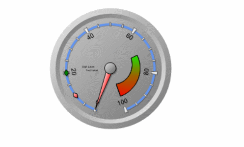
In the Scale tab, users can customize various properties related to the scale of the gauge control.
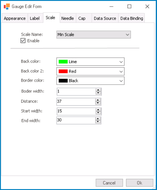
- Scale Name: This field allows users to select the specific scale they want to configure from a dropdown menu.
- Scales: Base Scale, Min Scale, Middle Scale, or Max Scale.
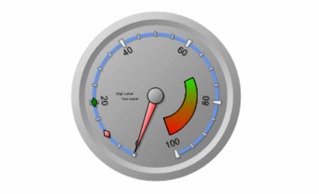
- Gauge Scales Preview: Web View
-
![]()
- Scales: Base Scale, Min Scale, Middle Scale, or Max Scale.
- Enable: This is a checkbox which, if selected, allows users to enable the display of the selected scale.
- Back Color: This is a color picker that allows users to choose the background color of the scale.
- This color is used as the initial color or the starting point of the gradient that defines the scale’s background.
- Back Color 2: This is a color picker that allows users to choose the secondary color of the scale.
- This color is used as the final color or the ending point of the gradient that defines the scale’s background.
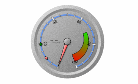
- Gauge Scale Background Color Customization: Web View
-
![]()
- Border Color: This is a color picker that allows users to choose the color of the scale’s border.
- Border Width: This is a numeric updown field that allows users to set the width of the scale’s border.
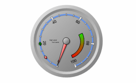
- Gauge Scale Border Customization: Web View
-
![]()
- Distance: This is a numeric updown field that allows users to specify the distance between the scale and the gauge control.
- This value determines the spacing or gap between the scale and other elements of the gauge control.
- Gauge Scale Distance Customization: Web View
-
![]()
- Start Width: This is a numeric updown field that allows users to specify the starting width of the scale.
- This value determines the initial width of the scale at its starting point.
- Gauge Scale Start Width Customization: Web View
-
![]()
- End Width: This is a numeric updown field that allows users to specify the ending width of the scale.
- This value determines the final width of the scale at its ending point.
- Gauge Scale End Width Customization: Web View
-
![]()