
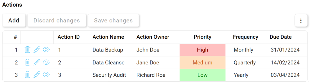
Grid controls are useful tools for displaying and manipulating large sets of data in a structured format. They enable users to sort, filter, add, edit, and interact with data in a tabular view, making it easier to visualize and analyze complex information.
When a grid control is selected in the design environment, its associated properties are displayed in the Control Properties panel.
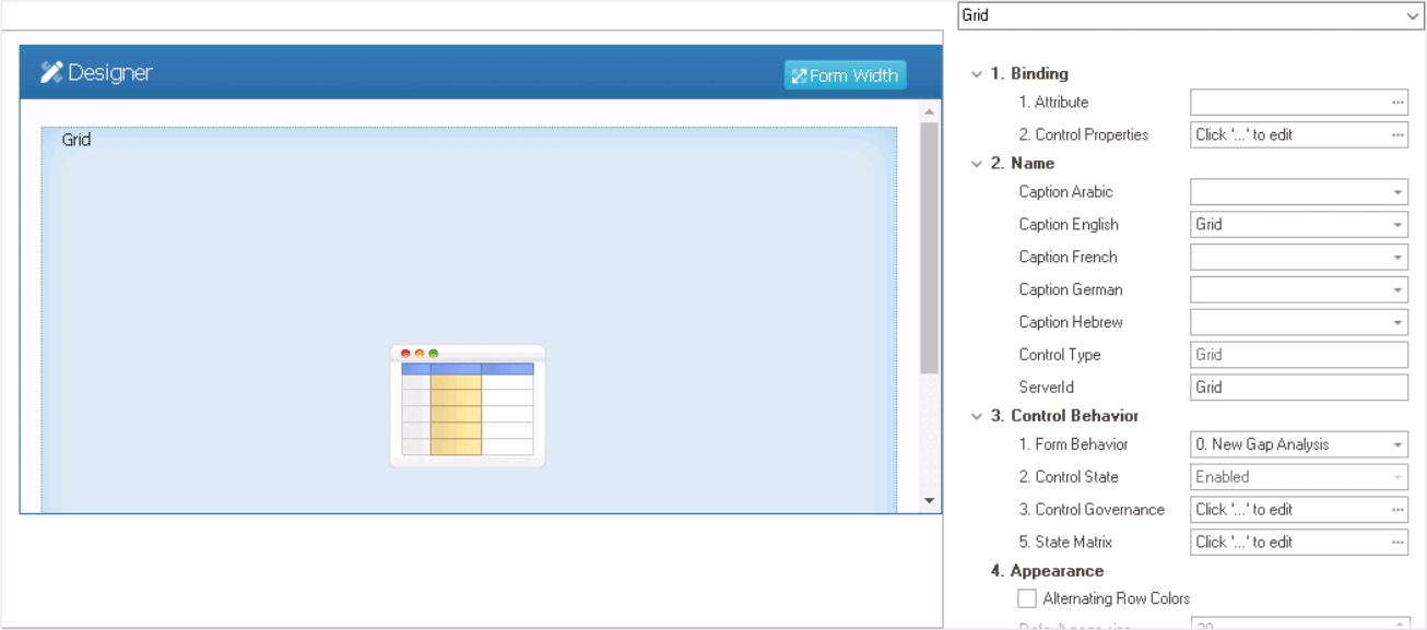
- Binding: In this category, users can link a control to its corresponding attribute and define its binding properties.
- For more information on the fields in this category, click here.
- Name: In this category, users can access basic properties required for the control’s identification and proper referencing in the code.
- For more information on these properties and how to configure them, click here.
- Control Behavior: In this category, users can configure the behavior of the control and define how it interacts with the form or application.
- Control Governance
-
- In the Control Governance field, users can configure various properties that govern the functionality of controls.
- To access the control governance properties, click on the ellipses (
![]() ) inside the field. It will display the Form / Behavior / Control window.
) inside the field. It will display the Form / Behavior / Control window.
- This window consists of two tabs:
- To access the control governance properties, click on the ellipses (
- In the Control Governance field, users can configure various properties that govern the functionality of controls.
- For more information on these properties and how to configure them, click here.
- Appearance: In this category, users can customize the visual appearance of the control.
- Alternating Row Colors: This is a checkbox which, if selected, applies alternating background colors to consecutive rows in the grid.
- Alternating Row Colors Preview: Web View
-
![]()
- Default Page Size: This field allows users to set the number of items that are displayed in the grid at one time.
- By default, the page size is set to 20. To adjust this size, users can enter numbers into the field either manually or by clicking the increment/decrement arrows.
- By default, the page size is set to 20. To adjust this size, users can enter numbers into the field either manually or by clicking the increment/decrement arrows.
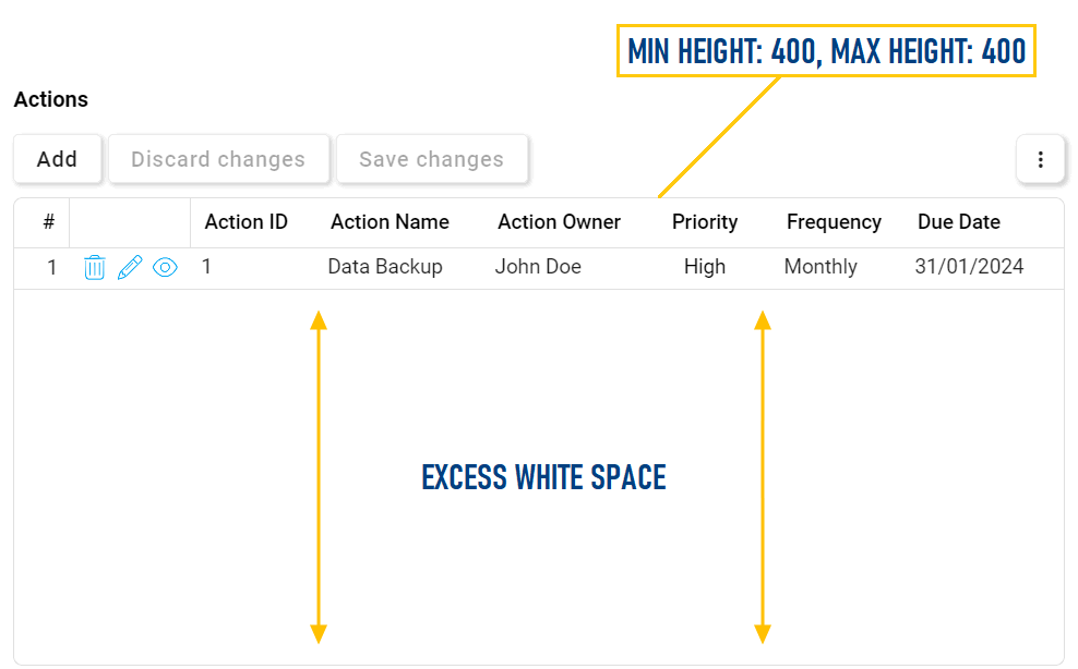
- Minimum Height: This is a numeric updown field that allows users to set the minimum height of the control.
- By default, the minimum height is set to 400. To adjust this size, users can enter numbers into the field either manually or by clicking the increment/decrement arrows.
- Maximum Height: This is a numeric updown field that allows users to set the maximum height of the control.
- By default, the maximum height is set to 400. To adjust this size, users can enter numbers into the field either manually or by clicking the increment/decrement arrows.
- Grid Height Adjustments Preview: Web View
-
![]()
- By default, the maximum height is set to 400. To adjust this size, users can enter numbers into the field either manually or by clicking the increment/decrement arrows.
- Show Horizontal Lines: This is a checkbox which, if selected, displays horizontal lines between rows in the grid.
- Show Outer Border: This is a checkbox which, if selected, displays a border around the outer edges of the grid.
- Show Vertical Lines in Body: This is a checkbox which, if selected, displays vertical lines between columns in the grid body.
- Show Vertical Lines in Header: This is a checkbox which, if selected, displays vertical lines between columns in the grid header.
- Lines & Borders Preview: Web View
-
![]()
- Tooltip: This field allows users to input a tooltip for the control.
- Users can customize the control tooltip in multiple languages.
- In the web application, the tooltip is represented by the tooltip icon (
![]() ) next to the control.
) next to the control.
- Users can customize the control tooltip in multiple languages.
- Alternating Row Colors: This is a checkbox which, if selected, applies alternating background colors to consecutive rows in the grid.
- Caption Appearance: In this category, users can customize the visual appearance of the control’s caption.
- For more information on the fields in this category, click here.
 ) inside the field. It will display the Form / Behavior / Control window.
 ) next to the control.
 - Quick Forms Application
- To apply the Quick Forms feature to grid controls, take the following steps:
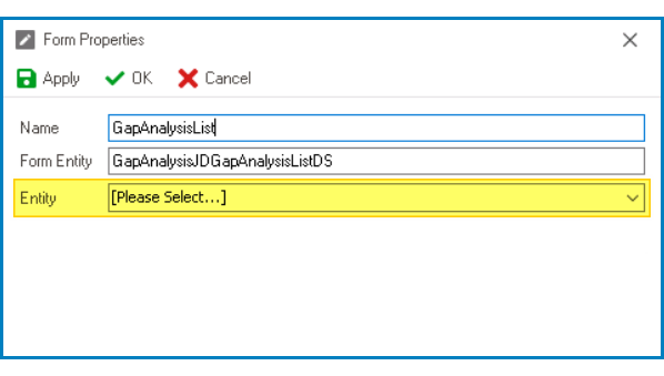
- Create a new form and leave the Entity field empty.
![]()
- Confirm the prompt to design the form.
- In the Form Designer, drag a grid control from the toolbox and drop it onto the design environment.
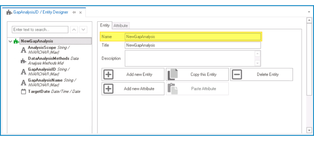
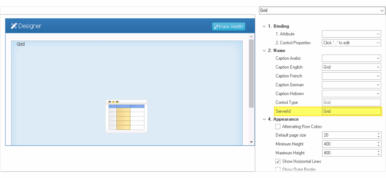
- Go to the Entity Designer and copy the name of the main entity—that is, the entity associated with the form that the grid is referencing.
![]()
- Return to the newly created form and paste the entity name into the Server ID field.
![]()
- Save the form.
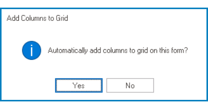
- If you want to automatically add columns to the grid (based on the attributes defined in the main entity), confirm the following prompt:
![]()
- Once added, these columns can be viewed and customized in the control properties of the grid.
- Confirm the prompt to generate a form behavior.
- After users have answered the prompts, the form will close automatically. When the form is opened again, users will find that the grid is now linked to the appropriate attribute.
- Create a new form and leave the Entity field empty.
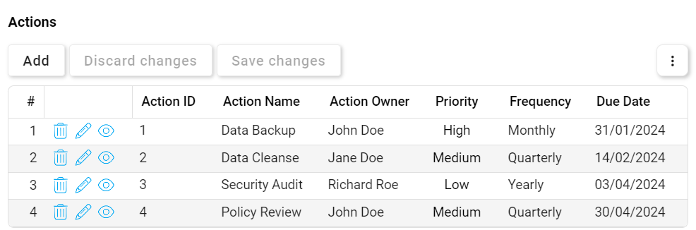
- Grid Control Preview: Web View
![]()