
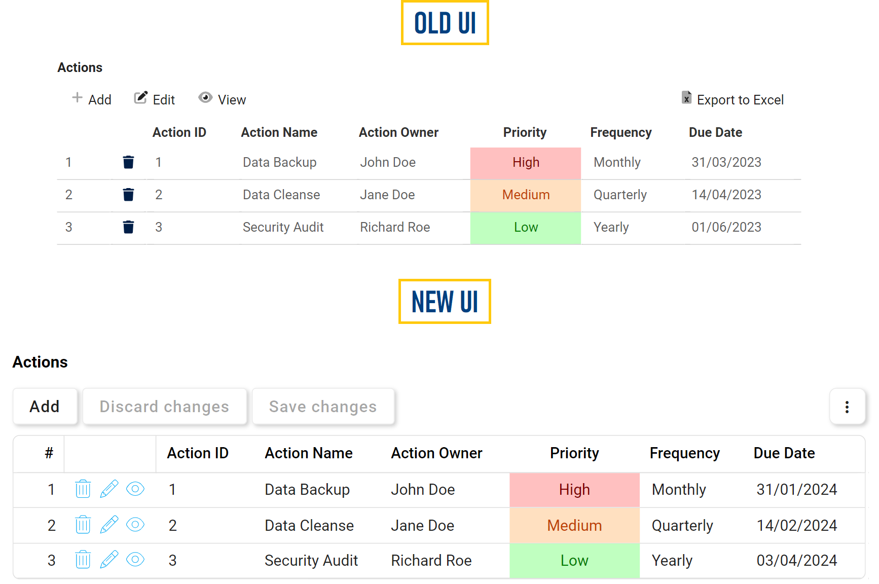
We have introduced significant enhancements to the grid control, aimed at refining the user experience and providing more intuitive functionality. This release focuses on streamlining operations, improving accessibility, and introducing new customization options.
Key Improvements:
- Streamlined User Operations
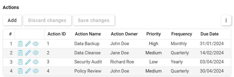
- Modal Operations:
![]()
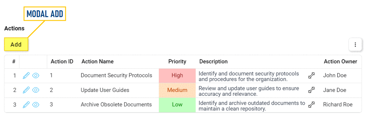
- Modal Add:
- To simplify data entry, users can now only choose one type of add function: Modal Add or Inline Add.
- Add button now features enhanced borders and a subtle shadow for improved visibility and distinction.
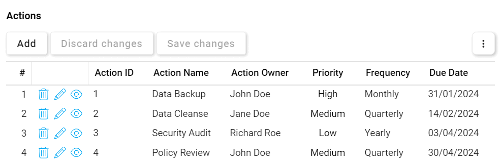
- Modal Edit & View:
- Modal Edit and View functions have received a visual upgrade for a cleaner interface.
- Changed from an Edit button to a simple pencil (
![]() ) icon.
) icon. - Changed from a View button to a simple eye (
![]() ) icon.
) icon.
**To avoid confusion, rich text content configured for pop-up display, which previously used the eye icon, is now denoted by an expand (
![]() ) icon.
) icon.
- Changed from an Edit button to a simple pencil (
- Modal Edit and View functions have received a visual upgrade for a cleaner interface.
- Modal Add:
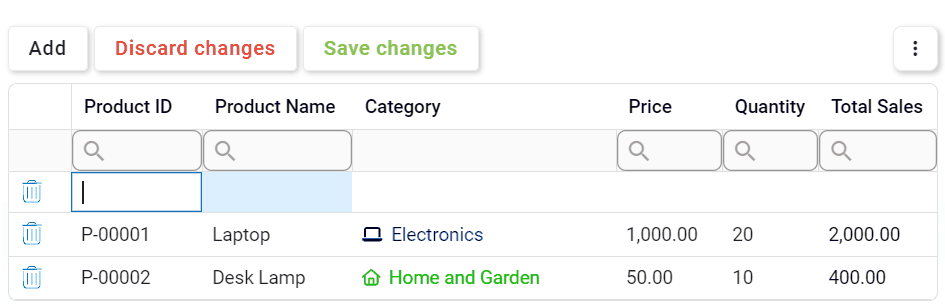
- Inline Operations:
![]()
- Inline Add:
- No longer an Inline Add button; it is now represented by the same Add button as Modal Add.
- Batch Inline Add: Users can now add and fill multiple rows at once before saving their changes.
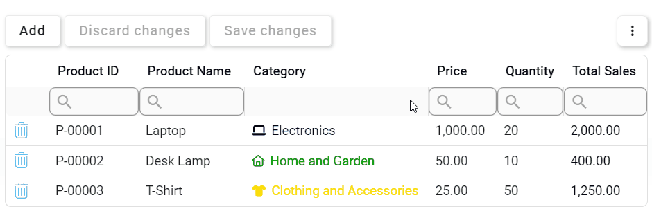
- Inline Edit:
- No need for an Inline Edit button; users can now directly edit inside the grid by clicking on modifiable elements.
![]()
- Batch Inline Edit: Users can now modify multiple cells and rows at once, even across different pages, before saving their changes.
- No need for an Inline Edit button; users can now directly edit inside the grid by clicking on modifiable elements.
- Delete:
- No need for the modal dialog; the deletion process is now simpler. To confirm deletions, users can click Save Changes or simply click outside the grid. Canceling deletions is equally straightforward—click Discard Changes for multiple deletions or Undo (
![]() ) for individual deletions.
) for individual deletions.
![]()
- Batch Delete: Users can now select multiple rows for deletion before confirming their changes.
- No need for the modal dialog; the deletion process is now simpler. To confirm deletions, users can click Save Changes or simply click outside the grid. Canceling deletions is equally straightforward—click Discard Changes for multiple deletions or Undo (
- Inline Add:
- Modal Operations:
 ) icon.
 ) icon.
  ) icon.
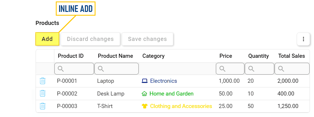
 ) for individual deletions.
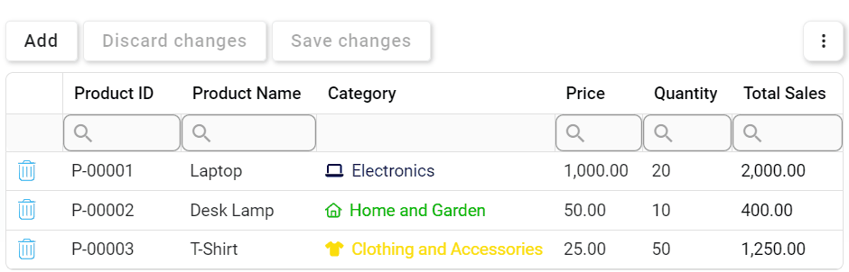
- User Guidance & Data Validation
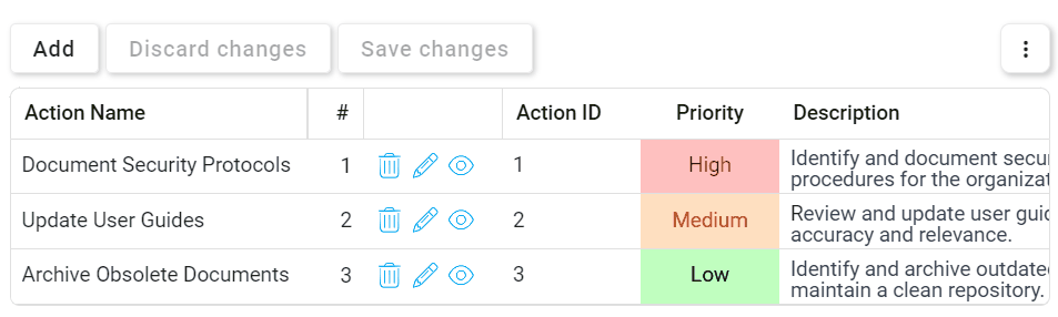
- Mandatory Fields:
- Mandatory columns are now visually distinguishable in the grid by color, enhancing user awareness during inline add or edit.
![]()
- Mandatory columns are now visually distinguishable in the grid by color, enhancing user awareness during inline add or edit.
- Mandatory Fields:
- Enhanced Data Management
- Data Filtering:
- The filter row, designed to refine data searches within grid columns, has been upgraded for enhanced functionality.
- Each column’s search box now features a magnifying glass (
![]() ) icon, revealing a menu with conditional operators.
) icon, revealing a menu with conditional operators.
![]()
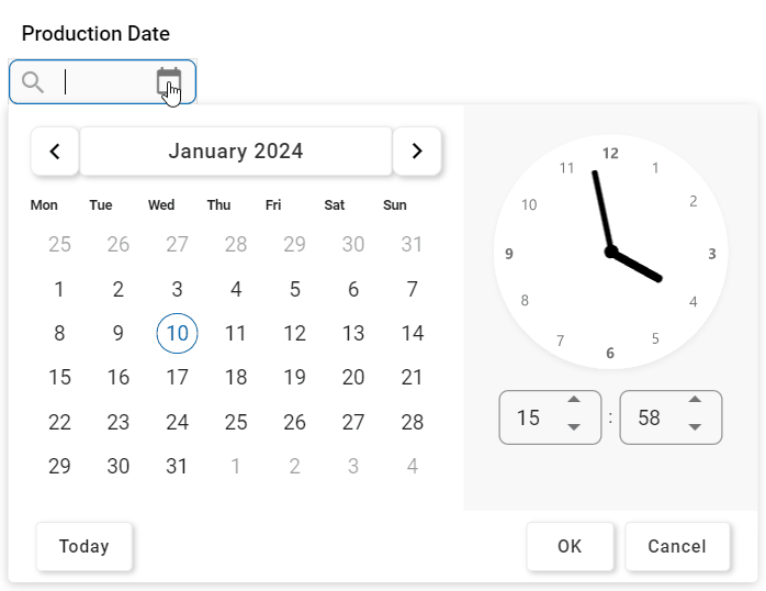
- The filter row now also supports filtering for date/time and checkbox columns. Users can choose dates and times from a date/time picker or toggle checkbox states from a dropdown.
![]()
- Each column’s search box now features a magnifying glass (
- The filter row, designed to refine data searches within grid columns, has been upgraded for enhanced functionality.
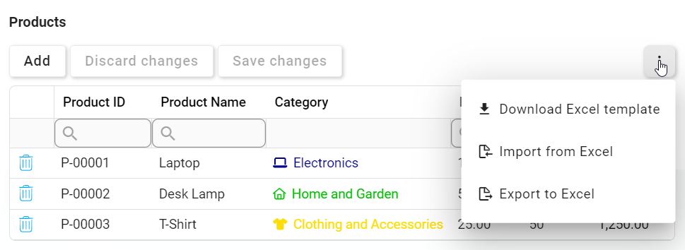
- Excel Data Integration Options:
- The Excel data integration options are now featured in a compact kebab menu, optimizing space while providing efficient access to relevant actions.
![]()
- The Excel data integration options are now featured in a compact kebab menu, optimizing space while providing efficient access to relevant actions.
- Data Filtering:
 ) icon, revealing a menu with conditional operators.
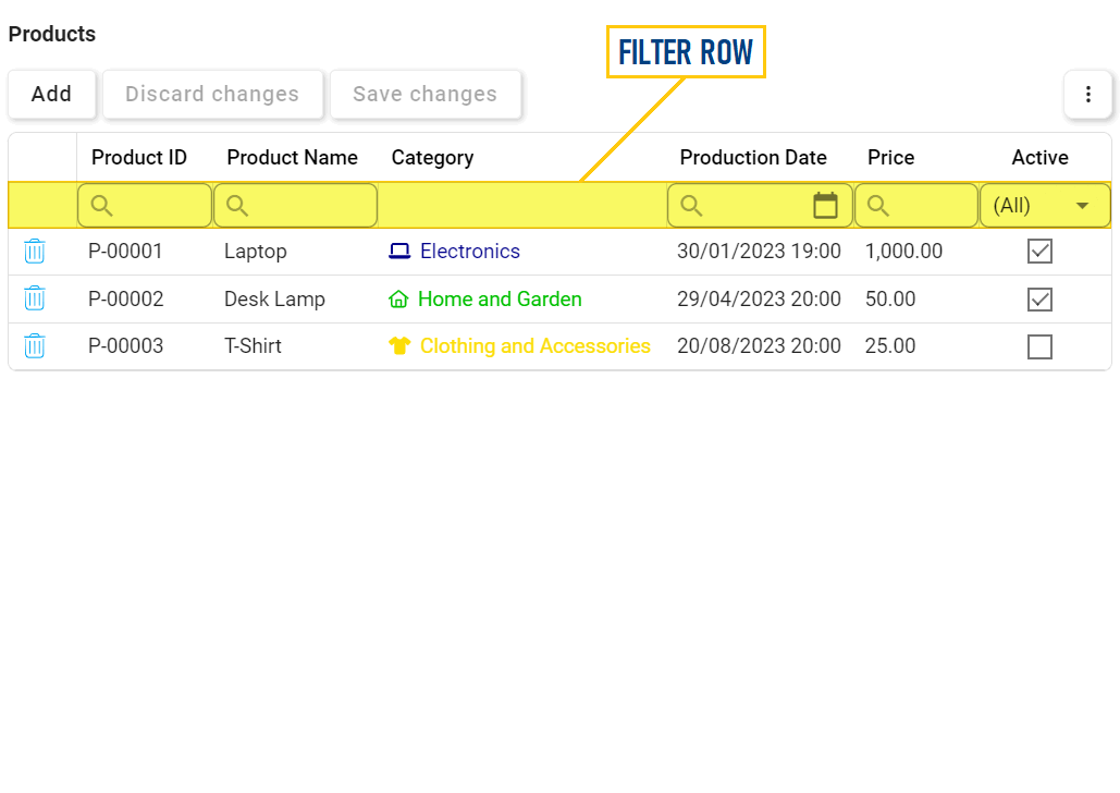
- New Customization Options
- Grid Customization:
- Users now have enhanced control over the grid appearance through a range of customizable features.
- Alternating Row Colors: Apply alternating colors to rows in the grid to improve visual distinction and readability.
![]()
- Lines & Borders: Customize the grid layout with options for horizontal lines between rows, an outer border, and vertical lines in the body and/or header.
![]()
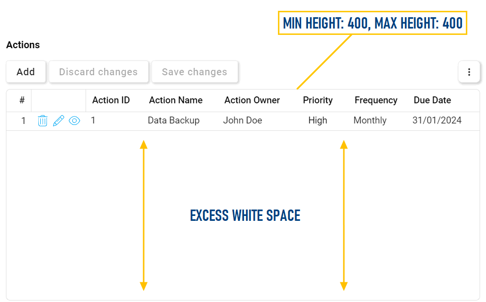
- Grid Height: Tailor the grid’s vertical dimensions by setting minimum and maximum height parameters.
![]()
- Alternating Row Colors: Apply alternating colors to rows in the grid to improve visual distinction and readability.
- Users now have enhanced control over the grid appearance through a range of customizable features.
- Column Customization:
- Users also have more control now over the display and arrangement of grid columns.
- Fixed Columns: Set columns as ‘fixed’ to either side of the grid, enabling a persistent view when scrolling horizontally.
![]()
- This configuration is available in both the Designer and the DBP web portal.
- In the Designer, users can configure fixed columns for the grid through the Control Properties window.
- In the web, users can fix/unfix columns in the grid by right-clicking on the corresponding column headers.
- In the Designer, users can configure fixed columns for the grid through the Control Properties window.
- This configuration is available in both the Designer and the DBP web portal.
- Column Rearrangement: Rearrange grid columns directly in the web interface.
- To rearrange columns, simply drag and drop them to the preferred position in the grid.
![]()
- To rearrange columns, simply drag and drop them to the preferred position in the grid.
- Fixed Columns: Set columns as ‘fixed’ to either side of the grid, enabling a persistent view when scrolling horizontally.
- Users also have more control now over the display and arrangement of grid columns.
- Grid Customization: