
In the Label tab, users can customize various properties related to the label of the gauge control.
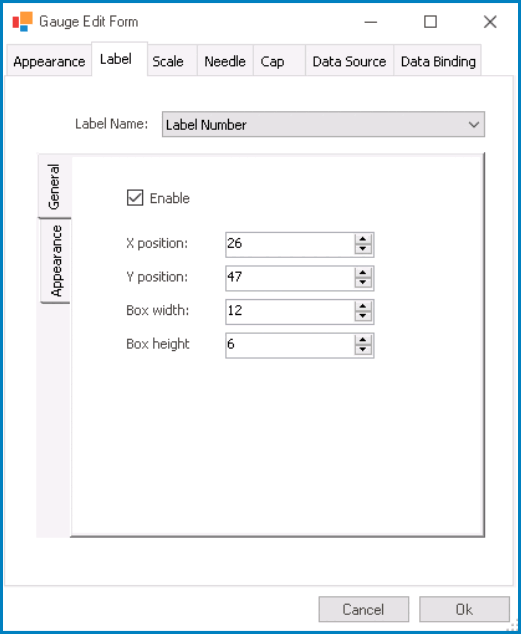
- Label Name: This field allows users to choose the specific label they want to configure from a dropdown menu.
- Labels: Label Number or Label Text.
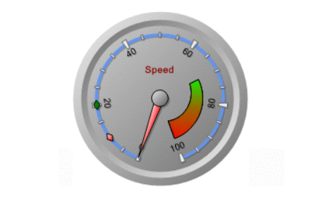
- Gauge Labels Preview: Web View
-
![]()
- Labels: Label Number or Label Text.
- General: In this tab, users can configure general properties related to the selected label.
- Enable: This is a checkbox which, if selected, allows users to enable the display of the label associated with the gauge control.
- X Position: This is a numeric updown field that allows users to specify the horizontal position of the label.
- Users can enter numbers into this field either manually or by clicking the increment/decrement arrows.
- Y Position: This is a numeric updown field that allows users to specify the vertical position of the label.
- Box Width: This is a numeric updown field that allows users to set the width of the label box. The label box refers to the rectangular area that contains the label’s content.
- Box Height: This is a numeric updown field that allows users to specify the height of the label box.
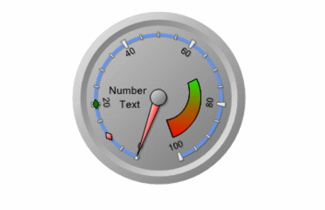
- Gauge Label Position Customization: Web View
-
![]()
- Appearance: In this tab, users can customize the visual appearance of the selected label.
- Back Color: This is a color picker that allows users to choose the background color of the label.
- This color defines the primary or fill color for the label’s background.
- Secondary Color: This is a color picker that allows users to choose the secondary color of the label.
- This color is used for gradient effects or complementary visual elements within the label.
- Border Color: This is a color picker that allows users to choose the color of the label’s border.
- Border Width: This is a numeric updown field that allows users to set the width of the label’s border.
- Font: This field allows users to configure the font properties for the text displayed in the label.
- To configure the font properties for the text, click on the
![]() button.
button.
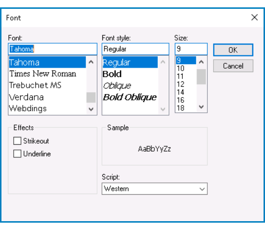
- Configuring Font Properties
- If the
![]() button is selected, the Font window will appear.
button is selected, the Font window will appear.
![]()
- Font: This field allows users to choose the font family from a scrollable list of options.
- Font Style: This field allows users to choose the font style from a scrollable list of options.
- Depending on the font family selected, the options displayed in this list may vary.
- Size: This field allows users to choose the font size from a scrollable list of options.
- Users can also simply type in a specific font size.
- Effects: In this section, users can modify the appearance of the text by applying common effects, such as strikeout and underline.
- Strikeout: This is a checkbox which, if selected, allows users to apply a strikeout effect to the text.
- Underline: This is a checkbox which, if selected, allows users to apply an underline effect to the text.
- Sample: This field displays a preview of how the text will look based on the chosen font family, style, size, and effect. It updates in real-time as the user makes changes to the font settings.
- Script: This field allows users to choose a specific script or writing system for the text from a dropdown menu.
- By selecting the appropriate script, users can ensure that their text is correctly displayed and formatted for the desired language or writing system.
- OK or Cancel: To save your changes and close the window, click on the OK button. To cancel your changes and close the window, click on the Cancel button.
- To configure the font properties for the text, click on the
- Font Color: This is a color picker that allows users to choose the font color for the text displayed in the label.
- Back Color: This is a color picker that allows users to choose the background color of the label.
 button.
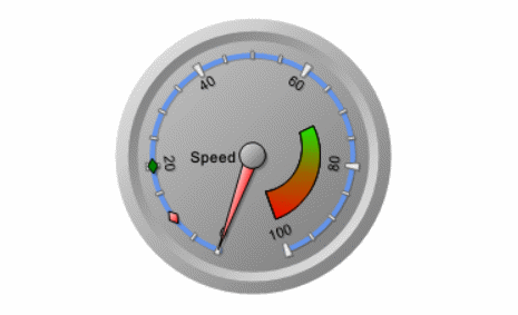
- Gauge Label Appearance Customization: Web View
-
![]()