
When incorporated into a form, date/time pickers offer a simple and efficient means of entering or displaying date and time information, simplifying the process of tracking tasks or deadlines.
When a date/time picker control is selected in the design environment, its associated properties are displayed in the Control Properties panel.
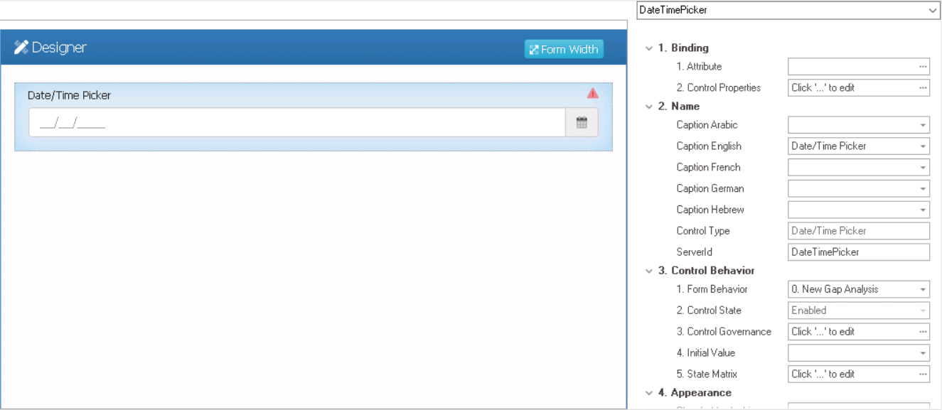
- Binding: In this category, users can link a control to its corresponding attribute and define its binding properties.
- For more information on the fields in this category, click here.
- Misc: In this category, users can define additional properties for the control.
- Display Type: This is a single-select dropdown field that allows users to choose the display type of the date/time picker control.
- Display Types: Date/Time, Date, or Time.
- Date/Time This option allows the control to store and display both date and time information.
- Date: This option allows the control to store and display only the date information.
- Time: This option allows the date/time picker control to store and display only the time information.
- Display Types: Date/Time, Date, or Time.
- Store as UTC: This is a checkbox which, if selected, allows the date/time entered or displayed in the control to be stored in Coordinated Universal Time (UTC) format.
- Display Type: This is a single-select dropdown field that allows users to choose the display type of the date/time picker control.
- Quick Forms Application
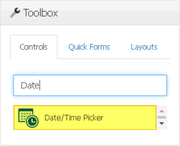
- To apply the Quick Forms feature to date picker controls, take the following steps:
- Drag a date picker control from the toolbox and drop it onto the design environment.
- Provide a caption for the control.
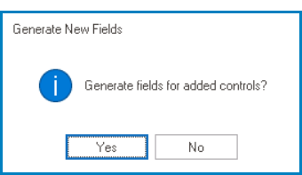
- Save the form and select Yes in response to the following prompt:
![]()
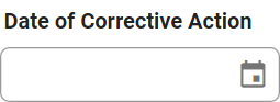
- Date/Time Picker Control Preview: Web View
-
![]()