
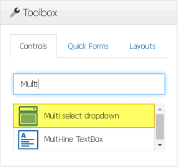
A multi-select dropdown control is a user interface element that allows users to select multiple options from a list of predetermined choices. It can reference various system tables such as users, roles, and groups, as well as display a list created in a different form.
When a multi-select dropdown control is selected in the design environment, its associated properties are displayed in the Control Properties panel.
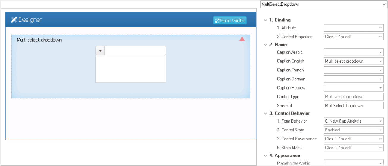
- Binding: In this category, users can link a control to its corresponding attribute and define its binding properties.
- For more information on the fields in this category, click here.
- Name: In this category, users can access basic properties required for the control’s identification and proper referencing in the code.
- For more information on these properties and how to configure them, click here.
- Control Behavior: In this category, users can configure the behavior of the control and define how it interacts with the form or application.
- Control Governance
-
- In the Control Governance field, users can configure various properties that govern the functionality of controls.
- To access the control governance properties, click on the ellipses (
![]() ) inside the field. It will display the Form / Behavior / Control window.
) inside the field. It will display the Form / Behavior / Control window.
- This window consists of two tabs:
- To access the control governance properties, click on the ellipses (
- In the Control Governance field, users can configure various properties that govern the functionality of controls.
- For more information on these properties and how to configure them, click here.
- Appearance: In this category, users can customize the visual appearance of the control.
- For more information on these properties and how to configure them, click here.
- Caption Appearance: In this category, users can customize the visual appearance of the control’s caption.
- For more information on the fields in this category, click here.
 ) inside the field. It will display the Form / Behavior / Control window.
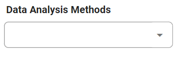
- Multi-Select Dropdown Control Preview: Web View
-
![]()
- Quick Forms Application
- Applying the Quick Forms feature to a multi-select dropdown control depends on whether it references a system table or another form.