
UNDERSTANDING THE LAYOUT – Button Mode/View
The Button Mode is best used to navigate through different sections of the report quickly. The rows of buttons at the top of the page are your primary Categories, and these give you quick access to jump to that section of your report.
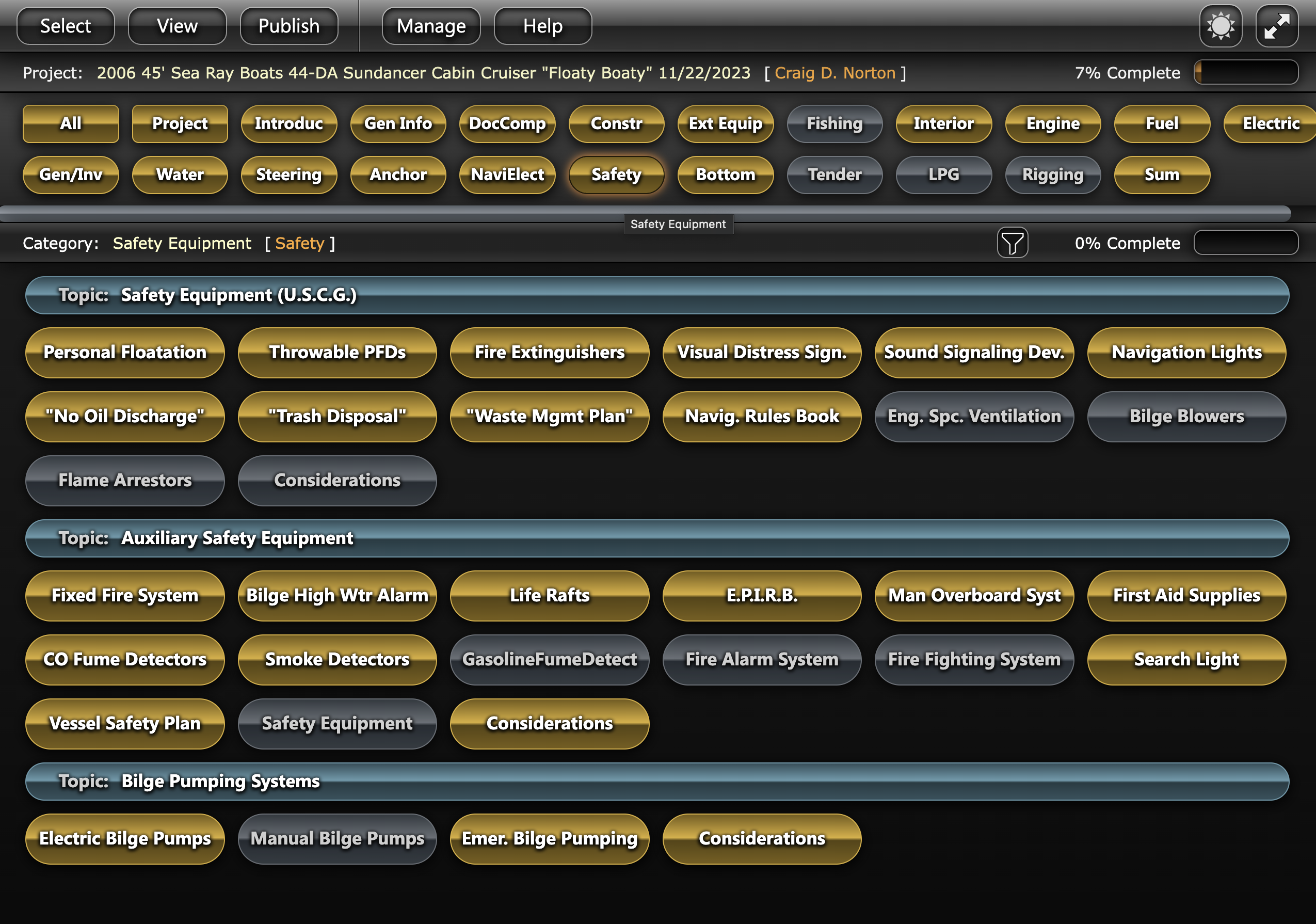
Below and within each category are the sub-categories and individual headings. The Categories, Sub-Categories and Headings can be modified and re-ordered as you prefer.
You will notice the different colors marking the different levels of completion of each heading.
- Gray buttons are not applicable.
- Orange/Copper buttons have no information yet added.
- Yellow/Gold buttons are in progress.
- Green buttons are complete.
You can filter the level of completion in various ways using the filter icon to the left.  You will notice the filtered buttons disappear but the buttons retain their original position, this is to maintain consistency once you become familiar with each button’s location.
Once all the buttons within a category have been completed, you’ll notice that the category heading turns green accordingly. This color coordination helps to quickly distinguish which items have been completed, and which are still required to complete the survey.