
Users can insert text in the form by using the label control
The first step is to set up the “label” control. Insert the control in the design (See 7.1) canvas by dragging and dropping the control.
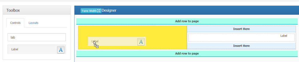
The next step in setting up the “label” control is to specify other control properties in the properties panel of the label control to the right of the design canvas

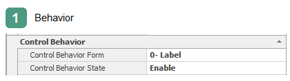
The Elements of the behavior of the control is shown in this (See 7.2) section.
Enable: If this option is selected, the control will be enabled on the web.
Disable: If this option is selected, the control on the web is disabled and cannot be changed by the user.
Invisible: If this option is selected, the control will be invisible to the user on the web.
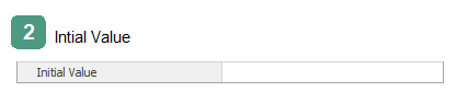
The label control can have an initial value or pre-defined text that can be selected by clicking the button  and using the services predefined in the “object selector” form (such as dates, System attributes).

Organization Chart Service: The organizational chart sub key In the “ Object selector” form, the tables are linked to the organizational chart and can be expanded by selecting the + button next to them.
Date and Time: Insert the current date or day of the Week.
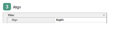
Text Alignment ( left-aligned, right-aligned) is set in this box
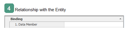
Clicking on the button in the Data member box will display the object Browser to link attributes
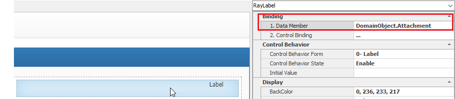
Note: The attribute associated with the label control according to the displayed text can be associated with any type of data type defined in the entity
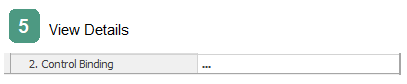
Clicking on the button in the Physical Form Binding Details box will display a form for controlling the data of the selected control. For more information( See 7.1.2.1)
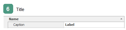
Controls are automatically given a caption. The user can change the caption of the label
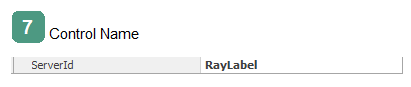
The Name of the control used in the coding environment
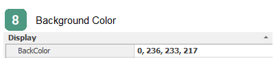
The control background color can be changed using this box
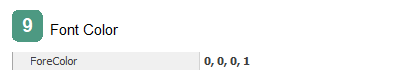
The color of the label font can be changed using this box
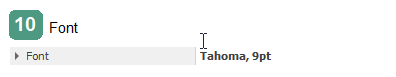
The font type and size of the label can be changes using this box.