
Buttons can perform operations such as storing form information, sending form information, or executing some code.
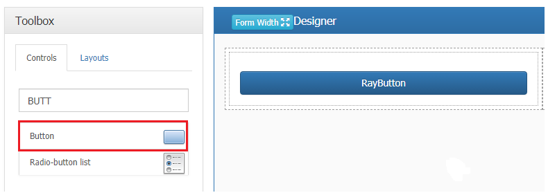
To insert the button control, drag and drop the control onto the design canvas
The next step in setting up the “Button” control is to set the button action and other control properties in the properties window.
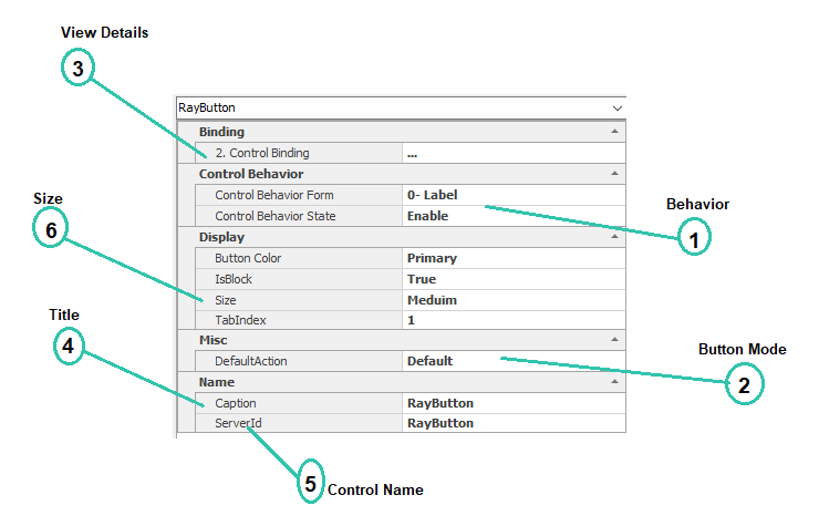
1. Behavior:
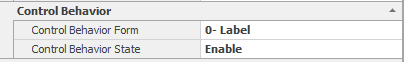
Current form behaviors (See 7.2) are displayed in the “form” section.
Enable: If this option is selected, the control will be enabled on the web.
Disable: If this option is selected, the control on the web is disabled and cannot be changed by users.
Invisible: If this option is selected, the controls will be invisible to users on the web.
2. Button Mode:
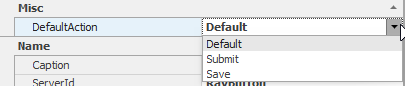
The button type can be set using the dropdown
- Default: If you select this option, the code that runs in the defined form control action is executed when the button is pressed(See 7.4).
- Submit: If you select this option, the form information will be sent to the next step by clicking the button in the initial form. Note: The expected operation of this button is only active in the initial stage and will be deactivated in the next steps.
- Save: If you select this option, the form information is stored in the same form as the current one when the button is clicked. In the initial stage, only if the “draft (See 7.2.1)” of the expected operation is activated, this button will be activated, and with the storage operation at that stage, a copy of the work will be transmitted to the “Drafts”.
3. Display Details:
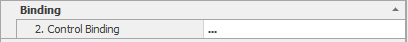
Clicking on this section and clicking the button  will display the menu to edit the display details of the linked attribute. For more information about data control form (See 7.1.2.1)
4. Title:
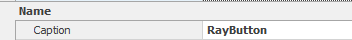
Controls inserted in the form are automatically captioned. The caption can be changed in this box.\
5. Control Name:

The name of this control used in the coding environment
6. Size:

You can change the size of the control using this box