SmartView provides the capability to create a Custom Graph by overlapping the data from multiple sensors in order to perform an analysis of several used monitoring devices. The Custom Graph has the capability to include and combine data from sensors of the same type or of different types (e.g. Q-Tag, etc.) into one single graph.
Each Custom Graph contains the following two elements:
1. Overlay of the temperature graph of the various sensors that shows the different values of the sensors in a single graph.
2. Statistical Table that shows the statistical information in table format, with easy indication of the lowest and highest maximum etc.
Usability
If the graph includes sensor data from real-time monitoring devices, the Custom Graph functionality offers the possibility to define the desired period for which the data should be included in the graph. If the graph will include sensor data from a Q-Tag USB logger device, the graph will overlay automatically the data based on the start time and the end time of the device.
The Custom Graph is to be created manually by selecting the sensors that should be included in the graph in order to analyze their containing data. A maximum number of 100 sensors can be included and overlayed in the custom graph.
The Custom Graph is commonly used for conducting Thermal Mapping studies inside a temperature-controlled facility, for sensor recalibration or for performing different tests with a larger number of sensors.
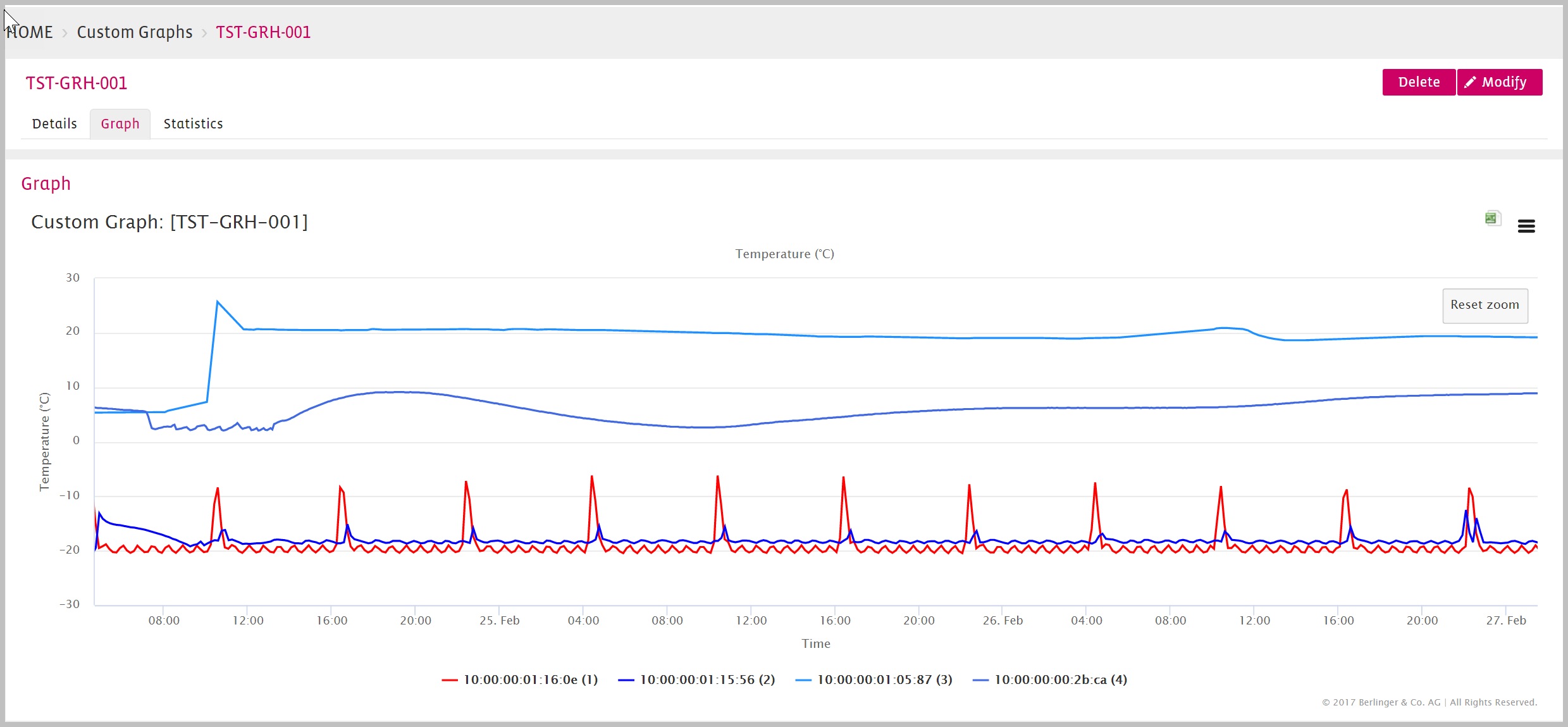
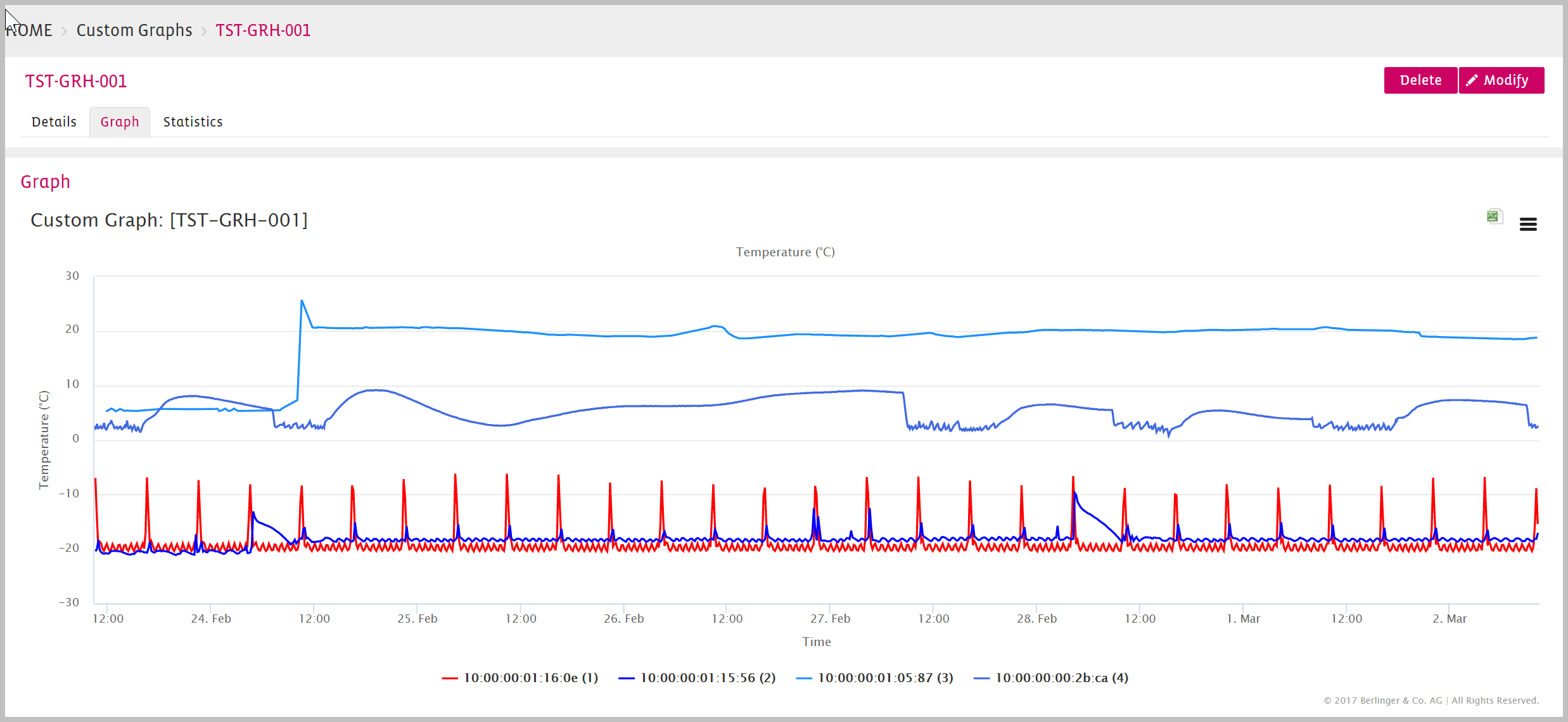
Custom Graph Overwiew
![]()
Custom Graph Zoom Area
Click, hold and drag the mouse from one point to the other a zoom area will be selected as shown in the next graphic.
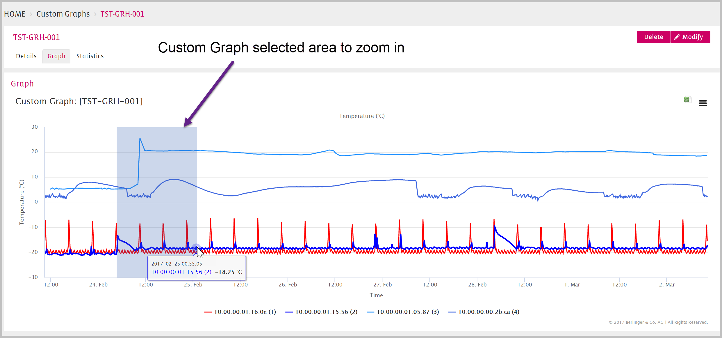
Custom Graph Zoomed
The next screenshot shows the zoomed in area. Go back to the overview by clicking the “Reset zoom” Button on the right.