
In this module, users can access a pie chart representing the average duration of completed tasks.
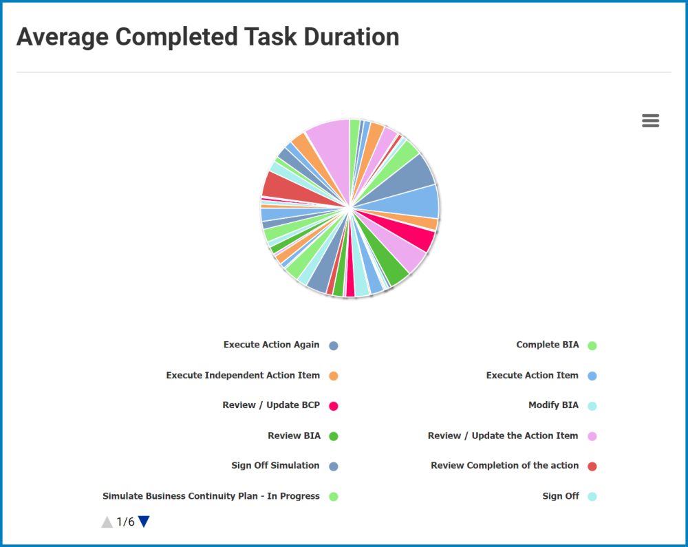
- Chart Context Menus: This is a hamburger button which, when collapsed, displays a list of options that allow users to either print or download the chart.
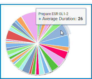
- Average Duration: This is quantitative data that users can access by hovering their cursor over the different symbols in the chart (i.e., slices of pie chart). It represents the average duration (in minutes) of a completed task.
![]()
Post your comment on this topic.