
In this tab, users can access visual representations of data trends. These trends are derived from three applications inside the QMS suite: Quality Event, Audit, and Action Items.
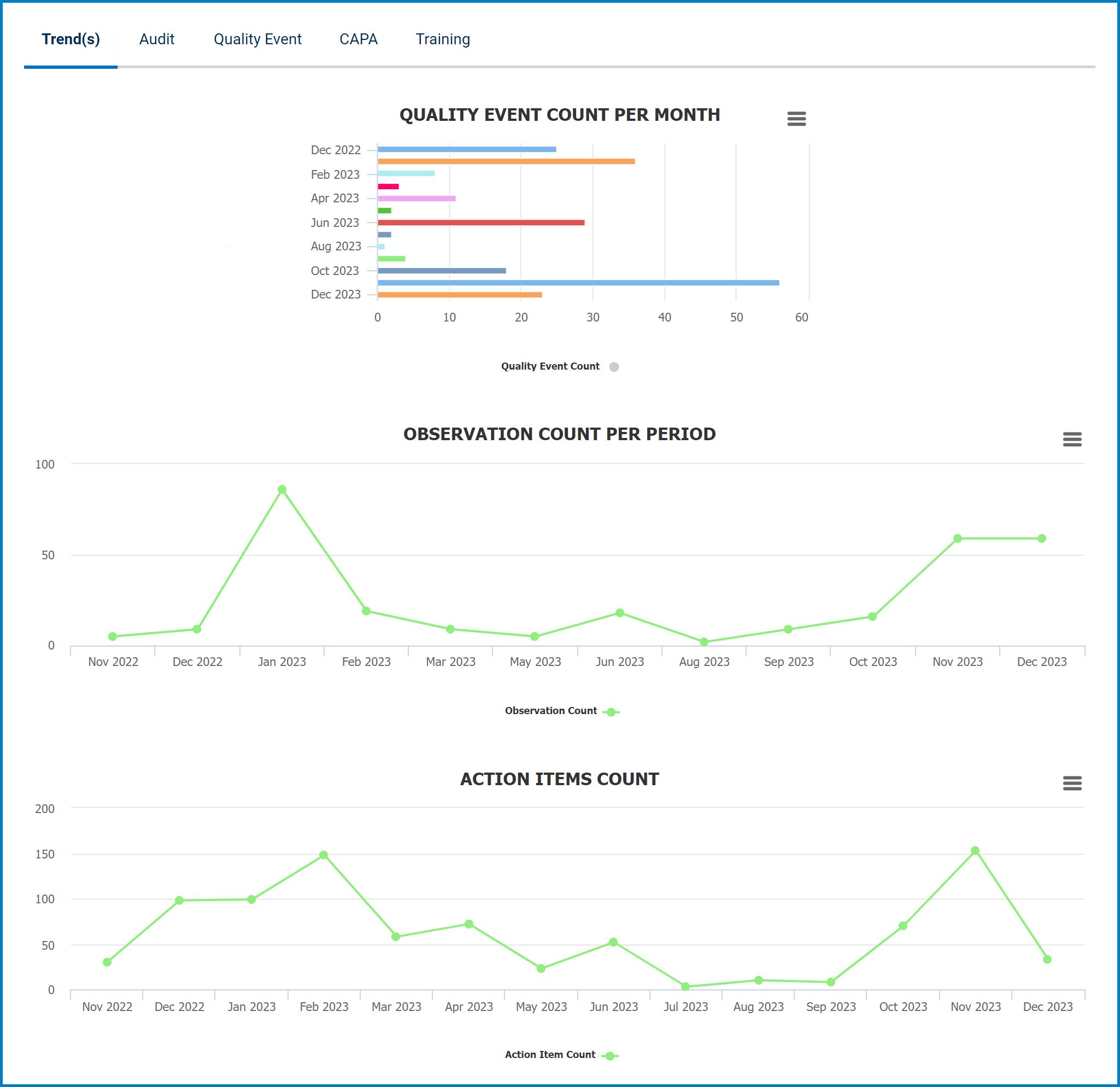
- Chart Context Menus: These are hamburger buttons which, when collapsed, display a list of options that allow users to either print or download the chart.
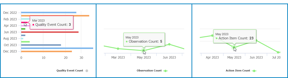
- Quality Event Count/Observation Count/Action Item Count: This is quantitative data that users can access by hovering their cursor over the different symbols in the charts. (Symbols, in this case, refers to the bars of the bar chart and the points of the line graph).
![]()
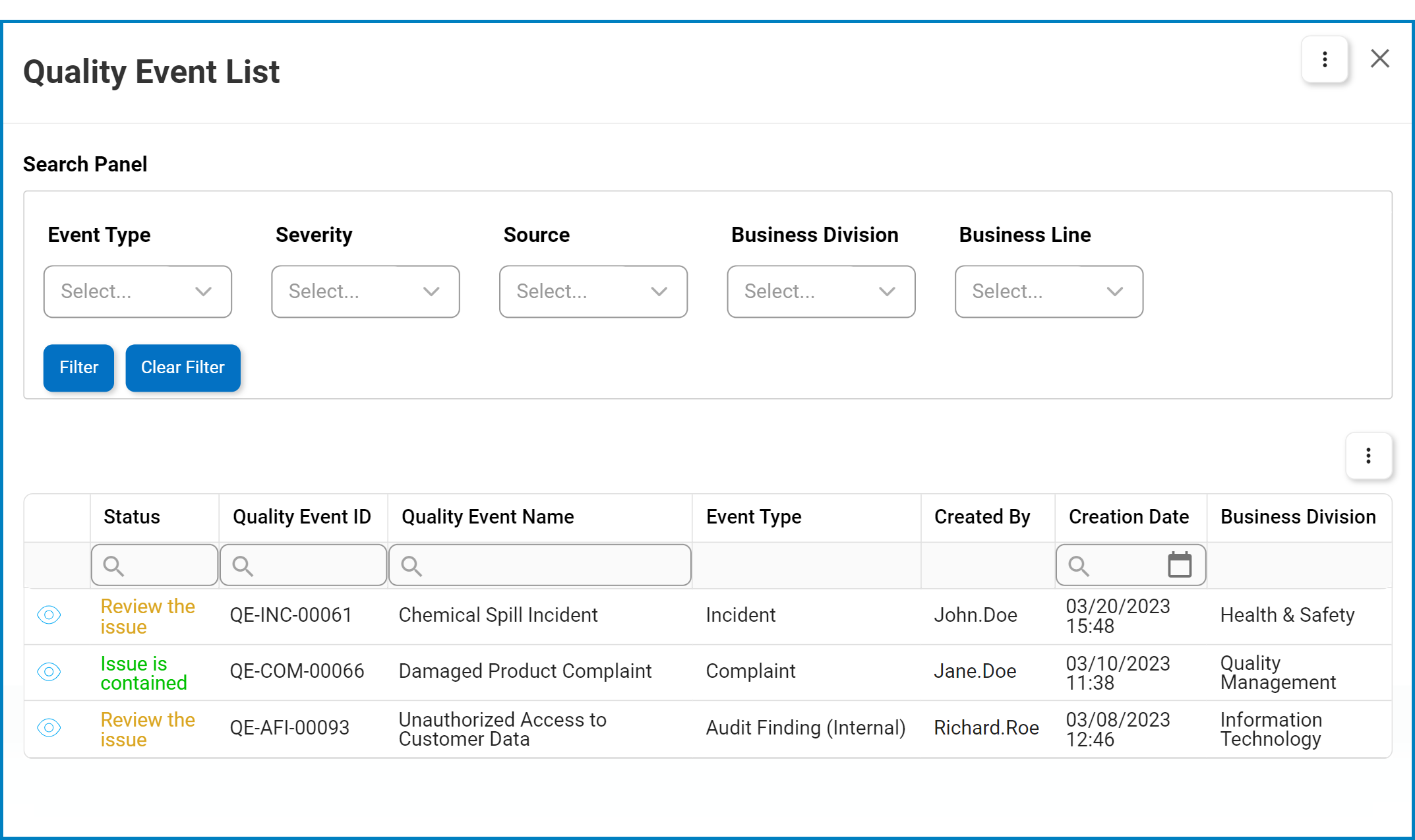
- Drilldown Reports: These are data reports that users can access by double-clicking on the different symbols in the bar chart.
- For example, if users were to double-click on the bar representing quality events created in March 2023, a pop-up window would appear with the following form:
![]()
- For example, if users were to double-click on the bar representing quality events created in March 2023, a pop-up window would appear with the following form:
Post your comment on this topic.