
In our ongoing commitment to optimizing the user experience with the Management Review application, we have implemented a series of enhancements aimed at elevating its interface.
Changes in this latest release include:
- Streamlined Navigation & Structure
To enhance user experience, we have streamlined navigation to the Management Review application, simplifying the overall platform structure. Now, although the Management Review application remains a part of the QMS application suite, it is no longer nested under the QMS category. This change has reduced the number of steps needed to access the application and its modules.

- Enhanced Iconography
We have also updated the icons used to represent the Management Review application and its modules, achieving two key objectives:
- Distinct Application Identity: We have changed the Management Review application’s icon to make it more distinguishable and align it better with its intended purpose.
![]()
- Consistent Icon Styles: To create a more cohesive visual experience both within the application and across the QMS suite, we have standardized icon styles for modules with similar functions.
- For example, modules presenting lists, such as Management Review List, now share the same List icon. Modules for creating new items, such as New Management Review Definition, use the same Add icon.
![]()
- For example, modules presenting lists, such as Management Review List, now share the same List icon. Modules for creating new items, such as New Management Review Definition, use the same Add icon.
- Modern Design: As part of our design evolution, demonstrated in the above graphics, we have adopted a thinner icon style, embracing a sleeker and more modern aesthetic.
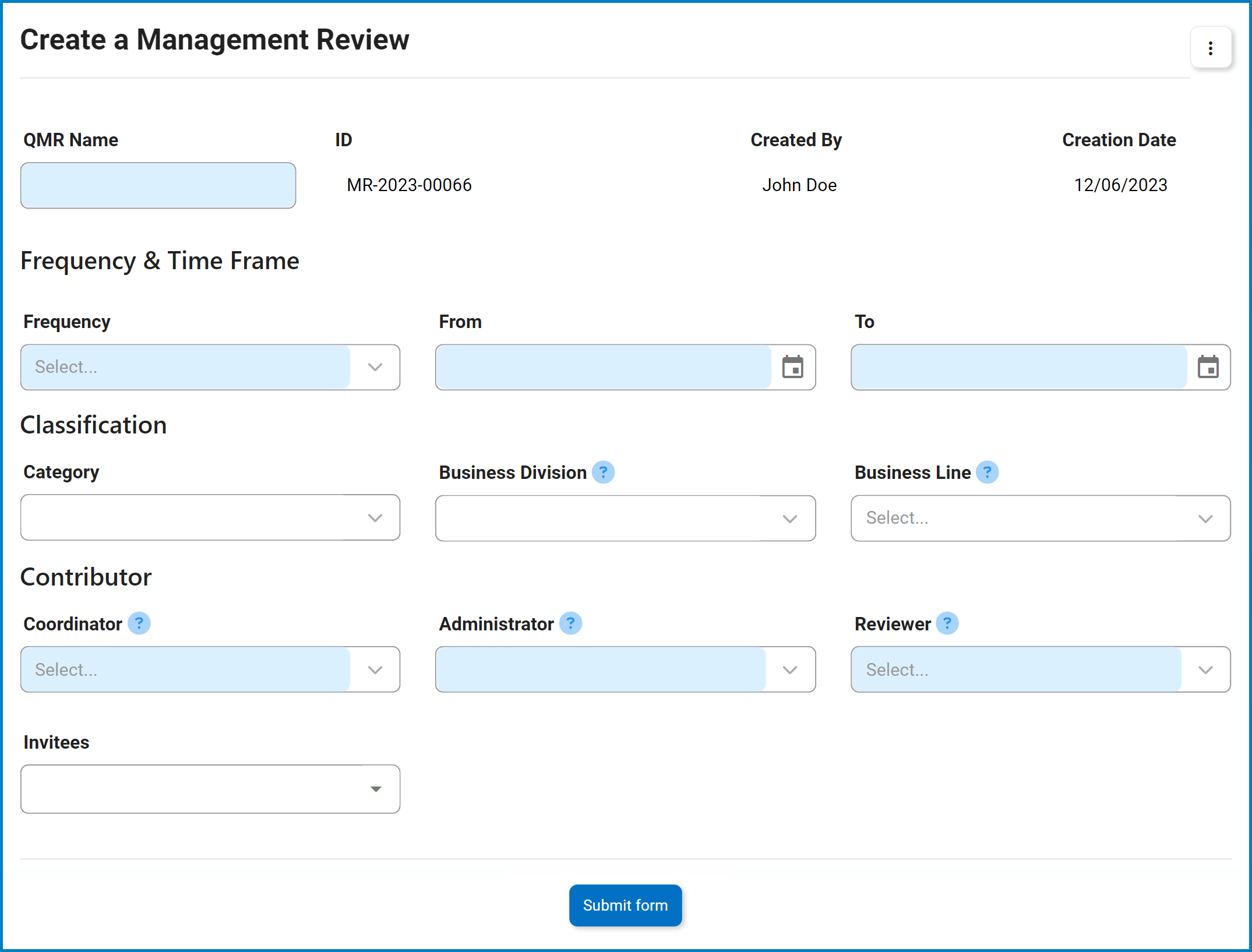
- Improved Form Design & Layout
We have redesigned our forms to make them more intuitive and space-efficient. This includes reordering fields to ensure a logical flow, improving field labels for clarity and comprehension, and removing unnecessary elements to simplify and declutter the interface.
Post your comment on this topic.