
In this module, users can access a bar graph representing the average task duration per process.
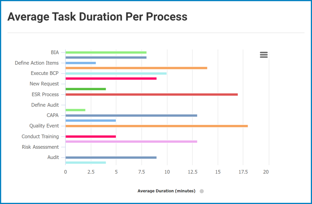
- Chart Context Menu: This is a hamburger button which, when collapsed, displays a list of options that allow users to either print or download the chart.
- Average Duration (Minutes): This is quantitative data that users can access by hovering their cursor over the different symbols in the chart. (Symbols, in this case, refers to the bars of the bar chart). It represents the average duration (in minutes) of a given task.
![]()
- Drilldown Reports: These are data reports that users can access by double-clicking on the different symbols of the bar chart.
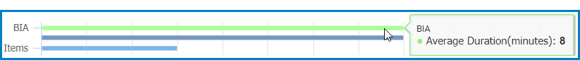
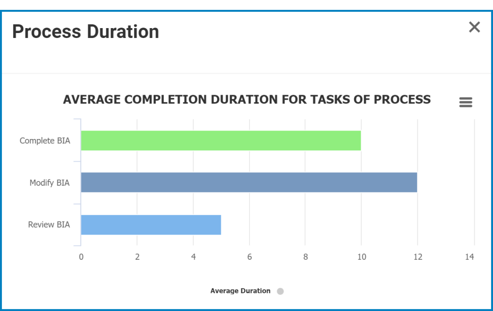
- For example, if users were to double-click on the bar representing the average duration of tasks in the BIA process, a pop-up window would appear with the following form:
![]()
- In this form, users can also access quantitative data by hovering their cursor over the different symbols in the chart. Likewise, users can access data reports by double-clicking on the different symbols.
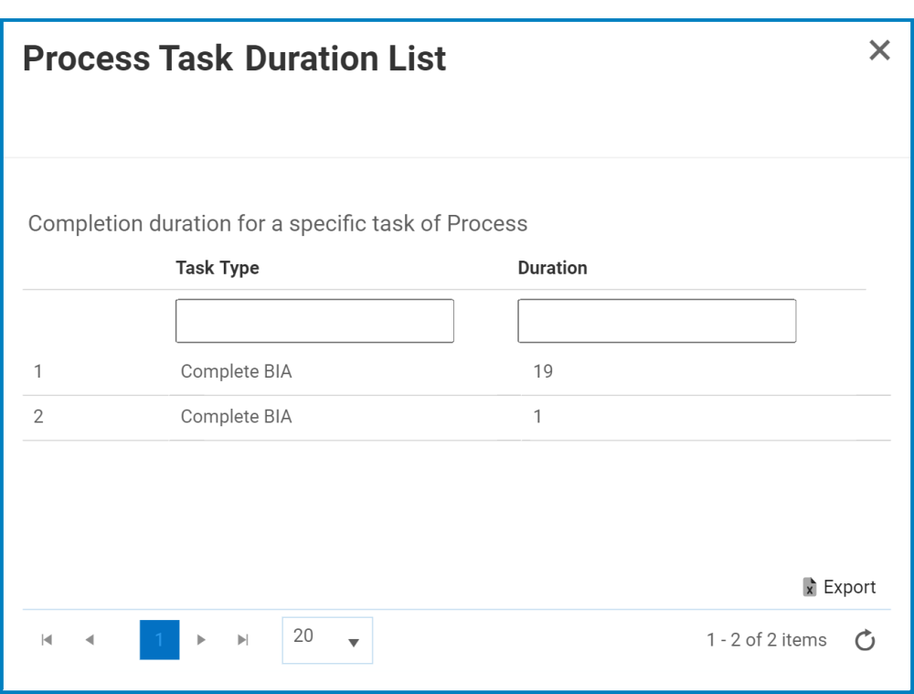
- Upon doing so, a pop-up window will appear with the following form:
![]()
- Upon doing so, a pop-up window will appear with the following form:
- In this form, users can also access quantitative data by hovering their cursor over the different symbols in the chart. Likewise, users can access data reports by double-clicking on the different symbols.
- For example, if users were to double-click on the bar representing the average duration of tasks in the BIA process, a pop-up window would appear with the following form:
Post your comment on this topic.