
In this module, users can access a pie chart representing the average duration of completed tasks.
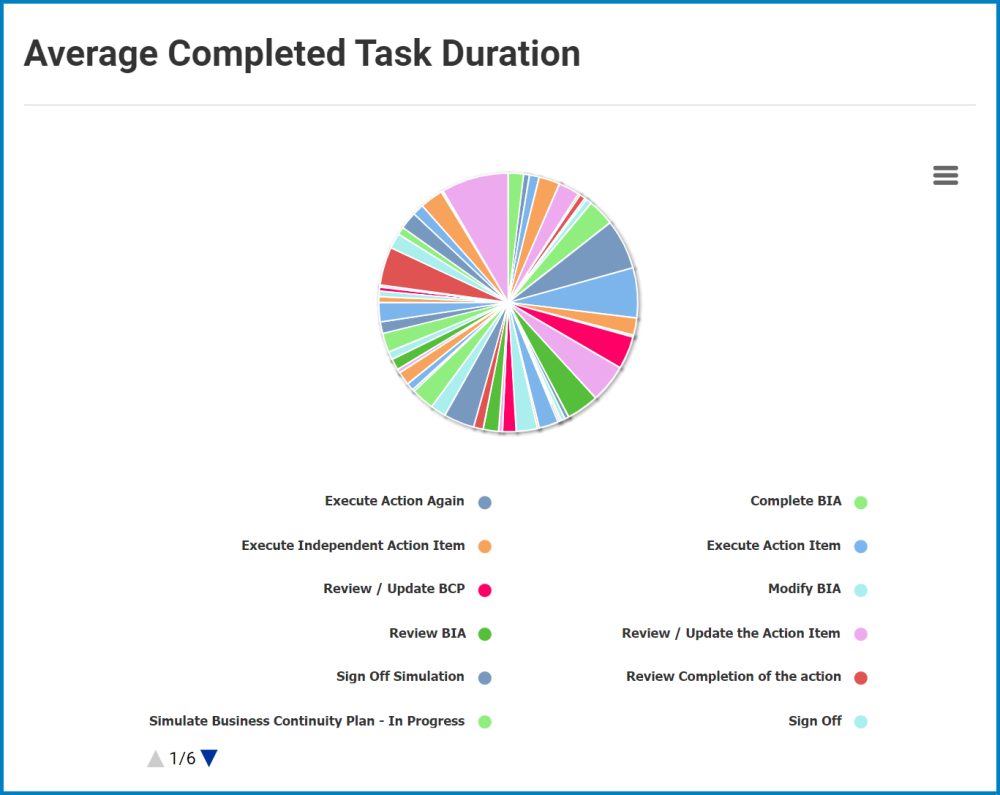
- Chart Context Menus: This is a hamburger button which, when collapsed, displays a list of options that allow users to either print or download the chart.
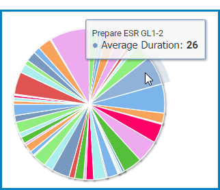
- Average Duration: This is quantitative data that users can access by hovering their cursor over the different symbols in the chart. (Symbols, in this case, refers to the slices/sectors of the pie chart). It represents the average duration (in minutes) of a completed task.
![]()
Post your comment on this topic.