
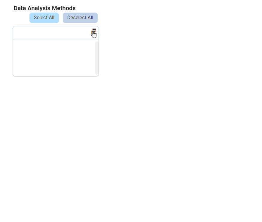
For those unfamiliar with using the multi-select dropdown field in the DBP web application, the following guide will walk you through the process, covering two interaction modes:
A. Standard Multi-Select Dropdown
A standard multi-select dropdown allows users to select multiple values at a time from a predetermined list of options. These options are presented in a dropdown menu.
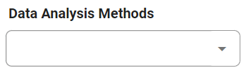
There are two ways to select items from this dropdown:
- Click on the
![]() icon.
icon.
- This action will release the list of values, allowing users to navigate through the options and make selections by checking the corresponding checkboxes.
![]()
- This action will release the list of values, allowing users to navigate through the options and make selections by checking the corresponding checkboxes.
 icon.
icon.
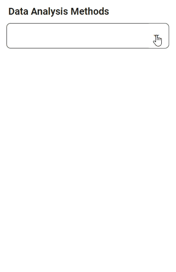
- Search for values in the dropdown by entering their name or keywords relating to them.
- Any values that match the search will be retrieved, and users can then click on the desired values to finalize their selection.
![]()
- Any values that match the search will be retrieved, and users can then click on the desired values to finalize their selection.

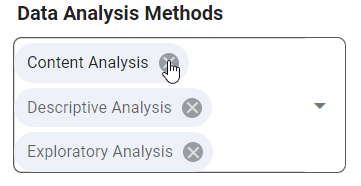
Note: Selected options are visually represented as tags in the dropdown. Users can remove them by clicking on the corresponding X icon.
B. Multi-Select Dropdown Field with Modal Window
If its browsing functionality is enabled, the multi-select dropdown will display a modal window instead of the standard dropdown menu.
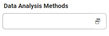
To utilize a multi-select dropdown linked to a modal window, follow these steps:
- Click on the
![]() icon. A modal window will appear, which typically contains a list of available options for selection.
icon. A modal window will appear, which typically contains a list of available options for selection. - Users can choose one or more options by clicking on them, or define new items for the dropdown as needed.
- Once users have made their selections or defined the items, they will be returned to the main form where they will either find the field now populated with their selection(s) or find the new item listed in the dropdown menu.
- Otherwise, to exit the modal window without making any changes, click on the Exit (X) button.
 icon. A modal window will appear, which typically contains a list of available options for selection.
In the example below, the modal window contains a grid control which allows users to add to the items in the dropdown list.