
The accordion control is a tool for organizing and displaying information in a collapsible and space-efficient manner. It is particularly useful for displaying content hierarchies, FAQs, or guiding users through step-by-step processes.
When an accordion control is selected in the design environment, its associated properties are displayed in the Control Properties panel.
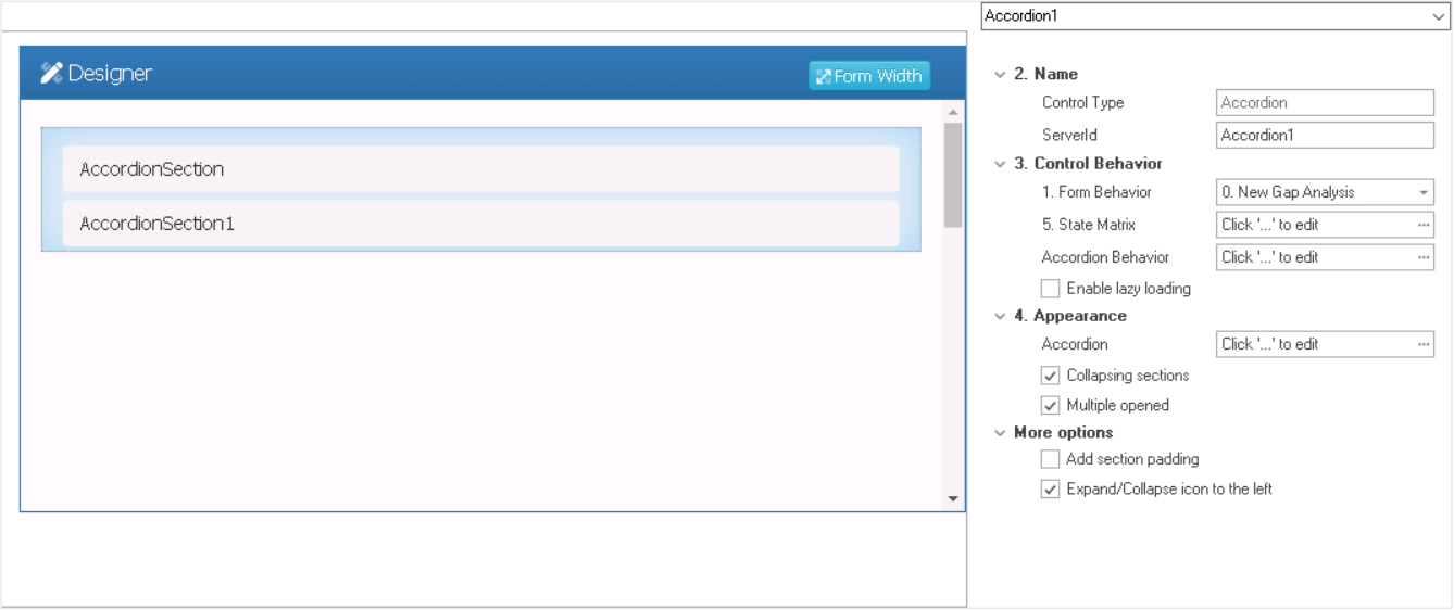
- Name: In this category, users can access basic properties required for the control’s identification and proper referencing in the code.
- Control Type: This field displays the control type. It cannot be modified.
- Server ID: This is a text field that allows users to input the Server ID for the control.
- Server ID refers to the name used to call the control in the code.
- Control Behavior: In this category, users can configure the behavior of the control and define how it interacts with the form or application.
- Form Behavior: This is a single-select dropdown field that retrieves the list of form behaviors (from the Form Behavior section of the Forms module). It allows users to select the form behavior associated to the control.
- Any state properties set for the control will apply only to the selected form behavior.
- Any state properties set for the control will apply only to the selected form behavior.
- State Matrix: This field allows users to configure the control state properties.
- To access the control state properties, click on the ellipses (
![]() ) inside the field.
) inside the field.
![]()
- Form Behavior: This field displays the form behavior.
- All form behaviors linked to associated form will be listed in this window.
- Control State: This is a single-select dropdown field that displays the list of control states. It allows users to modify the current control state for the form behavior.
- Control States
- Enabled: This option allows for the control to be visible and selectable in the web application.
- Disabled: This option allows for the control to be visible but not selectable in the web application.
- Invisible: This option allows for the control to be hidden in the web application.
- Apply: This button allows users to save their changes.
- OK: This button allows users to save their changes and close the window.
- Cancel: This button allows users to cancel their changes and close the window.
- Form Behavior: This field displays the form behavior.
- To access the control state properties, click on the ellipses (
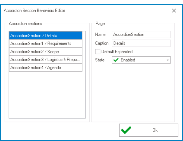
- Accordion Behavior: This field allows users to configure the behavior of individual sections within the accordion control.
- To access the accordion behavior properties, click on the ellipses (
![]() ) inside the field.
) inside the field.
![]()
- Name: This field displays the name of the section. It cannot be modified.
- Caption: This field displays the caption or title of the section. It cannot be modified.
- Default Expanded: This checkbox determines whether the section is expanded by default when the form loads.
- State: This is a single-select dropdown field that displays the list of states. It allows users to modify the current state of the accordion section.
- States
- Enabled: This option allows for the section to be visible and selectable in the web application.
- Disabled: This option allows for the section to be visible but not selectable in the web application.
- Invisible: This option allows for the section to be hidden in the web application.
- To access the accordion behavior properties, click on the ellipses (
- Enable Lazy Loading: This is a checkbox which, if selected, enables lazy loading for the accordion control.
- Form Behavior: This is a single-select dropdown field that retrieves the list of form behaviors (from the Form Behavior section of the Forms module). It allows users to select the form behavior associated to the control.
- Appearance: In this category, users can customize the visual appearance of the control.
- Accordion: This field allows users to customize the appearance of individual sections within the accordion control.
- To access these properties, click on the ellipses (
![]() ) inside the field.
) inside the field.
- It will display the Accordion Sections Editor window.
- To access these properties, click on the ellipses (
- Collapsing Sections: This is a checkbox which, if selected, allows users to manually collapse sections by clicking on the header.
- Collapsing Sections: Manual vs. Automatic
- Manual Collapse:
![]()
- Automatic Collapse:
![]()
- Manual Collapse:
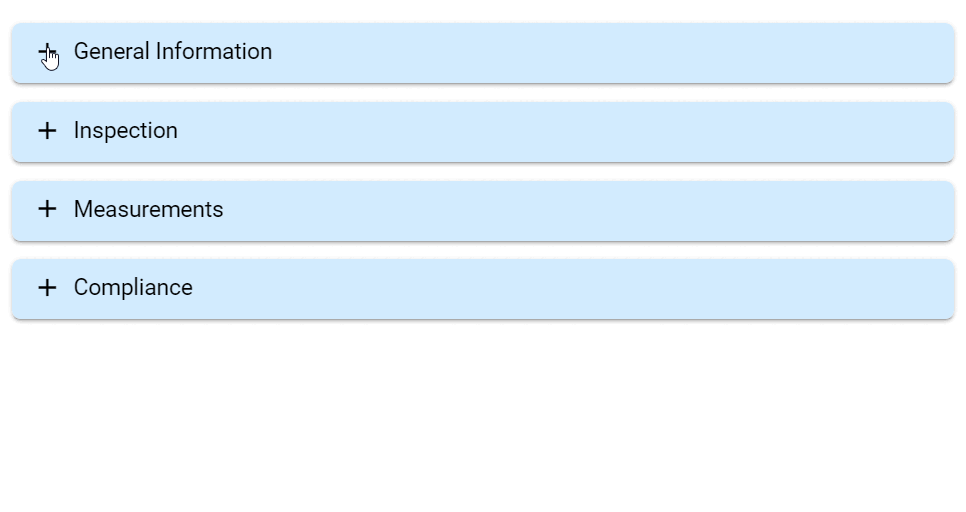
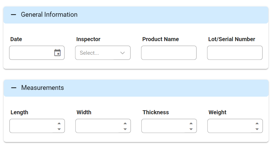
- Multiple Opened: This is a checkbox which, if selected, allows multiple sections to be opened simultaneously.
- Multiple Opened Sections Preview: Web View
-
![]()
- Accordion: This field allows users to customize the appearance of individual sections within the accordion control.
- More Options: In this category, users can define additional properties for the control.
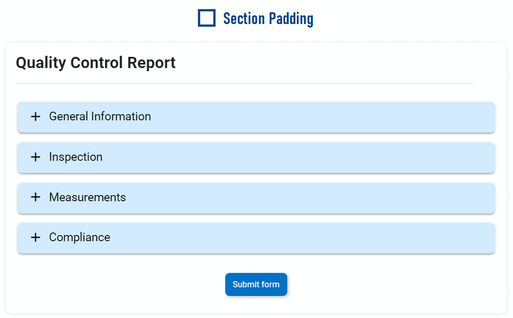
- Add Section Padding: This is a checkbox which, if selected, adds padding to the left and rights sides of the control.
- Section Padding Preview: Web View
-
![]()
- Expand/Collapse Icon to the Left: This is a checkbox which, if selected, positions the expand/collapse icon to the left of the section header.
- Add Section Padding: This is a checkbox which, if selected, adds padding to the left and rights sides of the control.
 ) inside the field.
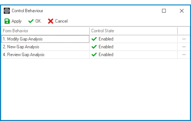
- Accordion Control Preview: Web View
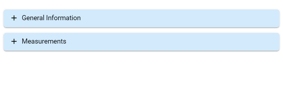
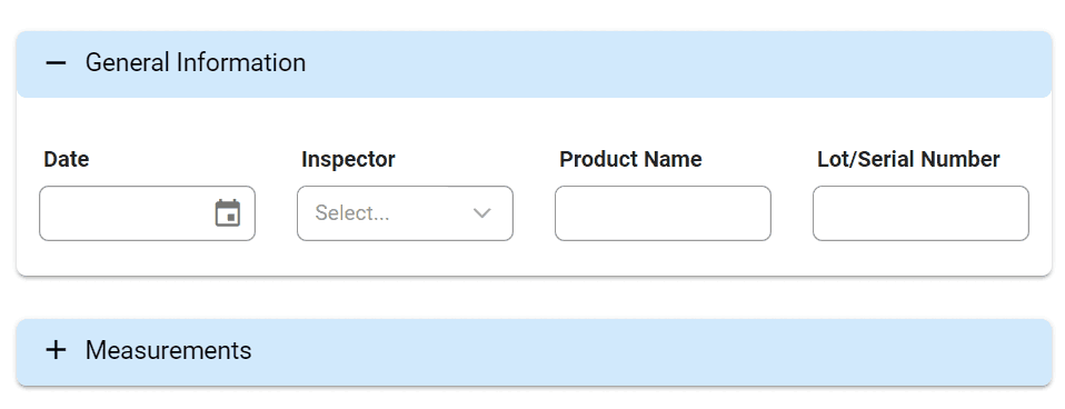
- An accordion consists of a series of sections, each with a header and content. Users can click anywhere on the header to expand or collapse the associated content.
![]()