
In the Appearance category, users can customize the visual appearance of the control.
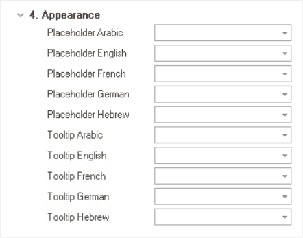
- Placeholder: This field allows users to input the placeholder text for the control.
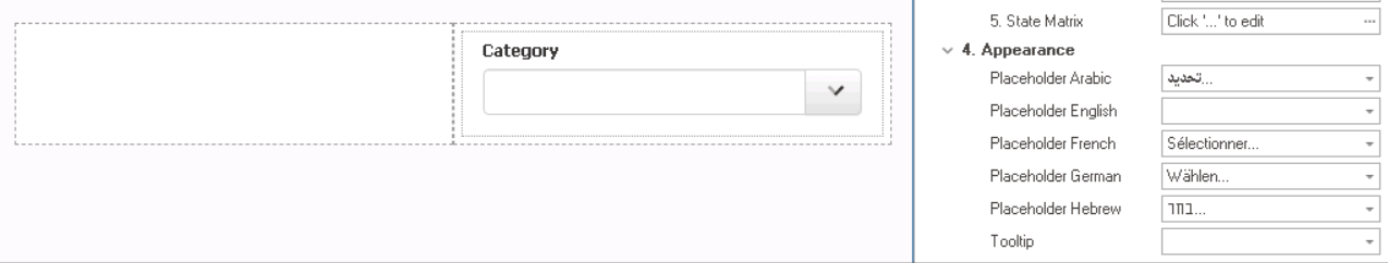
- Alternatively, users can directly add a placeholder text to the control simply by clicking on the inside of the control in the design environment.
![]()
- Users can customize the placeholder text in multiple languages.
- As English is set as the default language in the system, any input provided in the English placeholder field will be used as the display placeholder for the control, regardless of other language options that may be available.
- Similarly, any placeholder text entered in the design environment will automatically populate the English placeholder field.
- As English is set as the default language in the system, any input provided in the English placeholder field will be used as the display placeholder for the control, regardless of other language options that may be available.
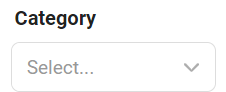
- Control Placeholder Text Preview: Web View
-
![]()
- Alternatively, users can directly add a placeholder text to the control simply by clicking on the inside of the control in the design environment.
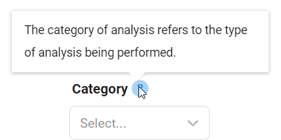
- Tooltip: This field allows users to input a tooltip for the control.
- Similar to the placeholder text, users can customize the control tooltip in multiple languages.
- In the web application, the tooltip is represented by the tooltip icon (
![]() ) next to the control.
) next to the control. - Control Tooltip Preview: Web View
-
![]()
 ) next to the control.