
In the Grid tab of the Control Properties window, users can build and customize the grid.
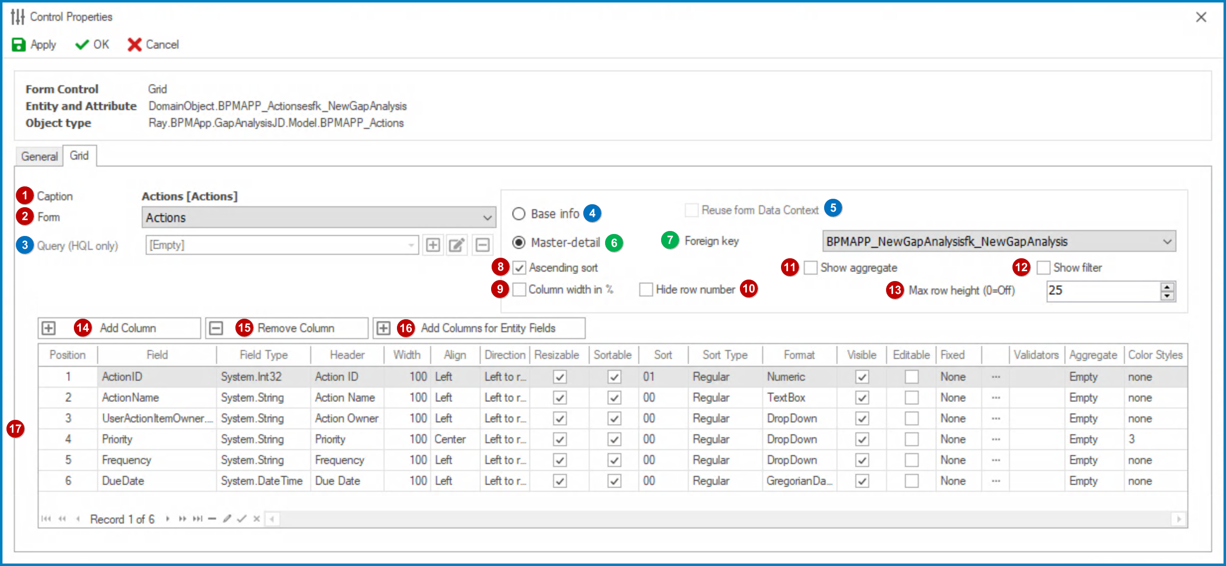
- Caption: This field displays the (English) caption of the grid.
- To modify the caption displayed in this field, refer to the Name category in the Control Properties panel.
- Form: This is a single-select dropdown field that retrieves the list of forms (from the List of Forms section of the Forms module). It allows users to select the form whose fields they wish to display in the grid.
- Query (HQL Only:) This is a single-select dropdown field that retrieves the list of relevant queries (from the KPI section of the Entities module). It allows users to select a custom HQL query to define the grid’s data source, providing greater flexibility and control over the displayed information.
- To define a new query, select the
![]() button.
button.
- It will display the Query Editor window.
- To modify an existing query, select the
![]() button.
button. - To remove a query, select the
![]() button.
button.
- To define a new query, select the
- Base Info: This option establishes a direct connection to the database, allowing the grid to retrieve data directly from an entity without reliance on referential integrity or relational links.
- If this option is selected, it will enable the following fields:
- Query (HQL Only): Allows users to select or define a custom query that will serve as the data source for the grid.
- Reuse Form Data Context: Enables the integration of data from other applications into the grid, leveraging existing form data contexts.
- If this option is selected, it will enable the following fields:
 button.
 button.
 button.
- Reuse Form Data Context: This checkbox allows the to grid to reuse the data context of a form from another application in the program.
- Master-Detail: This option does not directly link to the database, instead relying on predefined relationships or foreign keys to connect related entities. This approach allows the grid to retrieve and display both primary records (the “master”) and their associated detail records together in a cohesive view.
- If this option is selected, it will enable the Foreign Key field, which allows for the selection of this relationship.
- If this option is selected, it will enable the Foreign Key field, which allows for the selection of this relationship.
- Foreign Key: This is a single-select dropdown field that retrieves the list of foreign keys (from the Entity Designer section of the Entities module. It allows users to specify a relationship between the main entity and the custom entity’s detail records, which will be displayed in the grid.
- Ascending Sort: This is a checkbox which, if selected, allows users to sort the grid data in ascending order based on the selected column header.
- Column Width in %: This is a checkbox which, if selected, allows users to automatically adjust the width of the grid columns as a percentage of the grid width.
- Hide Row Number: This is a checkbox which, if selected, allows users to hide the row numbers displayed in the first column of the grid.
![]()
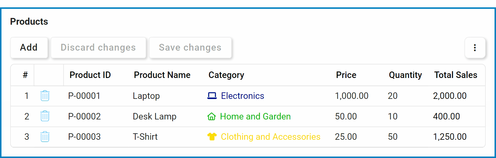
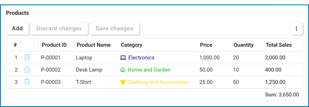
- Show Aggregate: This is a checkbox which, if selected, allows users to display aggregate values (such as sum or average) for selected columns in the grid footer.
![]()
- Show Filter: This is a checkbox which, if selected, allows users to display a filter row at the top of the grid, where they can filter the data based on specific criteria.
![]()
- Filter Row Features Preview: Web View
- Each column’s search box features a magnifying glass (
![]() ) icon, revealing a menu with conditional operators.
) icon, revealing a menu with conditional operators.
![]()
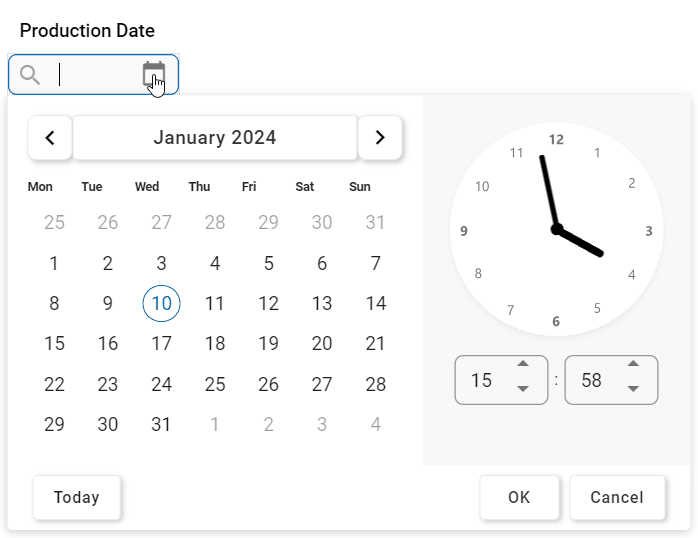
- The filter row, designed to accommodate various field types, extends support for date/time and checkbox columns. Users can choose dates and times from a date/time picker or toggle checkbox states from a dropdown.
![]()
- Each column’s search box features a magnifying glass (
- Max Row Height: This is a numeric updown field that allows users to set the maximum height of the rows in the grid.
- By default, the maximum height is set to 0. To adjust this size, users can enter numbers into the field either manually or by clicking the increment/decrement arrows.
- By default, the maximum height is set to 0. To adjust this size, users can enter numbers into the field either manually or by clicking the increment/decrement arrows.
- Add Column: This button allows users to add a new column to the grid.
- If selected, it will display the Grid Column window, in which users can define the properties of the column.
- Remove Column: This button allows users to remove a selected column in the grid.
- Add Columns for Entity Fields: This button allows users to add all fields in the related entity as columns in the grid.
 ) icon, revealing a menu with conditional operators.
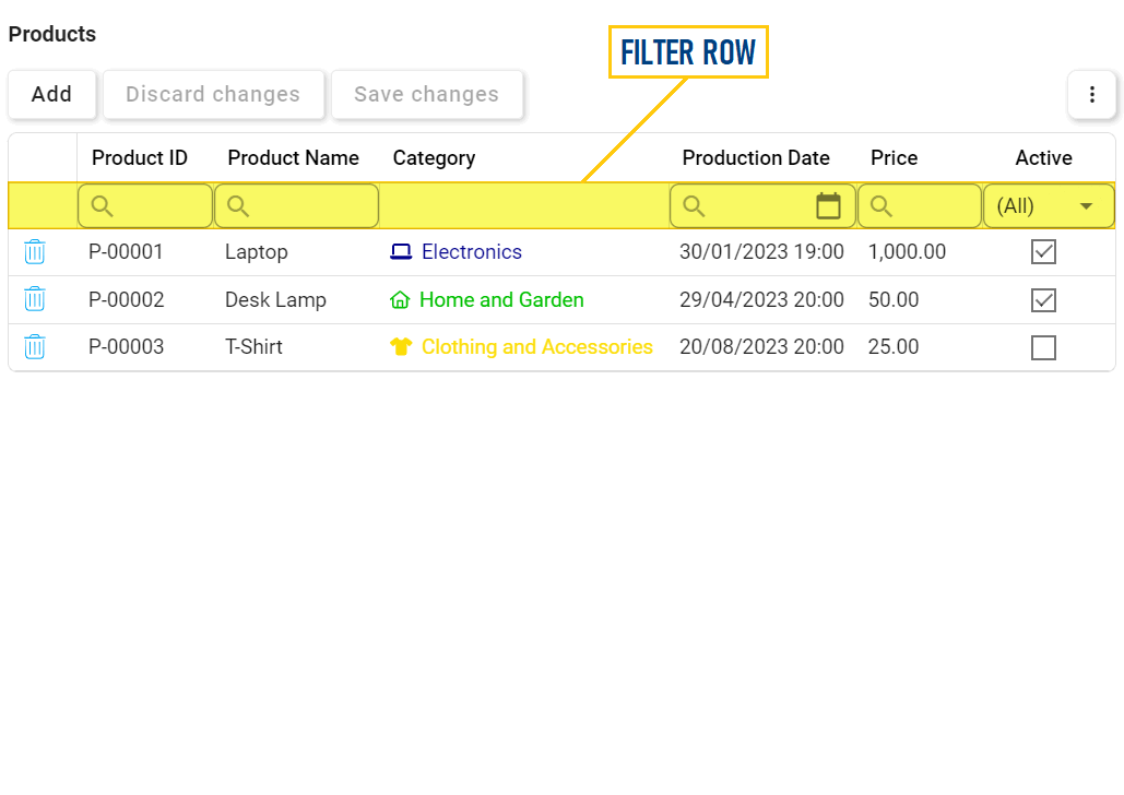
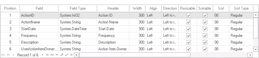
- Column Customization: In this table, users can access and customize the columns that populate the grid, defining their appearance and behavior in the web interface.
![]()
- Position: This field allows users to specify the order in which the column appears in the grid.
- Field: This field allows users to select the corresponding attribute for the column.
- To select a field or attribute, click on the ellipses (
![]() ) inside the box. It will display the Object Browser window, in which users can access a list of the associated entity’s attributes.
) inside the box. It will display the Object Browser window, in which users can access a list of the associated entity’s attributes.
- To select a field or attribute, click on the ellipses (
- Field Type: This field displays the data type of the attribute linked to the column.
- Header: This field allows users to specify the text that appears in the header of the column.
- Users can input their preferred header directly into this field. Alternatively, they can click on the ellipses to display the Grid Column Header Edit window, in which they can input or modify the caption in all available languages.
![]()
- As English is set as the default language in the system, any caption inputted in the English caption field will be used as the display caption for the column, regardless of other language options that may be available.
- Users can input their preferred header directly into this field. Alternatively, they can click on the ellipses to display the Grid Column Header Edit window, in which they can input or modify the caption in all available languages.
- Width: This field allows users to set the width of the column in pixels.
- Align: This field allows users to specify the alignment of the text within the column. Users can choose their alignment preference from a dropdown menu.
- Alignment Options
- Left: This option aligns the text to the left side of the column.
- Right: This option aligns the text to the right side of the column.
- Center: This option centers the text within the column.
- Default: This option aligns the text based on the language or culture setting in the web application.
- Direction: This field allows users to specify the direction of the text within the column. Users can choose their direction preference from a dropdown menu.
- Direction Options
- Left-to-Right: This option specifies that the text in the column should be read from left to right, in the standard direction for languages that use a Latin-based alphabet (such as English).
- Right-to-Left: This option specifies that the text in the column should be read from right to left, in the opposite direction to the standard direction for languages that use a Latin-based alphabet (such as Arabic or Hebrew).
- Default: This option specifies that the text direction should be based on the language or culture setting in the web application.
- Resizable: This is a checkbox which, if selected, allows users to adjust the width of the column by dragging the column border horizontally.
- Sortable: This is a checkbox which, if selected, allows users to sort data within the column in ascending or descending order by clicking on the column header.
- Sort: This field allows users to set the initial sort order of the column. Users can choose the sort order from a dropdown menu.
- By selecting a value from this dropdown, users are essentially assigning a priority level for the column.
- Sort Type: This field allows users to specify the type of sorting that should be used for the column. Users can choose their sorting preference from a dropdown menu.
- Sorting Options
- Regular: This option allows users to sort the data in the column based on their string representation. For example, if the column contains data in the format of “AA, BB, CC”, the sorting will be done alphabetically.
- As Numbers: This option allows users to sort the data in the column based on their numerical representation. For example, if the column contains numerical data, such as “10, 20, 30”, the sorting will be done based on their numerical value, not their string representation.
- Format: This field allows users to specify the display format of the column.
- To select or modify the display format, click on the ellipses (
![]() ) inside the field.
) inside the field.
- It will display the Edit Type window.
- It will display the Edit Type window.
- To select or modify the display format, click on the ellipses (
- Visible: This is a checkbox which, if selected, allows the column to be visible in the grid.
- Editable: This is a checkbox which, if selected, allows users to modify the content of cells within the column directly in the grid.
Fixed: This field allows users to fix or anchor a column to maintain its position within the grid. Users can choose their preferred fixation setting from a dropdown menu.
- Fixation Options & Web Preview
- Left: This option fixes the column to the left side of the grid.
- None: This option allows the column to scroll along with the rest of the grid, without being fixed in place.
- Right: This option fixes the column to the right side of the grid.
![]()
- Column State: This field allows users to set the column state per form behavior.
- To access or modify the column state, click on the
![]() button.
button.
- It will display the Column Behavior Grid window.
- To access or modify the column state, click on the
- Validators This field allows users to specify validation rules for the data within the column.
- For more information on required field and range validation, click here.
- Aggregate: This field allows users to specify how the data in the column should be aggregated. Users can choose their preferred aggregation option from a dropdown menu.
- Aggregation Options
- Average: This option allows users to calculate the average of the values in the column.
- Empty: This option allows users to specify that the grid should not perform any aggregation on the column.
- Sum: This option allows users to calculate the sum of the values in the column.
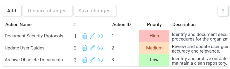
- Color Styles: This field allows users to apply color styles to the column in the grid.
- To apply color styles to the column, click on the ellipses (
![]() ) inside the field.
) inside the field.
- It will display the Column: Color Styles window.
- It will display the Column: Color Styles window.
- To apply color styles to the column, click on the ellipses (
 ) inside the box. It will display the Object Browser window, in which users can access a list of the associated entity’s attributes.
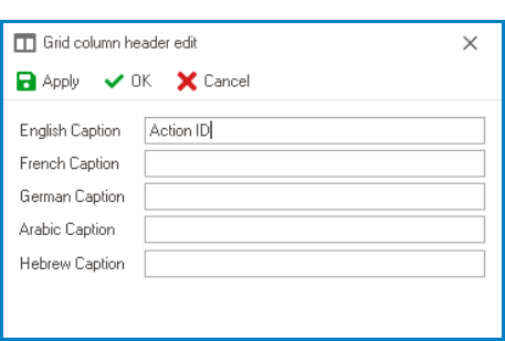
 button.