
To enhance readability and visual appeal, we have revamped our user interface. Changes in this latest release include:
- Checkboxes
In the web application, checkboxes now have a new look and feel. We have adopted a lighter, more modern border style. We have also removed the blue background color for selected checkboxes, opting instead for a transparent background.

- Radio Buttons
We have similarly altered—in terms of shape outline—the appearance of radio buttons in the web application.

- Tabs
Tabs have undergone both visual and interactive changes in the latest release. On the visual end, tabs now not only have a new look in the web application, but they also support a variety of styling options.

- Styling Options
- For each tab, users can now set the font family, font size, font color, background color, and typographical emphasis (bold, italic, underline).
- Users can set a different style for each tab or apply the same style for all tabs.
![]()
- Users can set a different style for each tab or apply the same style for all tabs.
- For each tab, users can now set the font family, font size, font color, background color, and typographical emphasis (bold, italic, underline).

On the interactive end, tabs now support a variety of display options which impact how they behave in the web application.
- Display Options
- Users can now choose how they want a set of tabs to be displayed in the web application.
- Allow Looping: This option allows for a tab set to be looped so that when users reach the last tab in a set, the first tab is automatically next to be shown.
![]()
- Fixed Tabs: This option allows for a tab set to be fixed so that all tabs are displayed on screen simultaneously. Each tab is placed at a fixed width, as determined by the total number of tabs in the set.
- By default, if tabs are not fixed, they are set up as scrollable. A tab set is only scrollable, however, if it can no longer fit uniformly on screen.
- Floating Tab Menu: This option allows for a tab set to remain in a fixed position as users scroll the page, “floating” above the content.
![]()
- As demonstrated in the examples above, rather than having borders on all sides, a floating tab set has only a bottom border.
- Header at Top/Bottom: This option allows for the tab headers to be displayed at both the top and bottom of the form.
- Allow Looping: This option allows for a tab set to be looped so that when users reach the last tab in a set, the first tab is automatically next to be shown.
- While styling options can be customized per tab, display options are applied to the all tabs in a given set.
- Users can now choose how they want a set of tabs to be displayed in the web application.

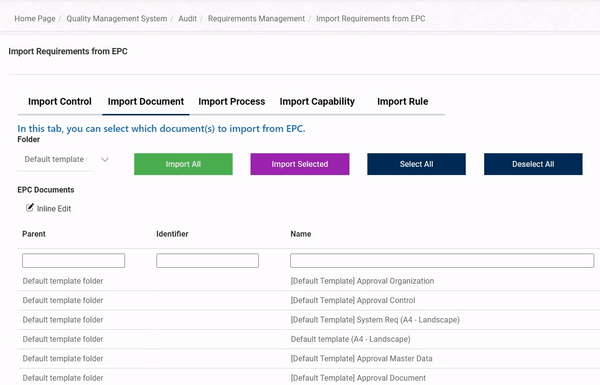
- Inline Add and Inline Edit – Save and Close
We have altered the appearance of the Save and Close buttons linked to the Inline Add and Inline Edit functions. They are now larger and in color.
