
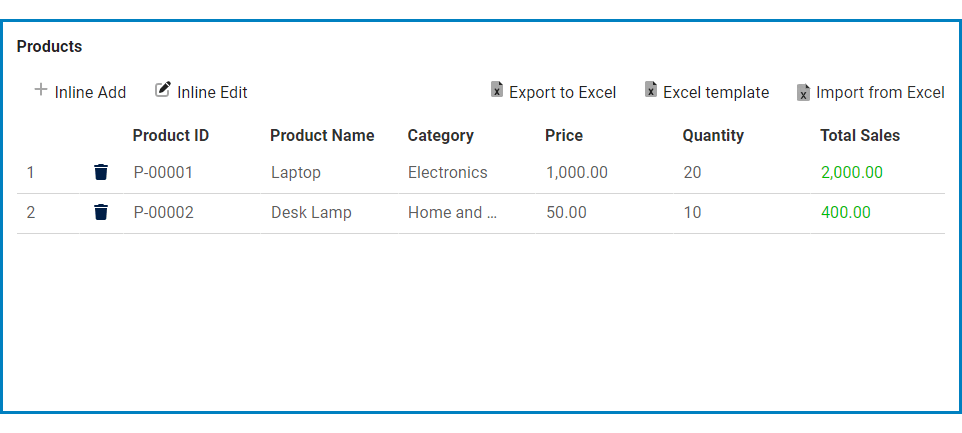
In the Column: Color Styles window, users can specify conditional formatting rules for the data within the column, such as applying a specific background or text color to cells that meet certain criteria.
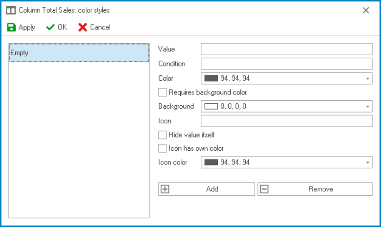
- Value: This field allows users to input a numeric or text value associated with the color style.
- Condition: This field allows users to set conditions that must be met for the color style to be applied.
- Comparing Data Between Two Columns
- Total Sales vs. Price
- If Total Sales > Price, display the value in green.
![]()
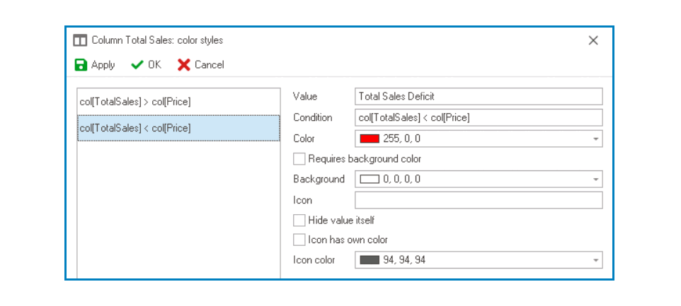
- If Total Sales < Price, display the value in red.
![]()
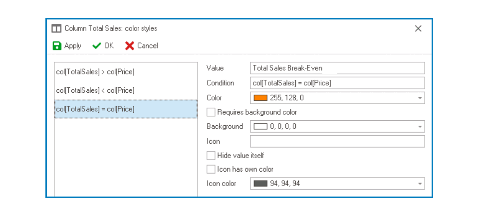
- If Total Sales = Price, display the value in orange.
![]()
- If Total Sales > Price, display the value in green.
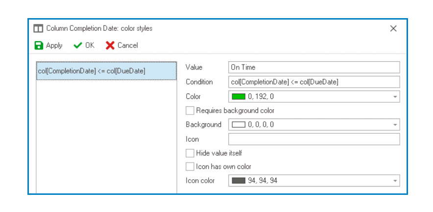
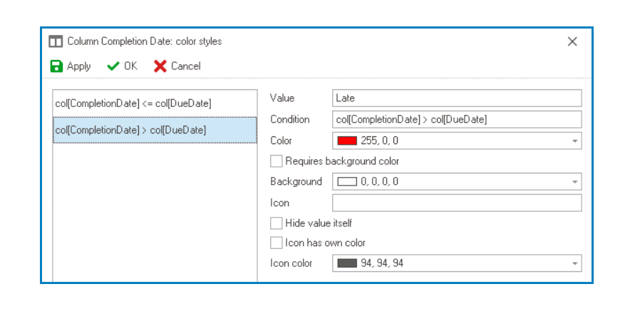
- Completion Date vs Due Date
- If Completion Date < / = Due Date, display the value in green.
![]()
- If Completion Date > Due Date, display the value in red.
![]()
- If Completion Date < / = Due Date, display the value in green.
- Total Sales vs. Price
- Comparing Data Within the Same Column
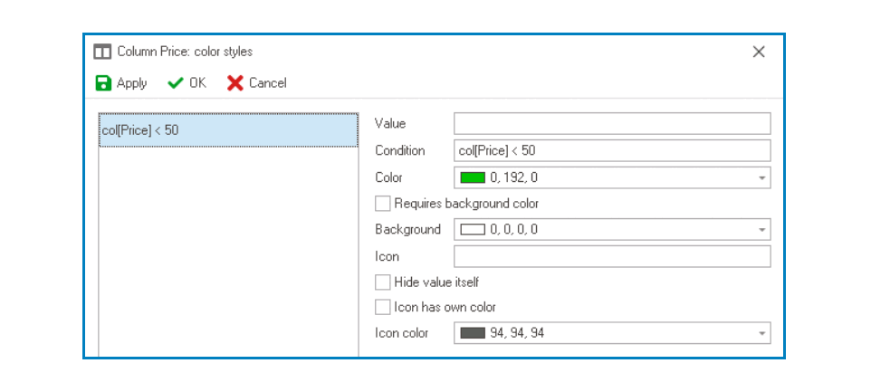
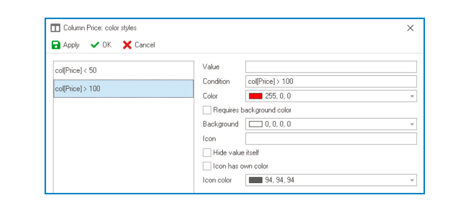
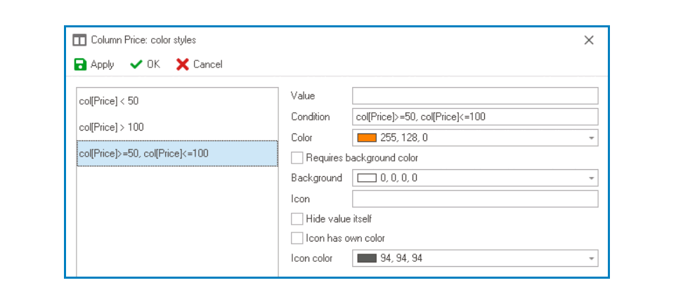
- Price
- If Price < 50, display the value in green.
![]()
- If Price > 100, display the value in red.
![]()
- If 50 <= Price <= 100, display the value in orange.
![]()
- If Price < 50, display the value in green.
- Price
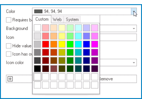
- Color: This field allows users to select the color they want to use for the color style.
- It contains three tabs: Custom, Web, and System.
![]()
- In the Custom tab, users can choose a color by selecting a color from a color picker. The color picker offers a selection of theme colors, standard colors, and the ability to create custom colors.
- In the Web tab, users can select a color from a scrollable list. The list displays a range of specific colors, each with its own name, allowing users to easily choose from pre-defined options.
- In the System tab, users can select a color from a scrollable list. The list displays a range of specific colors, each with its own name, allowing users to easily choose from pre-defined options.
- It contains three tabs: Custom, Web, and System.
- Requires Background Color: This checkbox indicates whether the color style requires a background color to be applied.
- If this checkbox is selected, users will need to specify a background color before the color style can be applied.
- Background: This field allows users to select the background color they want to use for the color style.
- It also has three tabs, similar to the Color field, where users can select a color from a color picker or a scrollable list of pre-defined options.
- Background Color Style Preview: Web View
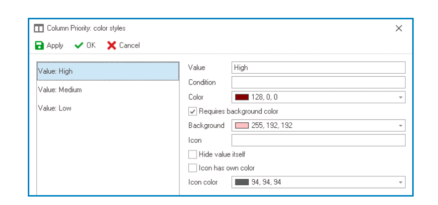
- Priority
- If Priority = High, display the value in red. If Priority = Medium, display the value in orange. If Priority = Low, display the value in green.
![]()
- If Priority = High, display the value in red. If Priority = Medium, display the value in orange. If Priority = Low, display the value in green.
- Priority
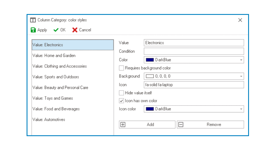
- Icon: This field allows users to set an icon to be associated with the color style.
- Users must choose icons from the Font Awesome library.
- Icon Color Style Preview: Web View
-
![]()
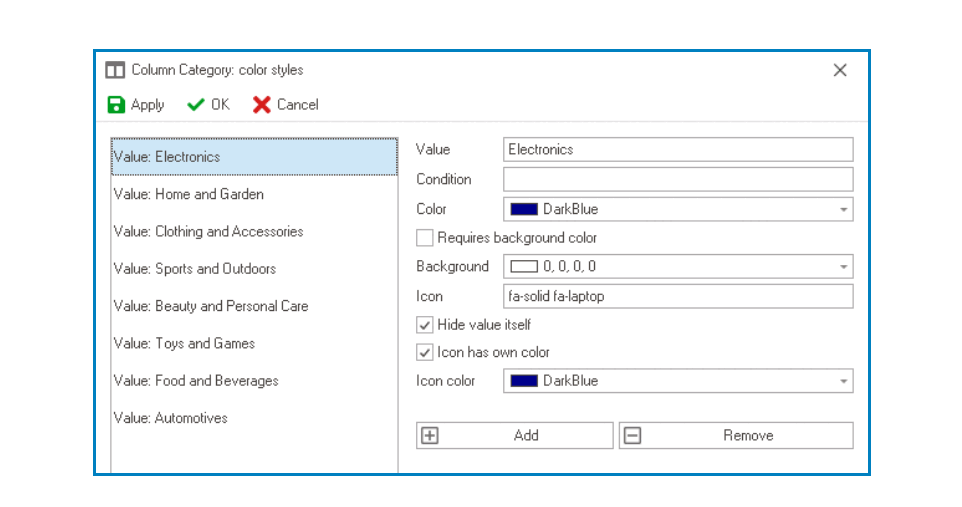
- Hide Value Itself: This checkbox determines whether the value associated with the color style should be displayed in the column.
- If this checkbox is selected, only the icon will be displayed.
- Hidden Value Preview: Web View
-
![]()
- Icon Has Own Color: This checkbox indicates whether the icon associated with the color style should have its own color.
- If this checkbox is selected, users will be able to select a separate color for the icon.
- Icon Color: This field allows users to select the color for the icon associated with the color style.
- It also has three tabs, similar to the Color field, where users can select a color from a color picker or a scrollable list of pre-defined options.
- It also has three tabs, similar to the Color field, where users can select a color from a color picker or a scrollable list of pre-defined options.
- Add: This button allows users to add a new color style.
- Remove: This button allows users to remove a selected color style.