
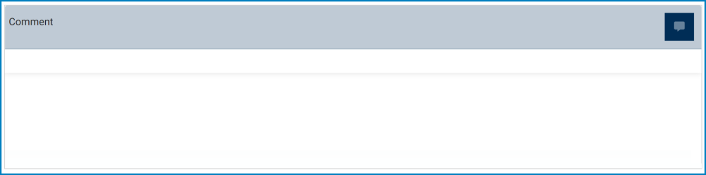
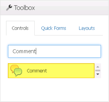
Comment controls enable users to add comments to a particular form.
When a comment control is selected in the design environment, its associated properties are displayed in the Control Properties panel.
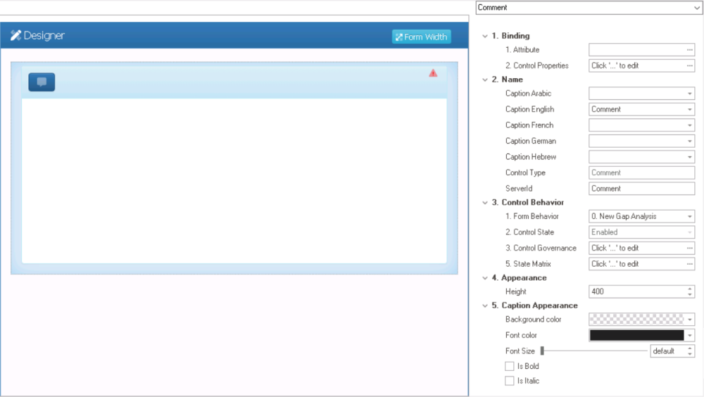
- Binding: In this category, users can link a control to its corresponding attribute and define its binding properties.
- For more information on the fields in this category, click here.
- Name: In this category, users can access basic properties required for the control’s identification and proper referencing in the code.
- For more information on these properties and how to configure them, click here.
- Control Behavior: In this category, users can configure the behavior of the control and define how it interacts with the form or application.
- Form Behavior: This is a single-select dropdown field that retrieves the list of form behaviors (from the Form Behavior section of the Forms module). It allows users to select the form behavior associated to the control.
- Any state properties set for the control will apply only to the selected form behavior.
- Any state properties set for the control will apply only to the selected form behavior.
- Control State: This field displays the current state of the control.
- Control States
- Enabled: This option allows for the control to be visible and editable in the web application.
- Disabled: This option allows for the control to be visible but not editable in the web application.
- Invisible: This option allows for the control to be hidden in the web application.
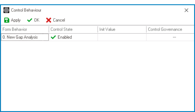
- Control Governance: This field allows users to configure various properties that govern the functionality of controls.
- To access the control governace properties, click on the ellipses (
![]() ) inside the field. It will display the Form / Behavior / Control window.
) inside the field. It will display the Form / Behavior / Control window.
- This window consists of two tabs:
- To access the control governace properties, click on the ellipses (
- State Matrix: This field allows users to configure the control state properties.
- To access the control state properties, click on the ellipses (
![]() ) inside the field.
) inside the field.
![]()
- Form Behavior: This field displays the form behavior.
- All form behaviors linked to associated form will be listed in this window.
- Control State: This is a single-select dropdown field that displays the list of control states. It allows users to modify the current control state of the form behavior.
- Init Value: This is a text field that allows users to input the initial value for the control.
- Control Governance: This field allows users to configure the control governance properties.
- If selected, it will display the Form / Behavior / Control window (described here).
- Apply: This button allows users to save their changes.
- OK: This button allows users to save their changes and close the window.
- Cancel: This button allows users to cancel their changes and close the window.
- Form Behavior: This field displays the form behavior.
- To access the control state properties, click on the ellipses (
- Form Behavior: This is a single-select dropdown field that retrieves the list of form behaviors (from the Form Behavior section of the Forms module). It allows users to select the form behavior associated to the control.
- Appearance: In this category, users can customize the visual appearance of the control.
- Height: This is a numeric updown field that allows users to set the height of the control.
- By default, the height is set to 400. To adjust this size, users can enter numbers into the field either manually or by clicking the increment/decrement arrows.
- Height: This is a numeric updown field that allows users to set the height of the control.
- Caption Appearance: In this category, users can customize the visual appearance of the control’s caption.
- For more information on the fields in this category, click here.
 ) inside the field. It will display the Form / Behavior / Control window.
- Comment Control Preview: Web View
-
![]()