
Users may plot sales on a map, through the Statistical Analysis tool.
It’s a great way to visualize the county’s sales data.
This became available 9.2.2022. Go see a short demo video on the update starting point 29:14.
CREATE Index of the Sales
(In this example there are multiple subdivisions, prop class UR, sale date >01/01/2020, sale price >0, local qualified, and (in the query) deleted=0.)
While in the Index GO to Tools — Statistical Analysis
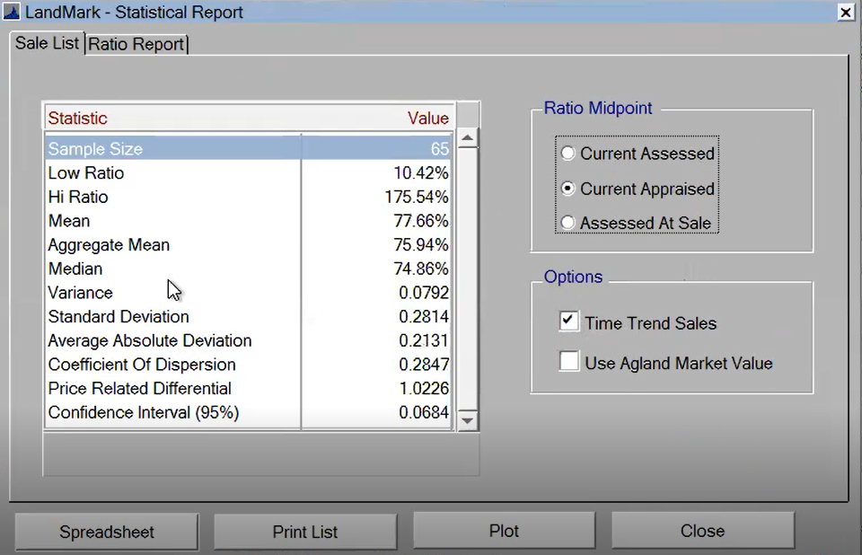
The Statistical Report window will open.
CHOOSE Current Appraised for Ratio Midpoint
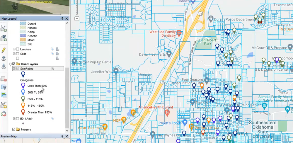
PLOT
This will open up the GIS layer and using the ratios will plot the parcels on the map.
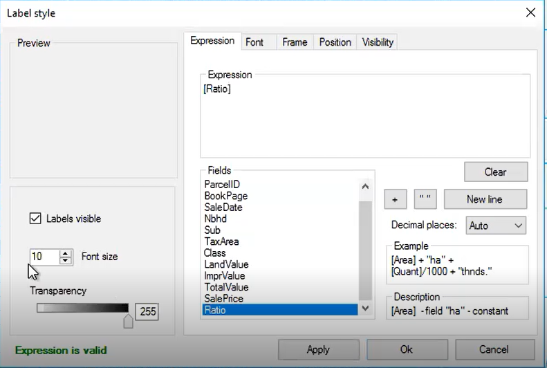
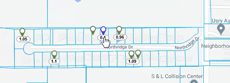
User may label the flagged parcels with any available fields. Ratio was chosen for this example.
Feedback
Copyright © 2025 LandMark GSI
—
Powered by 
Post your comment on this topic.