
Navigation within the graph section is primary controlled by the toolbar at the top of the page. The toolbar is divided into 2 sections.
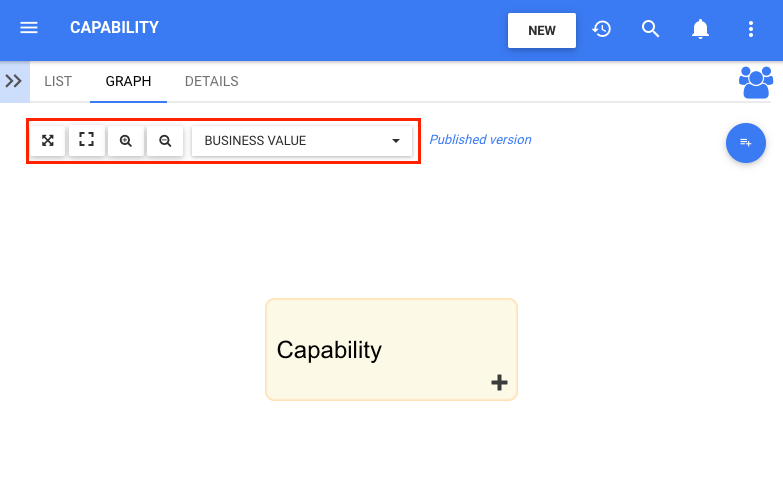
Section 1: items are focused on user viewing and graph functionality. Please see the table below for a full list and description of each item.
| Item | Icon | Description |
|---|---|---|
| Fit Screen |  |
This button will center the selected Rule on the users screen |
| Full Screen |  |
This button will enlarge the item and fit a large-scale view to the users screen |
| Zoom In |  |
This button will allow a user to zoom in to better view an item or item |
| Zoom Out |  |
This button will allow a user to zoom out to better view an item or item |
| Analysis Toggle Drop-Down Menu |  |
This button will allow a user to toggle between the color code of the analysis of the capability they are viewing |
Section 2: items are focused on Graph selection. Please see the table below for a full list and description of each item.
| Item | Icon | Description |
|---|---|---|
| Impact Graph |  |
Graph showing downstream representation of associated items |
| Hierarchy Graph |  |
Graph showing a top-down view of performance measures and how they fit within organizations |
| Share |  |
Copies URL to user’s clipboard to share |
| Subscribe |  |
This button will allow a user to subscribe to the performance measure being viewed. The icon will be displayed in white when a user is not subscribed to an item. The icon will be displayed in blue when a user is subscribed to an item. |
Besoin d'aide supplémentaire avec ce sujet?
Visit the Support Portal