
Graph
This screen displays all the entries as a graph. You can scroll it left and right to see a particular time interval depending on the selected scale.
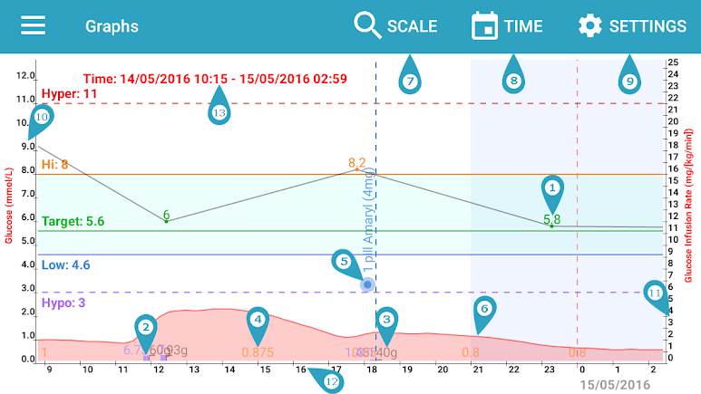
*The graph is important because it shows you all viable information distributed by short periods of time. You can easily find patterns in your daily medications/insulin intakes and your foods intakes. You can also analyze how different actions affect your body, for example exercises, insulin injections or bigger/lower food intakes.
- Glucose Entry
- Insulin injection mark
- Carbohydrates amount mark if present. Note that it should match the insulin mark if insulin covers the carbohydrates amount according your carbohydrates ratio for the time of the entry.
- Basal rate change
- Medications mark
- Insulin activity graph. You can see the peaks of activity especially if you have multiple injections before the expiration time of the first injection.
- “Scale” changes the scale of the graph. You can select from day, week, month and year.
- “Time” positions the graph view at a particular time
- “Settings” allows you to configure which marks and elements in the graph to see.
- Glucose levels line
- Glucose infusion rates line
- Timeline showing 0-24 hours from the day
- Shown time interval
Haben Sie noch weitere Fragen?
Kontaktieren Sie uns.