
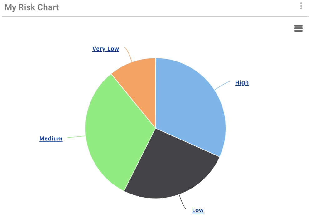
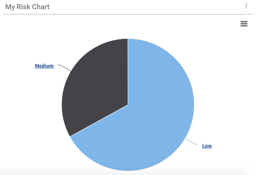
The widget My Risk Chart brings great value when users are in charge or tied to high risk tasks and processes. By adding the widget My Risk Chart to their dashboard, users have access to a pie-chart distribution. It displays the residual priority of all risks by category. Each category can be clicked on to access more specific details.
This widget gives quick visual information to the users, with the percentages of each level of risk appearing on the chart.
To add the My Risk Chart, the steps to follow are the following:
Like any other widget, you start by following these steps: Add Widgets to Home Page
From there, you can:
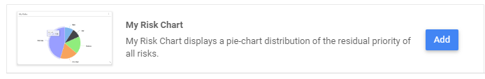
1. Click on Charts or scroll down to find “My Risk Chart”

2. Select My Risk Chart by clicking on Add
3. A confirmation message will appear
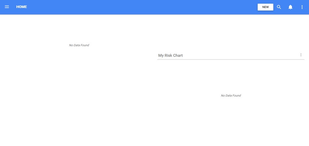
4. Navigate on your Home page to the newly added Widget
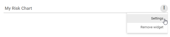
5. Select the  icon and click on Settings
6. The Settings page allows you to select what the chart will take into consideration and display, including the name of the widget
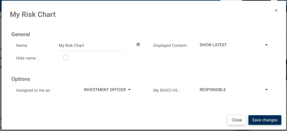
7. When clicking on the globe icon next to the Name, you’ll have access to the multilingual names section. It lets users customize their widget names to all language supported by EPC or your organization.
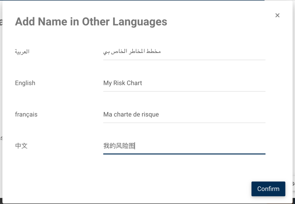
When toggling from a language to another, the name of the widget will change:

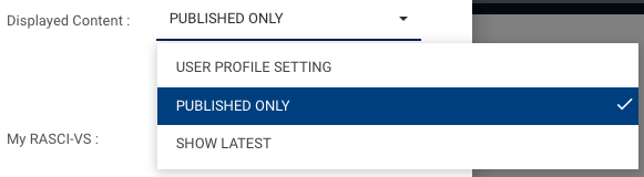
8. The Displayed Content option allows you to filter the widget content by:
- Show Latest: in progress + published content will be displayed
- Published Only: only published content will be displayed
- User Profile Setting: the content displayed will change depending on whether the user has put his EPC in published or show latest mode with the toggle button. If the user is in Show latest, the widget will show the Show Latest option. If the user is in Published Only, the widget will show the Published Only option.
When selecting Show Latest:
When selecting Published Only:
9. The “Assigned to me as” option allows you to select which role(s) and resource you want to take into consideration in the Risk Chart.
10. My RASCI-VS can only be selected once at least one role has been selected for the “Assigned to me as” option. It allows you to see the information related to a specific responsibility you have been given, or multiple responsibilities.

11. Once you have made your selections, a similar Chart will be visible on your Home page:

12. You can click on each color of the chart to access more specific information on the percentage of gross risk. You can click on Back to Risks to go back to the previous chart.

Need more help with this?
Visit the Support Portal