
Color Adjustment
Your image can be altered with this tool to correct colors when required, or to alter colors for artistic effect.
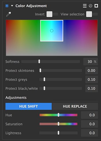
![]() Presets menu: Use this menu to select from several presets, to quickly select all colors, or to select a specific primary color group.
Presets menu: Use this menu to select from several presets, to quickly select all colors, or to select a specific primary color group.![]() Pipette: Used to select a color for adjustment. Click on the pipette to open selection loupe, then move it over your image to find the color you wish to select. Click again to select that color for adjustment.
Pipette: Used to select a color for adjustment. Click on the pipette to open selection loupe, then move it over your image to find the color you wish to select. Click again to select that color for adjustment.- Invert: Inverts the selection, so everything except the chosen color is altered by the effect.
- View selection: Displays the current selection on the viewer using a matte view.
- Spectrum selection indicator: Provides a visual representation to see and modify the range of colors selected.
- Center point: Indicates the base color from which the selection extends. To change the color, click anywhere in the spectrum and drag sideways to shift the base color, or use the pipette to select a different specific color from your image.
- White edges: Indicate the entire range of colors that is included in the selection. Drag any edge to adjust the range of colors in the selection
- Softness: Softens the selection at the edges of the selected color range. Increasing softness often creates more natural results when adjustments are applied to a color selection.
- Protect skintones: Prevents skin tones from being included in the selection. Effective for retaining accurate, natural skin tones when applying color shifts or adjustments to the image.
- Protect greys: Higher values exclude neutral mid-tones with low saturation from the selection
- Protect black/white: Higher values exclude the darkest and brightest areas of the image from the selection. This is frequently useful for preventing over-saturation of color noise in the shadow areas of your image.
Adjustments
The adjustments section provides two main methods of adjustment.
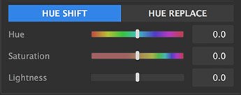
Hue shift
Hue shift is best for minor adjustments, where you are fine-tuning the existing hues in the image.
- Hue: Shifts the selected hue range through the color spectrum.
- Saturation: Increases (positive values) or reduces (negative values) the saturation of the selected hue range.
- Lightness: Brightens (positive values) or darkens (negative values) the selected hue.
Hue replace
Hue replace is a better option for major adjustments, where you are changing the selected hue to a completely different hue.
- Hue: Shifts the selected hue range through the color spectrum.
- Strength: Adjusts the intensity of the hue replacement. A value of 0 will have no effect, while a value of 100 will completely replace the source hue with the target hue.
- Saturation: Increases (positive values) or reduces (negative values) the saturation of the selected hue range.
- Lightness: Brightens (positive values) or darkens (negative values) the selected hue.
LUT
Look Up Tables (LUTs) are files which store a specific map for color adjustment, and allow you to apply a pre-defined color grade or adjustment to your layer very quickly.
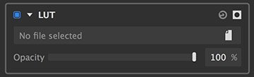
- File path: Click the file icon to the right to open a file browser and select the LUT file you wish to apply to the layer.
- Opacity: Reducing the opacity decreases the intensity of the LUT filter.
Saturation Editor
The saturation editor is optimized for fine tuning the intensity of each color in the layer. It uses a curve to control the saturation of different colors.

- Editing the curve: The horizontal line running through the center of the spectrum is a curve. You can add points to the curve above any hue, and reposition them to adjust the saturation of that hue.
- Adding points: Click anywhere on the curve to add a new point. When the first point is added, two additional points will be added on either side of it, so that the adjustment is limited to a specific hue range.
- Adjusting points: Drag any point to edit the effect it has on your image colors. Drag the point sideways to alter the primary hue it affects. Drag it upwards to increase the saturation of that hue, and drag it downwards to reduce the saturation of the selected hue.
- Pick Hue: Use the eyedropper to select a specific hue from your image, for precise adjustments.
Tone Coloring
Tone coloring applies hue shifts to specific tonal ranges of your layer. Unlike color adjustment, which applies adjustments based on color selections, Tone coloring alters color based on tonal selections, or luminosity.

- Editing the curve: The tone coloring curve has four control points. Each controls a different tonal range. The points correspond to the controls listed below the spectrum. Drag a point sideways to determine the color that is edited within its tonal range. Drag the point upward to add more of the selected color, or drag it downward to remove the selected color.

- Global: Affects the entire tonal range of the image. Edit the hue value (in degrees) to change the hue that is selected. Increase the percentage to add more of the selected hue, or lower the percentage to a negative value to reduce the selected hue.
- Shadows: Affects only the darker, shadow tones if the image. Edit the hue value (in degrees) to change the hue that is selected. Increase the percentage to add more of the selected hue, or lower the percentage to a negative value to reduce the selected hue.
- Midtones: Affects the middle tones of the image, while leaving the shadows and highlights unaffected. Edit the hue value (in degrees) to change the hue that is selected. Increase the percentage to add more of the selected hue, or lower the percentage to a negative value to reduce the selected hue.
- Highlights: Affects only the bright highlight tones of the image. Edit the hue value (in degrees) to change the hue that is selected. Increase the percentage to add more of the selected hue, or lower the percentage to a negative value to reduce the selected hue.
White Balance
If your image has inaccurate whites, you can correct the color with this tool. You can also use it to warm or cool the colors in the image overall. You can manually correct the white balance using the temperature and tint sliders, but it is usually faster and more effective to start by setting the neutral color.
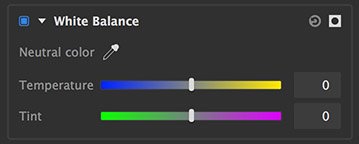
- Neutral color: Use the pipette to select a color in your image that should be neutral. White is preferred, but neutral gray or black can also work. In many cases, this is all that is necessary. If you need to adjust things further, you can use the sliders to do so.
- Temperature: Combining two colors which are opposite on the color wheel creates white light. Cyan and yellow are opposite each other, so by adding whichever one is lacking in the image, you can neutralize a color shift and balance the color. You are also able to warm up or cool the colors of the image for artistic effect.
- Tint: Combining two colors which are opposite on the color wheel creates white light. Green and magenta are opposite each other, so by adding whichever one is lacking in the image, you can neutralize a color shift and balance the color.
Need more help with this?
Don’t hesitate to contact us here.