Color correction effects are designed to enhance the visual quality of layers by adjusting their colors. Color correction is intended for the initial color manipulation and for fixing problems.
Auto Color
HitFilm includes three Auto grading effects to adjust the layer’s color, contrast or levels.
Compare the following image in each of these three effects to see the different results they give.
- Threshold: sets the threshold below which colors will remain unaffected.
- Blend With Original: the effect of the Auto Color can be softened by increasing this setting. Higher values retain more of the original color.
- Select Frame: by default the auto grading effects update on each frame, which can cause fluctuations in the layer’s appearance as the contents of the frame change. By activating the Select frame property you can manually choose a frame to use as the source for the automatic adjustment, which will be used for the duration of the layer.
Auto Contrast
HitFilm includes three Auto grading effects to adjust the layer’s color, contrast or levels.
Compare the following image in each of these three effects to see the different results they give.
- Threshold: sets the threshold below which colors will remain unaffected.
- Blend With Original: the effect of the Auto Contrast can be softened by increasing this setting. Higher values retain more of the original color.
- Select Frame: by default the auto grading effects update on each frame, which can cause fluctuations in the layer’s appearance as the contents of the frame change. By activating the Select frame property you can manually choose a frame to use as the source for the automatic adjustment, which will be used for the duration of the layer.
Auto Levels
HitFilm includes three Auto grading effects to adjust the layer’s color, contrast or levels.
Compare the following image in each of these three effects to see the different results they give.
- Threshold: sets the threshold below which colors will remain unaffected.
- Blend With Original: the effect of the Auto Levels can be softened by increasing this setting. Higher values retain more of the original color.
- Select Frame: by default the auto grading effects update on each frame, which can cause fluctuations in the layer’s appearance as the contents of the frame change. By activating the Select frame property you can manually choose a frame to use as the source for the automatic adjustment, which will be used for the duration of the layer.
Brightness & Contrast
Quick adjustment of the layer’s brightness and contrast.
- Brightness: adjust to the left to decrease brightness, or to the right to increase brightness.
- Contrast: adjust to the left to decrease contrast, or to the right to increase contrast.
Color Balance
Individually adjust the balance of red, green and blue in the layer’s shadows, midtones and highlights.
The Preserve luminosity property retains the layer’s original brightness when altering the colors.
Shadows
- Red Balance: adjust to the left to reduce red tones in the shadow areas, or to the right to increase red tones in the shadow areas.
- Green Balance: adjust to the left to reduce green tones in the shadow areas, or to the right to increase green tones in the shadow areas.
- Blue Balance: adjust to the left to reduce blue tones in the shadow areas, or to the right to increase blue tones in the shadow areas.
Midtones
- Red Balance: adjust to the left to reduce red tones in the midtones, or to the right to increase red tones in the midtones.
- Green Balance: adjust to the left to reduce green tones in the midtones, or to the right to increase green tones in the midtones.
- Blue Balance: adjust to the left to reduce blue tones in the midtones, or to the right to increase blue tones in the midtones.
Highlights
- Red Balance: adjust to the left to reduce red tones in the highlights, or to the right to increase red tones in the highlights.
- Green Balance: adjust to the left to reduce green tones in the highlights, or to the right to increase green tones in the highlights.
- Blue Balance: adjust to the left to reduce blue tones in the highlights, or to the right to increase blue tones in the highlights.
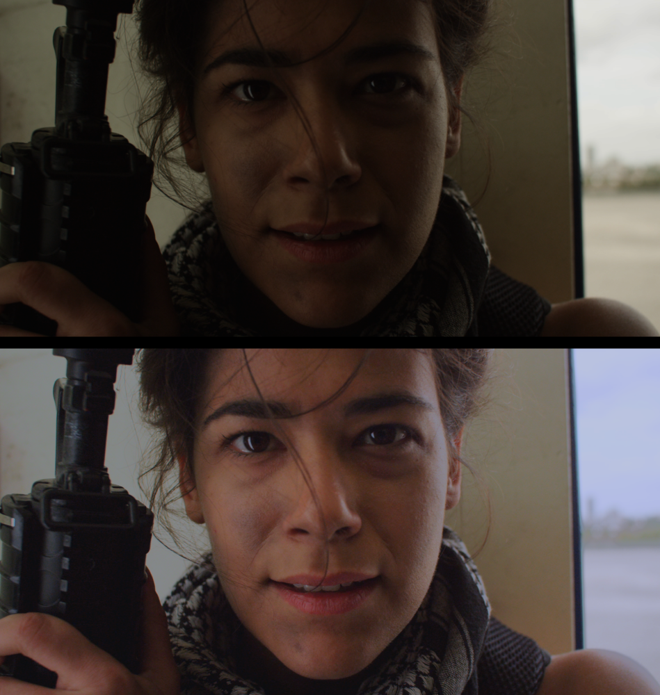
Color Correction Wheels
This effect provides a visual way to quickly adjust the highlights, midtones and shadows of your layer.
You can drag on the color wheels to adjust the color balance of highlights (top wheel), midtones (middle wheel) and shadows (bottom wheel). The further out from the center of the color wheel you drag the point, the more saturated the colors will become.
The sliders can be used to adjust the strength and lightness of the adjustment, and the rotator on the wheels changes the hue.
Additional controls can be found in the property groups below the wheels, including a white balance property which functions the same as the separate white balance effect.
Here you can see the difference the color wheels effect can make to a layer, with the original shown first and the color corrected version below it:
Color Temperature
Use to warm or cool the colors in your layer. Color temperature is measured in Kelvin.
- Temperature: adjusting to the left reduces color temperature, introducing more orange and red into the image. Adjusting to the right increases the color temperature, shifting it towards blue.
Crush Blacks & Whites
An alternative to simply altering the contrast, this enables you to change the black and white points separately for finer control.
- Black: Increasing this slider will raise the threshold below which shadow areas will be pushed into black
- White: decreasing this slider lowers the threshold above which highlights will be pushed into White.
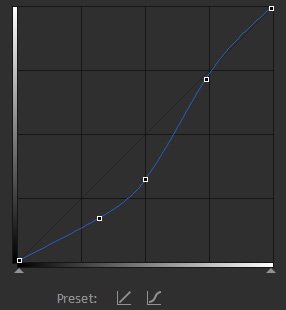
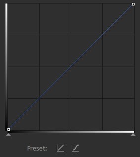
Curves
Curves is a powerful color correction and grading tool, based on an editable graph. Here’s an example of the curves graph as shown in the Controls panel:
The horizontal axis on the graph represents the input, which is the original image. The vertical axis represents the output, which is the graded result. Therefore if you follow a line vertically up from any point on the graph until you hit the curves, then track to the left, you can see how the input is being changed.
Therefore with the default curves graph you can see that the input values are identical to the output values:
Two easy presets are provided, one of which resets the graph to the default straight line and another which creates an s-curve:
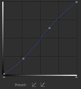
Where the graph becomes steeper you will see increased contrast, whereas a shallower incline will reduce contrast. In the case of an s-curve, the center of the graph is steeper, which increases contrast in the mid-tones, at the expense of detail in the shadows and highlights.
Given that the focus of a frame is often in the mid-tones (such as actor’s faces), an s-curve is often an effective way to add perceived detail and contrast to a shot.
Curves can be used to adjust the RGB channels combined or each channel individually. Adjusting individual channels can be useful for correcting white balance and lighting issues.
Custom Gray
This creates a grayscale image while providing finer control over how that image is generated. This is useful for creating specific black and white looks, as each RGB channel can be emphasized to a lesser or greater degree when creating the result, providing fine control over contrast.
- Red: Positive values increase the lightness of the red channel, negative values decrease the lightness of the red channel. Increasing the red level can help lighten skin tones, to bring the viewer’s focus onto human subjects.
- Green: Positive values increase the lightness of the green channel, negative values decrease the lightness of the green channel.
- Blue: Positive values increase the lightness of the blue channel, negative values decrease the lightness of the blue channel.
p(banner tip). The sum of the values of the Red, Green, and Blue channels should equal 1.00 to maintain the overall luminosity of the original image. Total values above 1.00 will brighten the image overall, and total values below 1.00 will darken it. - Offset: Raises or lowers the luminosity of the entire image equally, affecting all tones in the image equally
- Exposure: Raises or lowers the exposure of the image. This adjustment primarily affects the Highlights and Midtones, while the Shadow areas remain unaffected. Thus, reducing Exposure lowers the overall contrast of the image, while increasing Exposure increases the contrast between the brightest and darkest areas.
Exposure
Simulates the effect of letting more light into the camera lens. The end result is a brightening or darkening of the footage, but in a more natural, dynamic way than a direct Brightness adjustment. In addition to changing brightness, reducing Exposure lowers the overall contrast of the image, while increasing Exposure increases the contrast between the brightest and darkest areas. The available controls give you access to the three main tonal ranges of the image, allowing you to fine-tune the Highlights, Midtones, and Shadows separately.

- Exposure: Primarily brightens or darkens the highlights of the image, with minimal effects on the shadows.
- Offset: Brightens or darkens the shadow areas of the image, with minimal effects on the Highlights. Start with minor adjustments, as excessive changes here can create unnatural results.
- Gamma: Shifts the midtones of the image.
Gamma
Individually alter the gamma of red, green and blue channels. Gamma is weighted toward the midtones of the image, and will change the midtones the most, with a more minimal impact on the highlights and shadows.
- Red: Raises or lowers the red levels in the image, especially in the midtones.
- Green: Raises or lowers the green levels in the image, especially in the midtones.
- Blue: Raises or lowers the blue levels in the image, especially in the midtones.
Hotspots
A quick and easy way to isolate and alter the bright areas of your layer. Hotspots allow you to select and modify the brightest areas of your image, based on a user-defined brightness threshold.
- Threshold: Sets the brightness threshold on which the effect is based. Only areas above your Threshold setting will retain detail.
- Threshold Add Color: All areas of the image below the threshold level will be filled with the color you select here. By default the color is black, which can be useful for isolating the hot spots in your image for compositing purposes. For example, you could duplicate your footage, apply Hot Spots to the top copy, then set the blend mode of the top copy to Screen to blend the results of the Hot Spots effect onto the original copy of the footage below it.
- Saturation: Adjusts the intensity of the colors in any areas brighter than the Threshold.
- Brightness: Alters the brightness of all areas in your footage which are brighter than the Threshold.
- Smooth Source: Applies a blur to the source image before calculating the threshold, which is useful for smoothing the transition areas around the threshold and removing graininess in the result.
Hue, Saturation & Lightness
Control over the hue, saturation and lightness of your image. The Master controls affect the entire image, while the individual color controls (Red, Yellow, Green, Cyan, Blue, Magenta) allow you to limit adjustments to a specific color family.
- Hue Shift: Shifts the colors by rotating them the specified number of degrees around the color wheel. The colors are oriented around the color wheel in the sequence they are listed in the effect (red, yellow, green, cyan, blue, magenta), and the distance between each color family is 60 degrees. The Master control will affect the entire image, while the lower controls will only affect a range of colors within the specific color family you adjust.
- Saturation: Increases or decreases the saturation, or color intensity. The Master control will affect the entire image, or you can select a specific color family and adjust it separately from all other colors in the image.
- Lightness: Lightens or darkens the image. The Master control will affect the entire image, or you can select a specific color family and adjust it separately from all other colors in the image. Increasing the Lightness can result in a perceived decrease in saturation, so in many cases it may be useful to adjust Lightness and Saturation in combination to get the result you desire.
Levels Histogram
Levels gives you detailed information about the channel composition of the layer through the use of a Histogram Display.This allows you to make manual adjustments to the tonality of the layer to improve its appearance. A Histogram is a graph which allows you to quickly see at a glance the exact range of tonal values in your image. Histograms are also available in the scopes panel, and more information about histograms is available in Introducing Scopes. The histogram is a more accurate way to assess colors than by eye.
The histogram displays a readout of the tones in your image. The tones range from pure black on the left to pure white on the right. The height of the graph at any point indicates the relative frequency of that specific tone in the image. Information for different channels of your image can be viewed, based on your selection in the Channels menu.
Channels Menu
- RBG: Displays three separate histograms at once, one for each color channel of your image. Each histogram is colored to match the channel it represents.
- RGB Combined: Averages the values of all three channels, and displays a single histogram that represents the overall tonal values of the image.
- Red: Displays the tonal values of the Red channel of the image.
- Green: Displays the tonal values of the Green channel of the image.
- Blue: Displays the tonal values of the Blue channel of the image.
- Alpha: Displays the tonal values of the Alpha channel of the image.
The Histogram
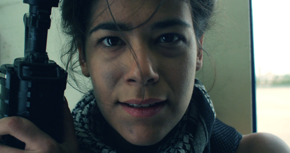
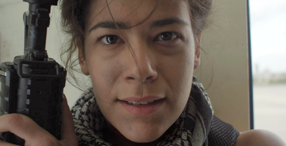
The primary method for viewing the levels in your image is the Histogram. The image below is represented by the histogram shown to its right.
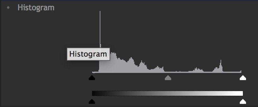
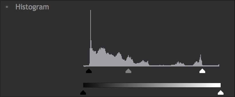
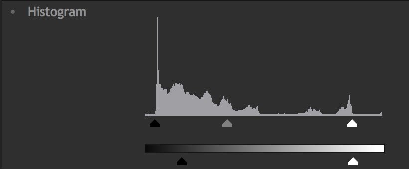
The histogram contains a Graph and a Gradient. Beneath the graph are three triangles, representing the Input Black (black triangle), the Gamma (grey triangle) and the Input White (white triangle). Looking at this histogram, notice that the graph does not begin at the Input Black, it ends before the Input White, and nearly all the image data is positioned below the mid-point Gamma control. By default, pure black is set to 0.0, and pure white is set to 1.0. Shifting the white or black input values evenly redistributes the tonal range of the image between black and white. However, adjusting them too far can result in clipping of the image, and loss of detail in the shadow or highlight areas.
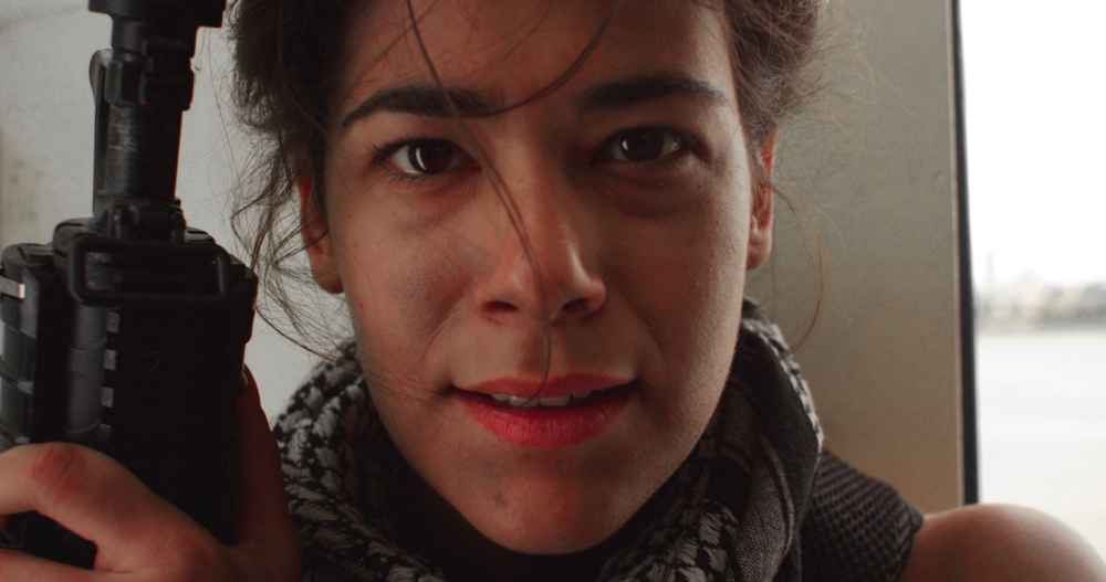
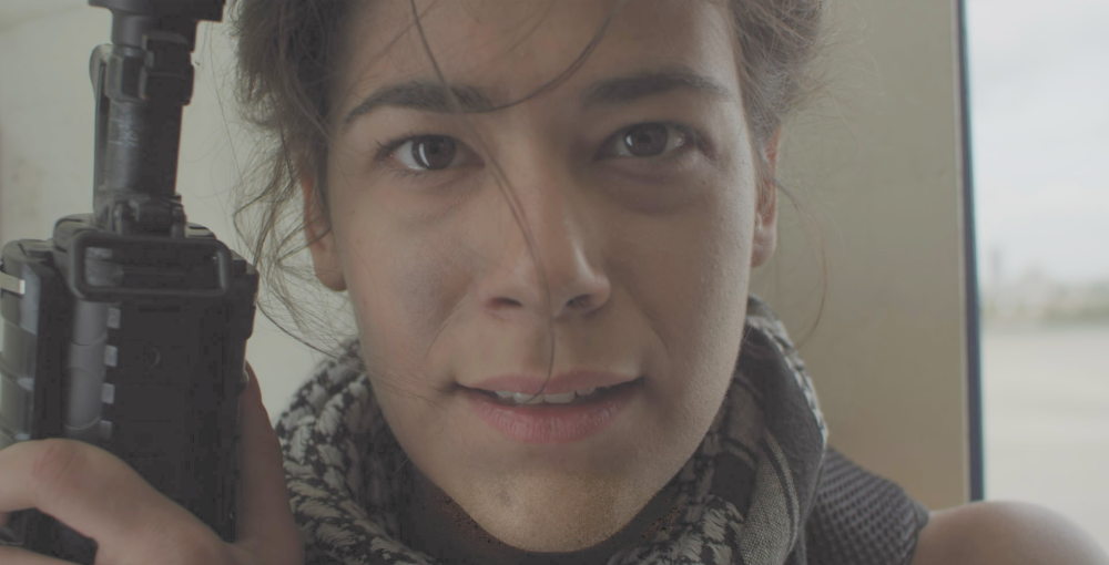
By adjusting these controls we can optimize the dynamic range of tones in our image. Slide the Input Black control to the right control until it touches the edge of the visible graph. Then, slide the White Input to the left, until it touches the edge of the visible graph. Shifting the Gamma will then redistribute the midtones between the white and black points. The image below shows how this basic adjustment can improve the image by darkening the blacks to true black, raising the highlights to pure white, and brightening the overall image with a Gamma shift.
There are also two triangle controls below the gradient, representing the Output Black (black triangle) and Output White (white triangle). Shifting these will reduce the contrast in the image, by reducing the intensity of the black point or white point of the image. This can be useful for creating a flat image in preparation for applying final grading adjustments. The image below shows how adjusting the Output Black and Output white affects our result.
Controls
- Input Black: Sets pure black in the image to the selected value. Any tones below the selected value will be clipped to pure black. Linked to the black triangle below the graph.
- Input White: Sets pure white in the image to the selected value. Any tones above the selected value will be clipped to pure white. Linked to the white triangle below the graph.
- Gamma: Redistributes the midtones between the defined input black and input white. Adjusting Gamma to the left will brighten the midtones, and adjusting it right will darken the midtones. Linked to the grey triangle below the graph.
- Output Black: Offsets the black point from 0.0 to the selected value.This is useful for lightening shadow areas of the image. Linked to the black triangle below the gradient.
- Output White: Offsets the white point of the image from 1.0 to the selected value. This can be beneficial for reducing the brightness of the highlights in your image. Linked to the white triangle below the gradient.
Pro Skin Retouch
Apply realistic and subtle post-production make-up to your actors, with fine control over skin color, detection thresholds, skin treatment and highlight glow.
Skin retouching has three distinct sections. Skin Detection is used to define the area to be processed. This area is called the skin matte. Skin Treatment contains the main controls for adjusting the amount of processing applied to the skin matte. Glow is used to add a subtle glow to the skin area, to soften it.
Skin Detection
HitFilm will automatically try to select common skin tones. Adjusting the settings below will allow you to ensure that all skin tones are selected, regardless of what color shifts or lighting is present in your footage.
- Skin Color: Sets the base color for skin detection. This should be adjusted based on the subject’s skin color, by dragging the eyedropper onto a typical portion of the subject’s skin in the viewer.
- Brightness Threshold: Limits the skin detection based on brightness. Higher values will include a wider range of highlights and shadows in the selection. This can be useful for selecting skin in shots with uneven lighting, but higher values also make it easier for unwanted areas of the frame to be included in the skin matte.
- Chroma Threshold: The skin detection is performed in the YUV color space. The chroma threshold defines the distance around the selected color used to create the detection circle. Increasing this setting includes a wider chromatic range in the selection, which can also easily begin to select unwanted areas of the frame. This setting shuld be kept at the lowest value that is acceptable for your footage.
- Softness: Applies a feather to the edge of the skin matte, to more naturally blend it with the rest of the frame.
- Elliptical Deformation: Adjusts the shape of the YUV detection circle into an ellipse, which is a more optimized shape for skin detection.
- Blur Selection: Blurs the resulting skin matte.
Skin Treatment
These controls define how the area inside the skin matte is modified.
- Smooth: Smoothes the skin by applying a blur within the area of the skin matte.
- Edge Threshold: The skin treatment attempts to retain edge detail while smoothing the skin. The edge threshold determines how much detail is retained.
- Saturation: Adjusts the color intensity of the skin. A subtle saturation boost often creates a healthy appearance.
- Exposure: Adjusts the exposure within the skin matte. Since human faces are the most common subject of video shots, this allows you to easily highlight underlit skin, and draw the viewer’s eyes to your subject.
Glow
- Brightness: Adjusts the strength of the glow. Subtle use is recommended for average shots, but higher values can also be useful for creating elf-glow effects.
- Threshold: Applies a threshold to the skin. Higher thresholds reduce the amount of skin used to generate the glow.
- Radius: Higher radius values will increase the size of the glow, creating a softer, more diffuse result.
- Colorize: The glow can be tinted towards a specific color using the color picker.If you want to tint the glow away from normal skin color, to give it a sickly green tinge or an ethereal blue tint, for example, you could select those colors here.
View
Switching between these view modes makes it easier to adjust the skin detection settings.
- Final Result: This option shows the processed skin composited back onto your source layer, so you can see the exact results of the effect.
- Skin Matte: Shows a greyscale representation of the skin matte, so you can see exactly what areas are selected. White indicates selected areas, black indicates unselected areas, and grey indicates areas of partial selection. The darker a grey area is, the less effect the Skin Treatment settings will have in that area.
- Skin: Isolates the selected area and hides all parts of the layer that are outside of the skin matte.
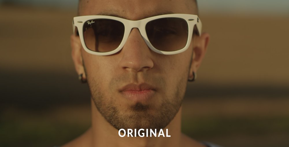
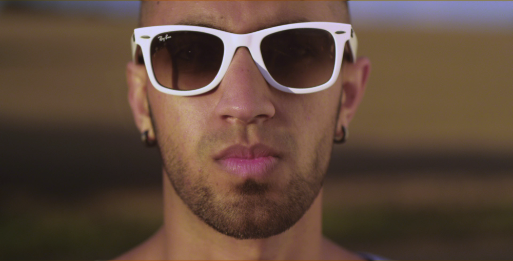
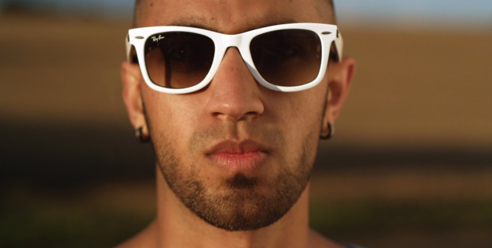
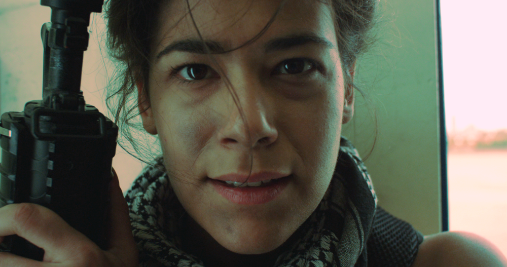
White Balance
If your video was shot with incorrect white balance, or has an undesirable color shift, this effect can help to correct the problem. Use the color pipette to select a part of the video that should be white (or neutral grey) and the layer will be corrected.
In the example below, the white balance has been set to the frames of the sunglasses. The first image is the original, with an overly warm, yellowish appearance, while the second image shows the corrected white balance.