
To illustrate how users can configure control-specific properties in the window linked to the State Matrix field, consider the two following examples:
Example 1: State Matrix for Checkbox Control: Expanded Configuration Options
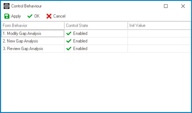
Along with configuring the control state for each form behavior, users can also perform the following action:
- Set initial value for the control on a per-form-behavior basis
![]()
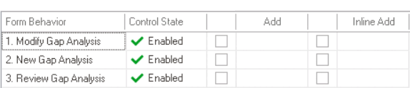
Example 2: State Matrix for Grid Control – Expanded Configuration Options
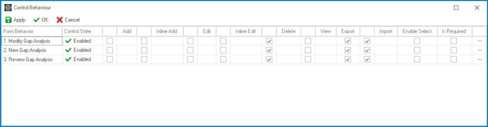
Along with configuring the control state for each form behavior, users can also perform the following actions:
- Enable control properties or functions on a per-form-behavior basis
- To enable a specific function, select the corresponding checkbox (located either directly under the function or to its left).
![]()
- To enable a specific function, select the corresponding checkbox (located either directly under the function or to its left).
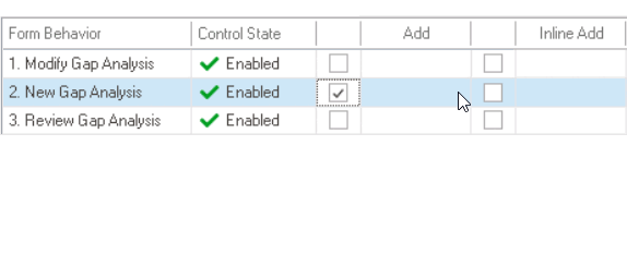
- Set the corresponding form behavior for each enabled function (where applicable)
- Once a function has been enabled for the control, users can select the form behavior associated with it.
![]()
- Once a function has been enabled for the control, users can select the form behavior associated with it.
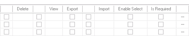
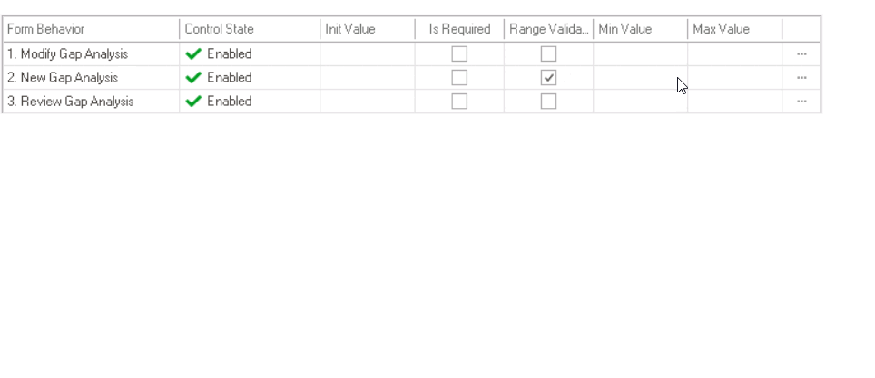
- Set validators for the control on a per-form-behavior basis
- Depending on the control, users can enable required field and/or range validation.
![]()
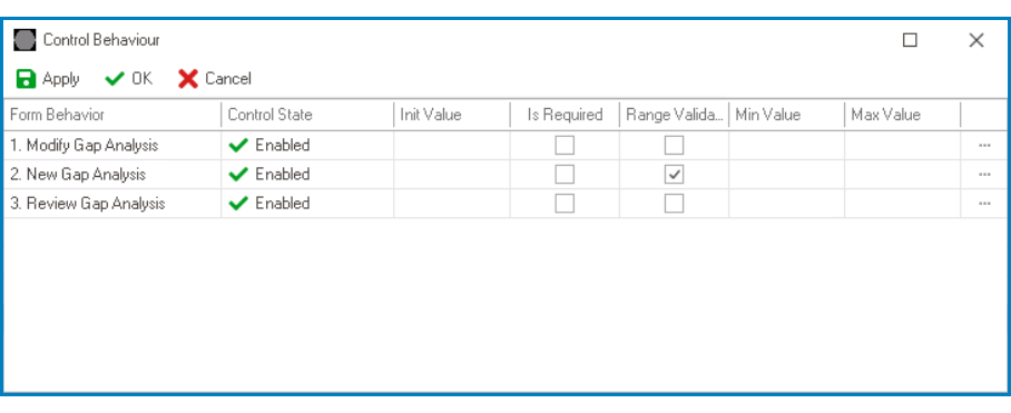
- Range Validation
- In cases where users can enable range validation for the control, they must also set a minimum and maximum value.
![]()
- For example, when setting up range validation for the date/time picker control, users must enable the Range Validator checkbox as well as select the relevant date values.
![]()
- For example, when setting up range validation for the date/time picker control, users must enable the Range Validator checkbox as well as select the relevant date values.
- Depending on the control, users can enable required field and/or range validation.