Managed BI Portal - User Guide
Table of Contents
Managed BI Portal - User Guide
GrabGrab
GrabGrab
  • Overview
  • Login & Navigation
  • Pivot Reports
    • Creating a new report (OLAP)
      • Quick Guide: Toolbar Buttons
    • Creating a new report (Relational OLAP)
    • Creating Report Subscriptions
    • Emailing Reports
    • Graphs & Charts
      • Options: Chart Size & Position
      • Options: Chart Floor / Ceiling
      • Options: Legend
      • Options: Labels (x & y-axis)
      • Options: Miscellaneous Settings
    • Geographic Maps
      • Geo Maps
      • Google Maps Integration
    • Calculated Fields/Measures
    • Conditional Formating
      • Conditional Formatting: Standard
      • Conditional Formatting: Data Bars
      • Conditional Formatting: Gradient
    • Sparklines
      • Sparklines: Measure & Time Dimension Settings
      • Sparklines: Size & Formatting Settings
    • Setting up Filters
    • Show Top/Bottom
  • Interactive Reports
    • Report Execution
    • Exporting to Desktop
Download as PDF

Graphs & Charts

With Managed BI, it is easy to add charts of many types (bar, pie, line, dual axis, geography, etc) to any pivot report. This page explains how to add a chart and the available options.

  1. Create a new report table (OLAP and ROLAP)
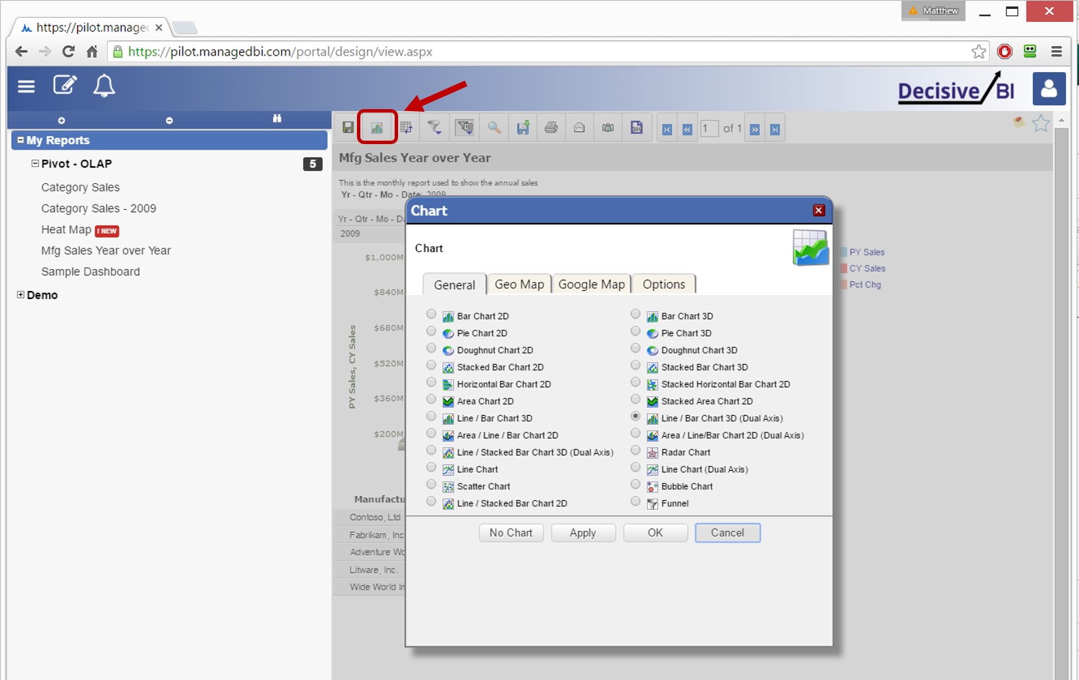
  2. Click the “Add Chart” icon to open charting dialog
  3. Select Report Type
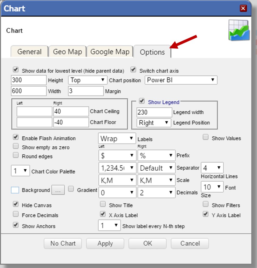
  4. Adjust Report Options
  • Size & Position
  • Chart Floor / Ceiling
  • Legend
  • Labels
  • Miscellaneous Settings

Click the “Add Chart” icon

Report Options

Emailing Reports
Options: Chart Size & Position
© 2016 - Decisive BI, LLC ALL Rights Reserved
Proprietary, Confidential, & Licensed for use only