Use the Display Columns section on the Display tab to select how the column data should be displayed by the Data Viewer Web Part. Only those columns you selected on the Columns tab are displayed in this section.
In this section you can configure:
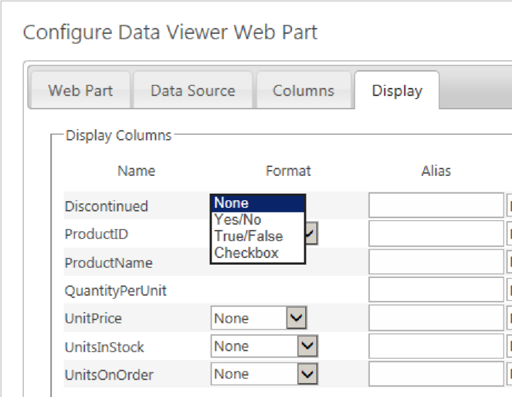
- Format: Select from the Format drop down list the format of columns, for example:
- For a Boolean column type, you can select: None, Yes/No, True/False or Checkbox.
- For numerical columns you can select, None, Currency, Decimal, Fixed Point, General, Hexadecimal, Number, Percent and Scientific.
- For Date/Time columns, you can select None, Long Date, Long Data and Time, Long Time, Short Date, Short Date and Time, Short Time and Year And Month. You can also type a custom date format.
- For a Boolean column type, you can select: None, Yes/No, True/False or Checkbox.
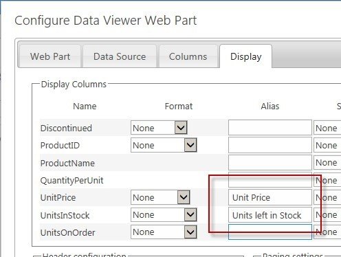
- Column width: Type in the Width, px text box the width of the column in pixels.
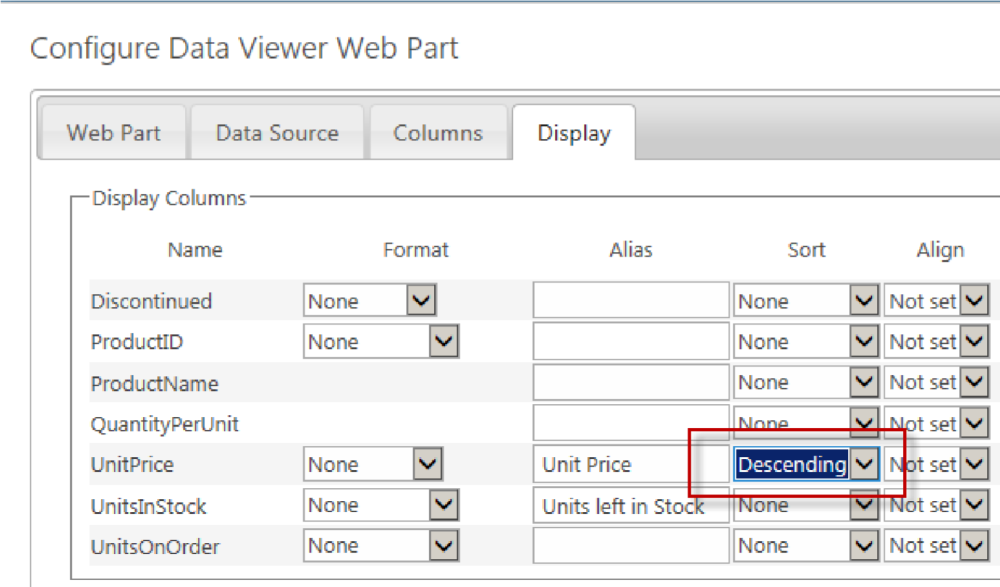
- Sorting: Use the Sort drop down list to sort the items displayed in Ascending or Descending order. A Sorting Order section appears.
By sorting data, you present the data in an order that works best for your users, instead of the order in which the data is returned from the data source. For example, you can create a Data Viewer Web Part that displays a product list, sorted by product name in alphabetically order to make it easier to find products in the list. You can also sort on multiple columns by adding more column to the sort order list. For example, to help make the products in the list easier to find, you can configure the Data Viewer Web Part to display the product list by category, and then by product name within each category. You can use the Sorting Order section to change the order of the sort columns, by dragging columns in sort order. The column at the top of the Sorting Order section is the first column used to sort the returned items from the data source.
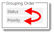
- Grouping: Select the Group By check box to the right of the column to group items by that column. A Grouping Order section appears. If you wish to group using multiple columns, you can change the order of the grouping, using the Grouping Order section, by dragging columns in group order. The column at the top of the Grouping Order section is the first column used to group the returned items.
By default groups are expanded. To collapse groups when the Data Viewer Web Part is first displayed, in the Linking and Grouping
grouping} section, select Groups Collapsed from the Grouping Initial State list. You can also display how many records are in a group by selecting Show Count of Items in Groups check box in the Linking and Grouping section.
- Display: When you select to group items by a column then the check box below Display becomes active, and you can select whether to show the values in the column not only as a group heading but also as a column in the Data Viewer Web Part.
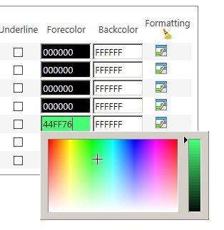
- Font and Background formatting: You can use the Align, Forecolor and Backcolor lists, as well as the check boxes B (bold), I (italic) and U (underline) to format the fonts and background colors for each column individually. The Forecolor and Backcolor can also be set either using the color picker or by entering the RGB code.
- Conditional Formatting. Conditional formatting can be set per value or per row allowing you to change formatting options only if a condition is true, for example, you could highlight any Products that have a Units in Stock less than 10 or Tasks assigned to you.Click the formatting icon
to display the Configure Conditional Formatting dialog. Click the Remove All Formatting icon
, to remove all filters from all columns.



Post your comment on this topic.