!https://manula.r.sizr.io/large/user/1483/img/dv-display-xml.jpg!The Columns tab, consists of the Columns section. Use this section to select columns that should be displayed in the Data Viewer Web Part. Once you have configured the columns to be display, click on the Display tab to format the column data.
At the top right of the Columns section, at least three icons are displayed, which when clicked allow you to:
Update the Data Viewer Web Part with the columns selected.
Add a calculated column
Configure Advanced filtering.
Below these three links there are three icons, which allow you to:
Select all columns.
Invert the selection.
Uncheck all columns.
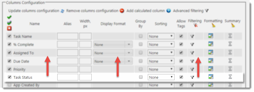
The content of the rest of Columns section, may look different depending on the data source selected. For data sources such as SharePoint lists and library apps, SQL Server databases, Oracle databases, ODBC and OData data sources, the Columns section contains a list of columns, as described below:
- Selecting the check box to the left of the column name, to display data from that column in the Data Viewer Web Part. You can set the order of the columns within the Columns section, by dragging the columns up or down.
- Filtering. You can filter the number of items return based on values in one column, by using the Filtering icon
, or more columns by clicking the Advanced filtering link in the top right of the Columns section. Click the Remove All Filters icon
, to remove all persistent filters from all columns.
The Display tab allows you to format, group, sort, align, and conditionally format the data from the columns you have selected, however, the Columns tab may provide other options within the Columns section dependant on the data source.
SQL Server data source
With SQL Server database tables the following options are available on the Columns tab:
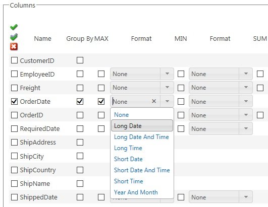
- Group By Select the Group By check box to the right of the column to group items by that column. You can then select to aggregate each group by selecting the checkboxes:
- Max
- Min
- Sum
- AVG
- Count
Optionally you can select to format for numerical columns of each aggregated function using the drop down list to the right of each function check box. - Max
- For numerical columns you can select, None, Currency, Decimal, Fixed Point, General, Hexadecimal, Number, Percent and Scientific.
- For Date/Time columns, you can select None, Long Date, Long Data and Time, Long Time, Short Date, Short Date and Time, Short Time and Year And Month. You can also type a custom date format.
OData data source
For an OData data source, the Columns section allows you to select the check boxes to specify the columns that are to appear on the Add New Item and Edit Item dialogs:
- Allow Insert
- Allow Update
You must remember to select the appropriate check boxes in the Data Connection section on the Display tab for the Add New Item button and Editicon to appear in the Data Viewer Web Part, so users can display the Add New Item and Edit Item dialogs.
XML data source
For a XML data source, in the Columns section:
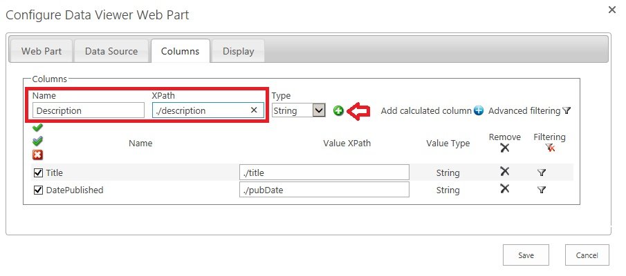
- For each column, in the Name text box, type the column name, and in the XPath text box type provide the XPATH expressions relative to the item tag you provided on the Data Source tab.
- Click the green plus
icon.
- Select and arrange the columns and configure filters if needed.


 Update the Data Viewer Web Part with the columns selected.
 Select all columns.
  Invert the selection.
  Uncheck all columns.


Post your comment on this topic.