
Bevel & Emboss
Simulates 3D depth by adding angled edges to the layer and illuminating them to simulate depth.
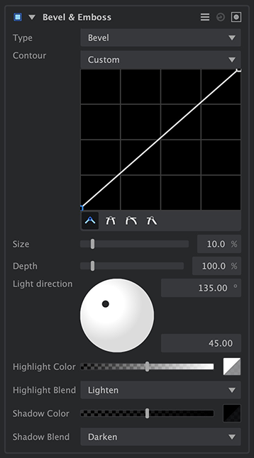
- Type: Choose the type of depth which is created.
- Bevel: The angled edges are created within the visible area of the layer.
- Emboss: The angled edges are create immediately outside the visible area of the layer, leaving the layer’s contents unaffected.
- Contour: Select or create the contour used for the angled edges. A variety of common options are listed in the menu, or you can use the interactive curve to create your own contour. See Creating Contours, below, for complete details.
- Size: Sets the width of the contoured edge.
- Depth: Controls the height of the contoured edge, as depicted by how it interacts with the light position.
- Light direction: Choose the direction of the light which illuminates the contoured edges. Drag the black handle in the direction wheel to reposition the light source. Dragging the handle around the edge of the wheel moves the light to the chosen angle. Dragging the handle toward the center of the wheel raises its angle overhead, in relation to the edges. The angle of rotation can also be manually edited from 0º to 359º using the upper numeric field. The angle overhead can be edited from 1º to 90º using the lower numeric field.
- Highlight color: Select the color applied to the illuminate areas of the contoured edge. Click the swatch to open a color picker and select any color you desire. Move the slider to adjust the opacity of the color.
- Highlight blend: Select the blend mode used to blend the highlight color onto the contoured edges.
- Shadow color: Select the color applied to the shadowed areas of the contoured edge. Click the swatch to open a color picker and select any color you desire. Move the slider to adjust the opacity of the color.
- Shadow blend: Select the blend mode used to blend the shadow color onto the contoured edges.
Creating contours
The contour of the edges created by the Bevel & Emboss effect is fully customizable. The most common options are created as presets, and can be selected from the Contour menu. The graphic curve will update to show the shape of whichever preset is selected. The curve can also be edited at any time, using any of the presets as a starting point.
- Adding a point: Click anywhere within the contour grid to add a point at that location.
- Moving a point: Any point can be moved by dragging it with the mouse.
- Deleting a point: Right-click any existing point to remove it.
- Editing a point: The shape of a line as it passes through a point can be changed using the shape buttons below the grid.
![]() Linear: This is the default option, where the line segment on each side of the point takes a straight line to the next point.
Linear: This is the default option, where the line segment on each side of the point takes a straight line to the next point.![]() Mirrored Curve: The angle at which the line enters the point, and the angle at which it leaves the point are diametrically opposed. The line therefore passes straight through the point at the angle set by the control handle. The length of the handle then adjusts the curve used to connect the point to the next point, and adjustments made to one handle will be mirrored by the other handle.
Mirrored Curve: The angle at which the line enters the point, and the angle at which it leaves the point are diametrically opposed. The line therefore passes straight through the point at the angle set by the control handle. The length of the handle then adjusts the curve used to connect the point to the next point, and adjustments made to one handle will be mirrored by the other handle.![]() Asymmetrical Curve: The angle at which the line enters the point, and the angle at which it leaves the point are diametrically opposed. The length of the handle on each side can be adjusted independently, though, for greater control over the curve.
Asymmetrical Curve: The angle at which the line enters the point, and the angle at which it leaves the point are diametrically opposed. The length of the handle on each side can be adjusted independently, though, for greater control over the curve.![]() Unlinked Curves: The angle and length of each handle can be adjusted independently, so you can form curves on either side, but still create a corner at the point.
Unlinked Curves: The angle and length of each handle can be adjusted independently, so you can form curves on either side, but still create a corner at the point.
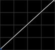
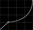
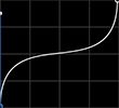
The built-in presets are as follows:
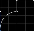
- Bevel: A simple 45º angle.
![]()
- Bevelled Ogee: A concave curve atop a beveled base.
![]()
- Ogee: An s-curve with vertical ends.
![]()
- Rounded Step: A convex curved base, with a square edge above.
![]()
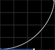
- Rounded Inwards: A concave curve.
![]()
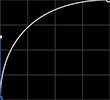
- Rounded Outwards: A convex curve.
![]()
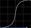
- Smooth Curved: An s-curve with horizontal ends.
![]()
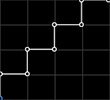
- Staircase: A stack of four right angled edges.
![]()
- Save Preset: Use this option to save a custom contour for future use. After creating a custom contour, select this option and a dialog will open where you can enter a name for the new contour. It will then be listed in the Contour menu, and can be selected at any time.
Bleach Bypass
Bleach bypass is a technique originating in film processing, where the bleaching step was completely or partially skipped during development. Bleaching typically serves the purpose of removing silver emulsion from the film. The result is a dramatic image with high contrast and low saturation.
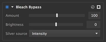
- Amount: Defines how much of the original image you see in relation to the bleach bypassed image. Higher values show more of the processed image, and less of the original.
- Brightness: Bleach bypass can sometimes make the image darker than desired. This control lets you adjust the brightness to compensate.
- Silver source: Choose which channel of the original image is used to generate the bleach bypass effect. Each option will give subtle differences, depending on the colors present in the image.
- Luminosity: Colors are mapped to grayscale values based on their perceived brightness to the human eye.
- Lightness: Colors are mapped to grayscale values based on their brightness relative to a similarly illuminated white.
- Intensity: Colors are mapped to grayscale values based on the average of the RGB components.
Cartoon
Creates a cartoon appearance by dramatically lowering the number of colors in the image, and adding lines to edges.

- Saturation: Increases (positive values) or reduces (negative values) the saturation of colors in the image.
- Brightness: Brightens (positive values) or darkens (negative values) the colors in the image.
Edge
Adding lines to the edges within your image is an effective way of simulating the look of hand-drawn cartoons, which rely heavily on strong lines for their style. You can control the presence and appearance of lines using these controls.
- Color: Select the color of the lines added to edge areas. Click the swatch to open a color picker and select any color you desire. Move the slider to adjust the opacity of the color.
- Detail scale: Adjusts the minimum size of details which will receive edge lines. Lower values include more edges and create finer lines. Higher values create fewer, heavier edge lines.
- Threshold: Sets the minimum contrast threshold at which edge lines will be drawn. Higher values exclude more edges and limit lines to areas of greater contrast.
- Softness: Feathers the selected edge areas before lines are drawn.
Background
Averaging areas of similar color down to a single color value, a process called posterization, creates the blocky color style we associate with cartoons. The number of colors and how they are blended can be adjusted using these controls.
- Smooth: Applies a blur to the posterized image. Higher values create more blur.
- Posterize: Specify the number of distinct color values that will appear in each color channel. This is not the total number of colors in the final image, due to the multiple combinations possible with three color channels.
- Smooth posterize: Softens the transitional areas between posterized values, creating more subtle transitions between colors.
- Phase: Shifts the phase of the posterization within each color channel.
Emboss
The emboss effect generates the appearance of an image embossed into a paper surface, then illuminated using a directional light source.

- Direction: Sets the angle of illumination for the effect, determining which edges are shadowed and which edges are illuminated.
![]() Rotate 90° clockwise: Use this button to quickly rotate the illumination in a clockwise fashion, in precise 90° increments.
Rotate 90° clockwise: Use this button to quickly rotate the illumination in a clockwise fashion, in precise 90° increments.![]() Rotate 90° counter-clockwise: Use this button to quickly rotate the illumination in a counter-clockwise fashion, in precise 90° increments.
Rotate 90° counter-clockwise: Use this button to quickly rotate the illumination in a counter-clockwise fashion, in precise 90° increments.
- Amount: Adjusts the depth of the embossing.
- Edge Width: Defines the width of the edges. Higher values give the effect more weight.
- Monochrome: Disable this option to allow the original colors of the layer to be illuminated within the edges. Enable it to use only greyscale values, and not include any of the original coloring.
- Blend Original: Adjusts how much of the original layer is visible through the effect. Higher values reveal more of the original layer.
Halftone
Halftone replicates the appearance of vintage newsprint, where differences in tone are created by the relative size of the dots making up the print.

- Resolution: Defines the number of dots which will be used to represent the image, horizontally.
- Background Color: Choose a color for the spaces between the dots. You can use the eyedropper to choose a color from the layer, or click the swatch to open a color picker and choose any color you prefer. You can also manually enter the color values for the red, green, and blue channels.
- Layers: Specify the lumber of halftone layers used. Standard CMYK printing uses four layers.
Per Layer controls
- Mode: Selects the channel of the source image which is used as the source of the halftone map.
- Luminance: Creates a halftone representation of the luminance of the image. This option is best used with a single channel, for a monochrome halftone.
- Red, Green, Blue Channel: When creating an RGB halftone image, you can use three layers, assigned to these three channels, to create your final color image.
- Cyan, Magenta, Yellow, Black Channel: When creating a CMYK halftone image, you can use four layers, assigned to these four channels, to create your final color image.
- Invert: Fills the dots with the background color, and the background with the dot color, to invert the layer.
- Dot Color: Choose a color for the dots. Click the swatch to open a color picker and choose any color you prefer. Use the slider to adjust the opacity of the color selection.
- Shift: Shifts the grid of dots along the horizontal (X) axis or the vertical (Y) axis.
- Threshold: Determines the maximum pixel brightness which will be included in the halftone. Pixels brighter than the threshold will be excluded, and filled with the background color.
- Strength: Sets the overall intensity of the layer. Decreasing the strength decreases the size of every dot in the layer.
- Angle: Sets the angle of each vertical line of dots.
Leave Color
Desaturates the entire image, except for a specific color range of your choice.
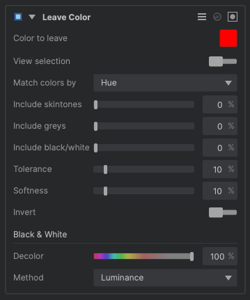
- Color to leave: The color which will not be desaturated is indicated by the swatch. Click the swatch to edit the color.
- View selection: Enable this option to see a black and white overlay, where white indicates areas where the selected coior is present.
- Match colors by: Select the method used to evaluate the colors in the image for a match to the selected color.
- Hue: Uses a standard RGB hue comparison.
- Lab: Uses LAB colorspace to evaluate the colors and determine the selection area.
- Include skintones: Allows you to add skintones to the selection, even if they are outside the selected color range.
- Include greys: Expands the color selection to include more midrange tones with low saturation values.
- Include black/white: Expands the color selection to include highlight and shadow areas with low saturation values.
- Tolerance: Extends the color selection, to include a wider range of colors bordering on the selected color.
- Softness: Feathers the selected color range to soften the edges of the color areas.
- Invert: Enabling Invert removes the selected color, and leaves all other colors unaffected.
Black & White
- Decolor: Specify how much the color data is reduced in the image.
- *Method:*Select the method used to generate the greyscale image used outside the selected color range.
- Luminance: The luminance value of each pixel is used to map its grayscale value.
- Intensity: The intensity of each pixel is used to map its grayscale value.
- Lightness: The lightness of each pixel is used to map its grayscale value.
- Black: All areas outside the color selection are filled with black.
- Red channel: The red channel of the image is used as the grayscale map for areas outside the color selection.
- Green channel: The green channel of the image is used as the grayscale map for areas outside the color selection.
- Blue channel: The blue channel of the image is used as the grayscale map for areas outside the color selection.
Mosaic
Creates a tiled mosaic appearance by dividing the image into tiles, averaging a color for each tile, then adding lighting give the tiles depth.
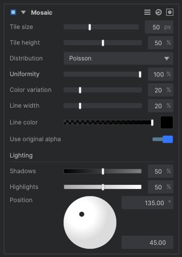
- Tile size: Defines the base tile size, in pixels.
- Tile height: Sets the height of each tile. Larger height values create a wider beveled edge around each tile.
- Distribution: Select the distribution method used to place the tiles. It is easiest to view the starting point of each distribution method if you set the Uniformity slider below to 100%
- Poisson: Distributes tiles in an organic, non-linear pattern, with some variation in the exact size and shape of each tile. Most tiles will have five or six sides.
- Square: Distributes square tiles in a grid.
- Hexagonal: Distributes six-sided tiles in a honeycomb pattern, with straight vertical lines.
- Uniformity: Adjusts the variation in shape and size from one tile to the next. The higher the value, the more uniform all tiles will be.
- Color variation: Adjusts how much the color of each tile will vary from the source image. At 0%, each tile will be filled with the average color of all pixels located within the tile’s area.
- Line width: Sets the width of the lines in between tiles, which simulate the grout which would hold an actual mosaic together.
- Line color: Choose the color for the grout lines. Use the slider to adjust the line opacity, and click the color swatch to open a color picker and select any color you desire.
- Use original alpha: Disable this toggle to allow the natural shape of tiles to extend beyond the alpha of the source layer. When enabled, all tiles along the edge will be trimmed to exactly follow the alpha edge.
Lighting
- Shadows: Sets the opacity of the shadowed tile edges.
- Highlights: Adjusts the opacity of the specular highlights on each tile. Reducing this value makes the tiles less shiny.
- Position: Define the positioning of the virtual light used to illuminate the tiles. The center of the circle represents a light position directly above the tiles. Drag the control handle toward the edge to create a more directional light, from any angle of your choosing.
Pixelate
Takes the image and applies an effect which looks like it was lower resolution and has been dramatically increased in size. Common use cases for it include hiding the identities of faces or number plates on cars.
![]()
- Size: Determines how big you want each pixel to be. It will then take the average color of the original pixels that was below them.
- Use original alpha: Allows you to not pixelate the alpha channel, but instead use the original alpha. This is useful if you want to pixelate the edges of say text.
Here is an example of the effect in action on a photo:
![]()
In the example below you will see pixelate applied to two pieces of text. On the left the Use original alpha is on. This means it will not pixelate the alpha channel and since the text has a solid color you do not see any difference over the original text. On the right you will see it with the Use original alpha off meaning it will pixelate the alpha channel and the edges of the text get pixelated as a result:
![]()
Posterize
Posterization is the process of reducing gradients into a small number of distinct color steps.

- Smooth source: Applies a blur to the source image, before the colors are posterized. Higher values create more blur.
- Levels: Specify the number of distinct color values that will appear in each color channel. This is not the total number of colors in the final image, due to the multiple combinations possible with three color channels.
- Smooth: Softens the transitional areas between posterized values, creating more subtle transitions between colors.
- Preserve Chroma: Determines to what degree the original chroma values are retained.
- Phase: Shifts the phase of the posterization effect.
- Channel Phase: Shifts the phase of the posterization within each individual color channel.
- Saturation: Adjusts the saturation of colors in the image.
- Black: Sets the threshold below which all values will be converted to black.
- White: Sets the threshold above which all values will be converted to white.
Solarize
Solarization is a behavior sometimes observed in overexposed traditional photography, wherein the brightest tones in an image are inverted. It was first observed in photographs of the sun, which is what led to the name.

- Threshold: Sets the threshold above which tonal values will be inverted.
- Saturation: Adjusts the saturation of colors in the image.
- Invert: Inverts the result of the effect.
- Brightness: Brightens or darkens the colors in the image.
- Offset: Shifts the entire range of tonal values up or down. Values shifted beyond pure black or pure white will be clipped.
Threshold
Converts the image to a two-tone color scheme, by colorizing the darkest areas to one color, and the brightest areas to another color.

- Channel: Choose the image channel that will be used to calculate the threshold.
- Threshold: Select the tonal value at which the split between the two colors will occur. Areas darker than the threshold will be filled with the shadow color. Areas brighter than the threshold will receive the highlight color.
- Transition: Softens the transition from one color to the other, centered at the threshold value.
- Median: Averages the values of the layer contents, to reduce noise in the transition area created by fine detail or contrast.
- Shadow Color: Choose the color that will be assigned to areas below the selected threshold. Click the swatch to open a color picker.
- Highlight Color: Choose the color that will be assigned to areas above the selected threshold. Click the swatch to open a color picker.
- Blend mode: Choose the blend mode that is used to blend the results of the threshold onto the layer.
- Blend opacity: Adjust the opacity of the rendered threshold effect. Reducing the value will allow more of the underlying layer to be visible.
Need more help with this?
Don’t hesitate to contact us here.