
Projections display
The following is displayed within the projections TAB:
| Tab | Output type | Description |
|---|---|---|
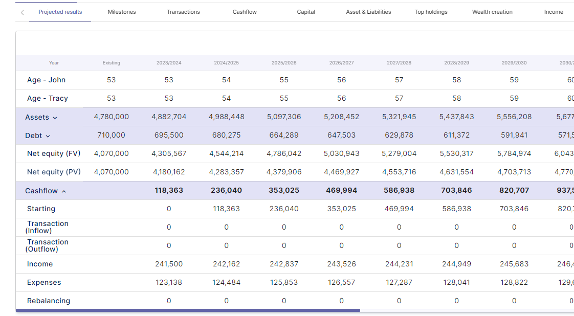
| Projected results | Table | Breaks down the projected net equity position for the life of the model. The table includes all assets, entities and debts. Cashflow transactions are also included to determine whether rebalancing has occurred year by year. |
| Milestones | Table | The milestone table allows you to display key events throughout a client/s lifecycle. This includes items such as; when objectives are achieved, net equity milestones, retirement debts, when is debt eradicated etc. |
| Transactions | Stacked column/area chart | The transactions table is a shapshot of all inflows and outflows each financial year grouped by; Transactions at the start of the year such as buying and selling assets, income earned throughout the year, expenses incurred and finally any end of year rebalancing items such as superannaution drawdowns and/or selling assets to meet expense requirements. Transactions are grouped as a stacked column chart and charted against the end value of the savings account. |
| Cashflow | Column/area chart | The cashflow chart displays income v expenses. It is designed to show all income for the year minus ongoing expenses. If the income area is higher than expenses, there is excess savings to direct to investment or debt reduction. If the expenses are higher than the income area, then the model will need to rely on capital drawdown to fund lifestyle requirements. |
| Capital | Stacked column/area chart | The capital chart plots assets and debts as a stacked column versus net equity as the area data set. Debt will be displayed as a negative. |
| Assets & Liabilities | Stacked column/area chart | Asset and liabiliteis chart breaks down assets into categories, such as superannuation, property and portfolio and plots the value versus total debt. The chart is shown as the combination of all entities. |
| Top holdings | Column chart | This chart displays the top 10 asset holdings across all products/entities. |
| Wealth creation | Stacked column/area chart | This chart maps the attribution as to how wealth or net is increaseing. Categories are broken down into savings, superannuation contributions, debt repayments and investment returns. |
| Income | Stacked column | The income chart breaks down the source of income over time. The categories are grouped into Salary, Investment, Age Pension & Superannuation |
| Expenses | Stacked column | The expense chart breaks down the source of expenses over time. Expenses are broken down into 10+ categories. |
| Property | Stacked column/area chart | The value of each individual property is shown via a stacked column chart and displayed against the debt attached to each property (area data set). |
| Debt | Stacked column | The value of each debt is shown via a line chart. |
| Superannuation | Stacked column | The value of each superannuation account is tracked over time. As a client moves from superannuation to pension, the chart will display the visual of accounts changing over time. |
| Contributions | Stacked column | Contributions are broken into contribution type and tracked over time. |
| Drawdown | Stacked column | The drawdown chart maps where capital is drawndown from over time. For example, a account based pension, portfolio selldown etc. |
Post your comment on this topic.