
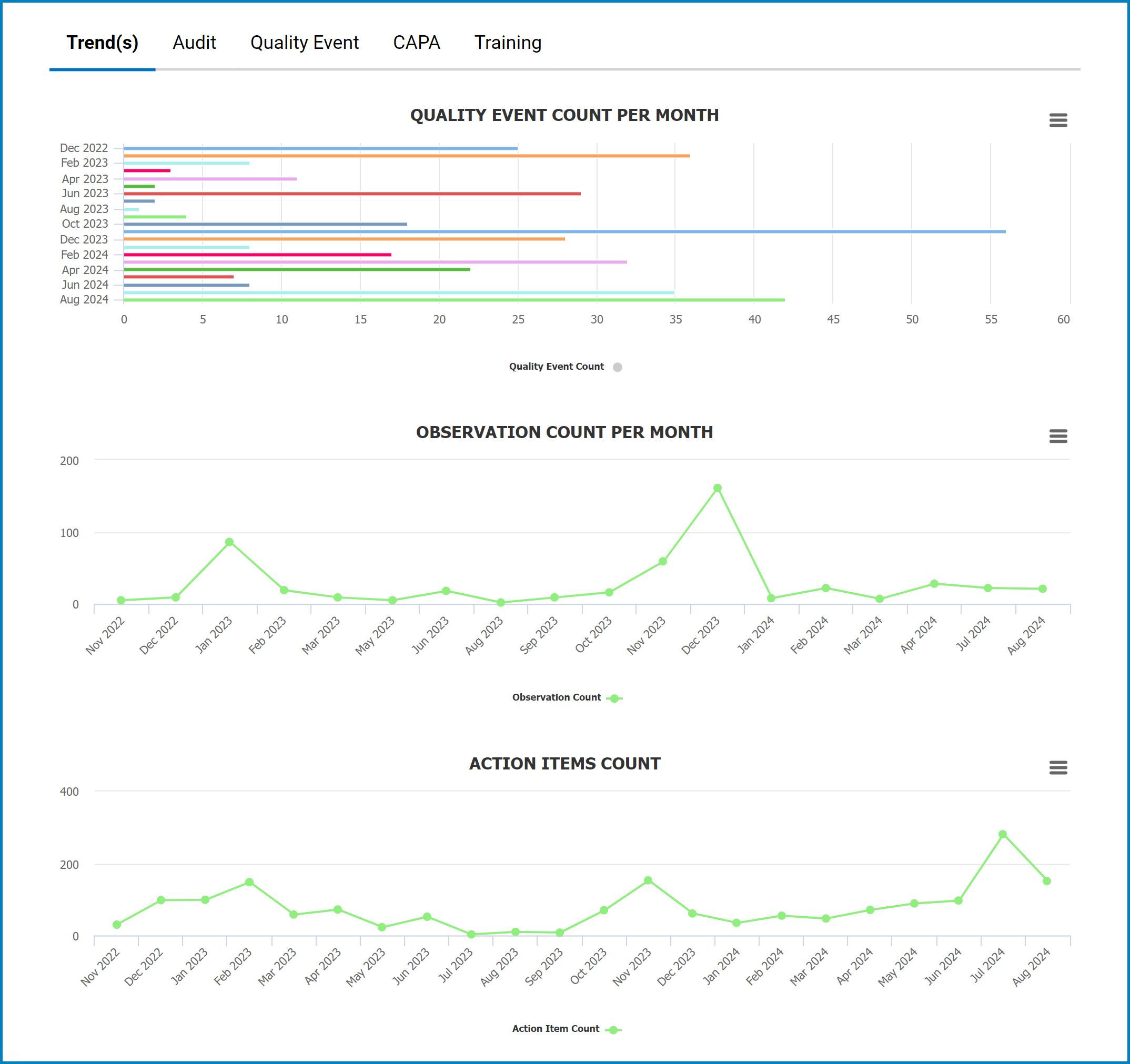
In this tab, users can access visual representations of data trends. These trends are derived from three applications inside the QMS suite: Quality Event, Audit, and Action Items.
- Chart Context Menus (
![]() ): These hamburger buttons, when clicked, reveal a menu with options for printing or downloading the chart.
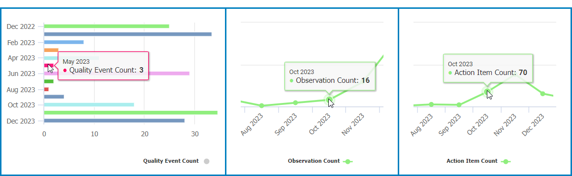
): These hamburger buttons, when clicked, reveal a menu with options for printing or downloading the chart. - Data Count: This quantitative data is accessed by hovering your cursor over different data points in the charts (e.g., bars in a bar chart, points in a line chart). It represents the number of items in each category.
![]()
- Drilldown Reports: These reports are accessed by double-clicking on specific data points in the bar chart.
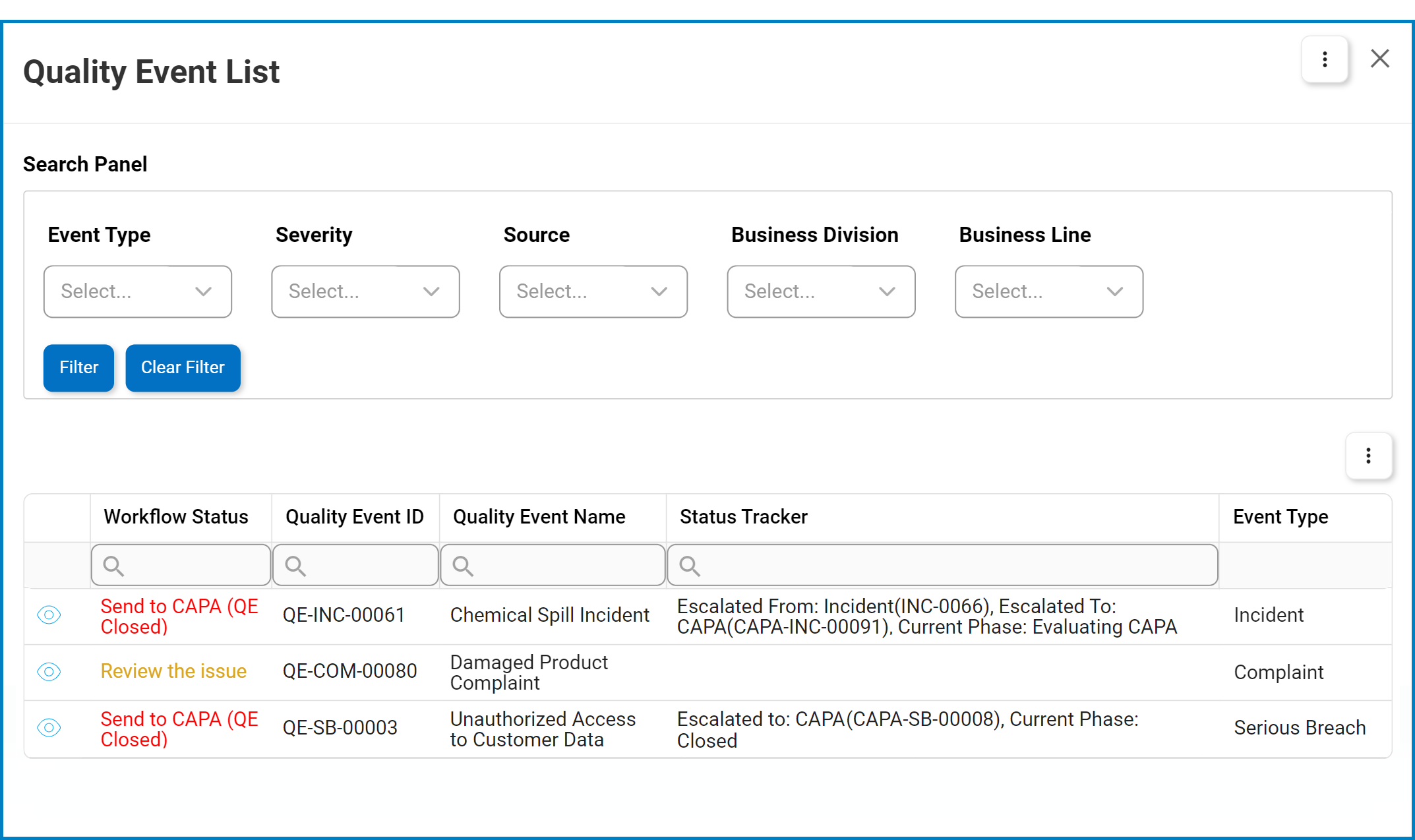
- For example, double-clicking the bar representing quality events created in March 2023 reveals the following modal window:
![]()
- For example, double-clicking the bar representing quality events created in March 2023 reveals the following modal window:
Post your comment on this topic.