
QR Design
You can customize the look and feel of the QR Code microsite and configure data fields using the form builder. As you make your changes to the design you will see the preview of the site update as well. Once you have configured your design options, you need to build the QR form in order to collect data.
- QR Microsite URL
- Design
- Text
- Header
- Description
- Footer
- Return Button
- Submit Button
- Single Use QR Code
- Payments
- Commands
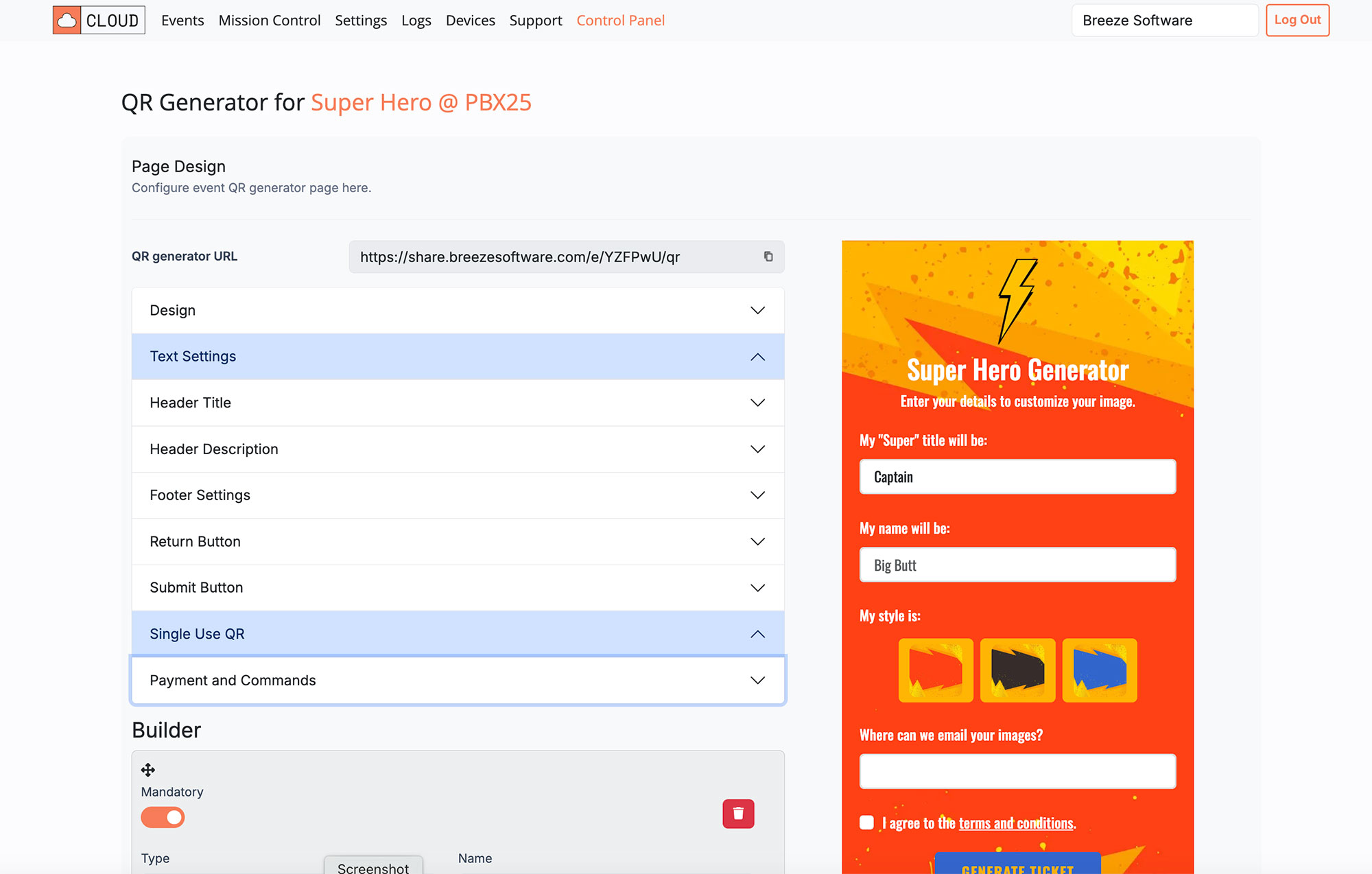
QR Generator URL
You can view your QR Microsite by copying the URL at the top of the designer.
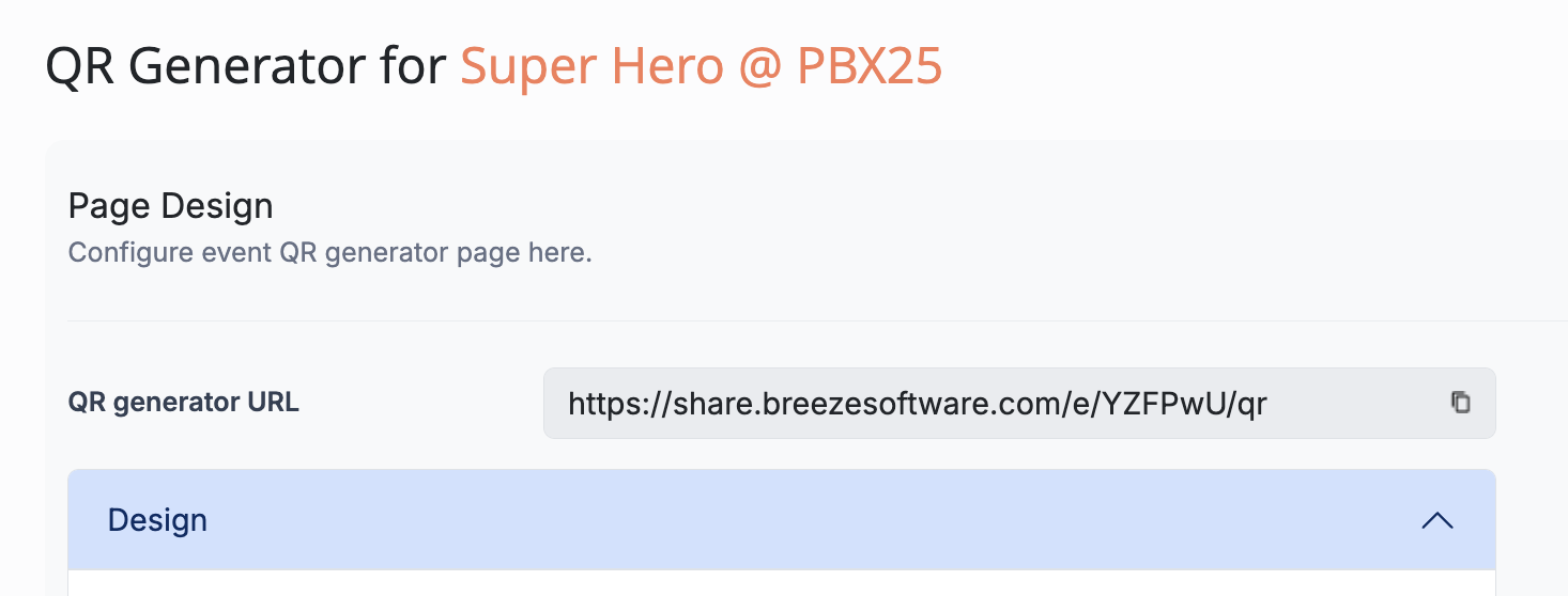
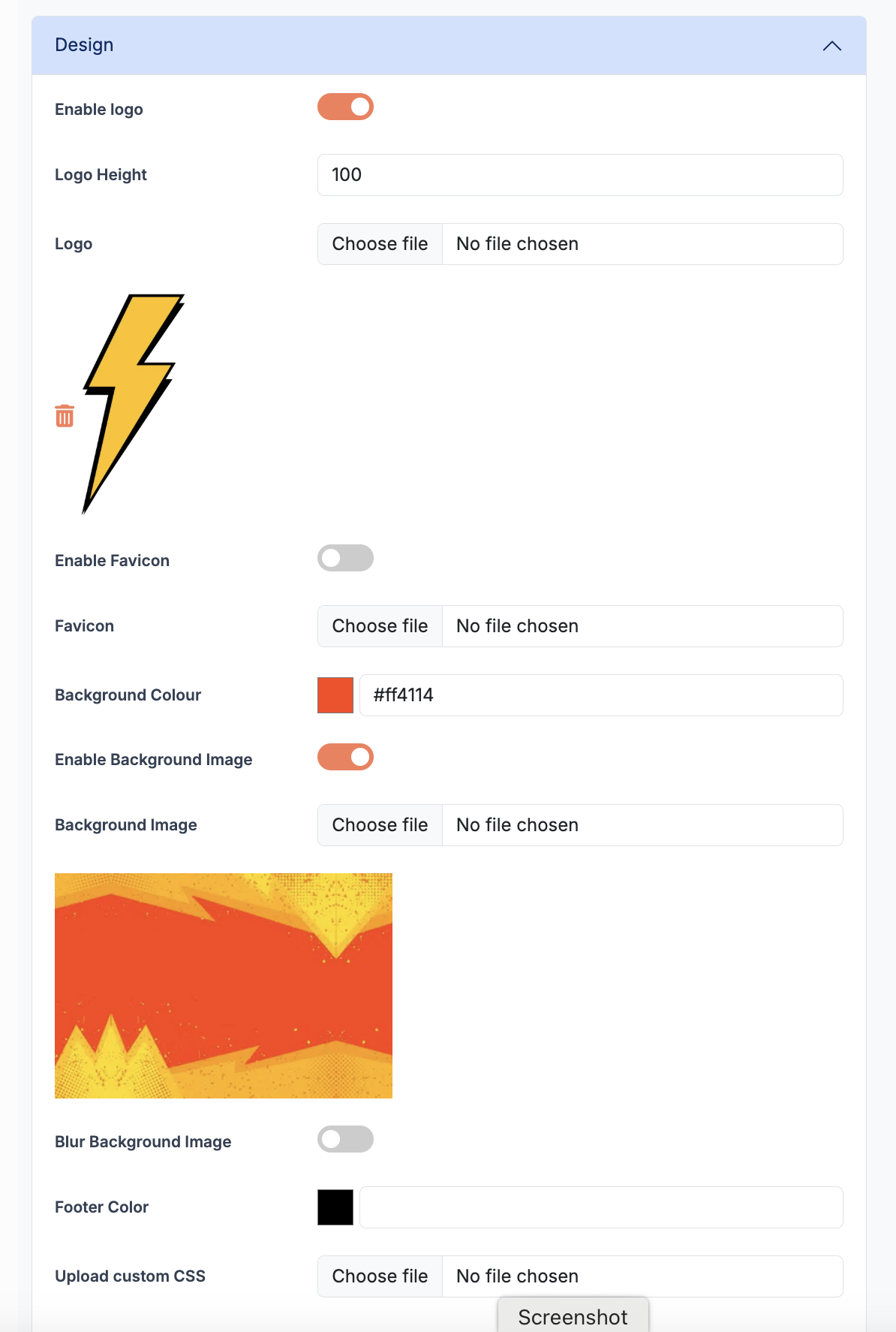
Design
The design options allow you to set the general look and feel of the microsite. This includes enabling logos, background images and using custom CSS.
| Option | Description |
|---|---|
| Enable Logo | Show / Hide a logo |
| Logo Height | Sets the height of the logo (width scales) |
| Enable Favicon | Optional browser tab logo |
| Enable Background Image | Optional microsite background image |
| Blur Background Image | Blurs the background image |
| Background Color | Set the background color |
| Footer Color | Set color of footer background. Leave blank for transparent |
| Upload Custom CSS | Upload custom style sheet to over-ride design styles |
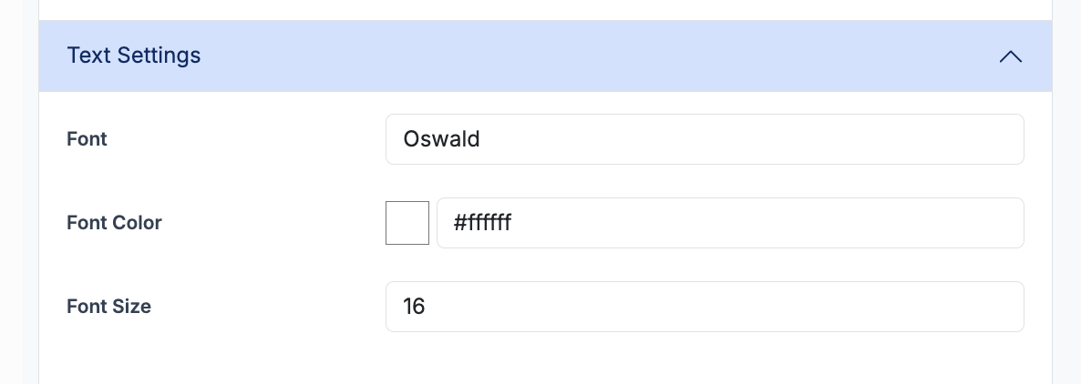
Text
Set the style of form titles and descriptions that appear above form elements.
| Option | Description |
|---|---|
| Font | Set the Form Description font style |
| Font Color | Set the Form Description font color |
| Font Size | Set the Form Description font size |
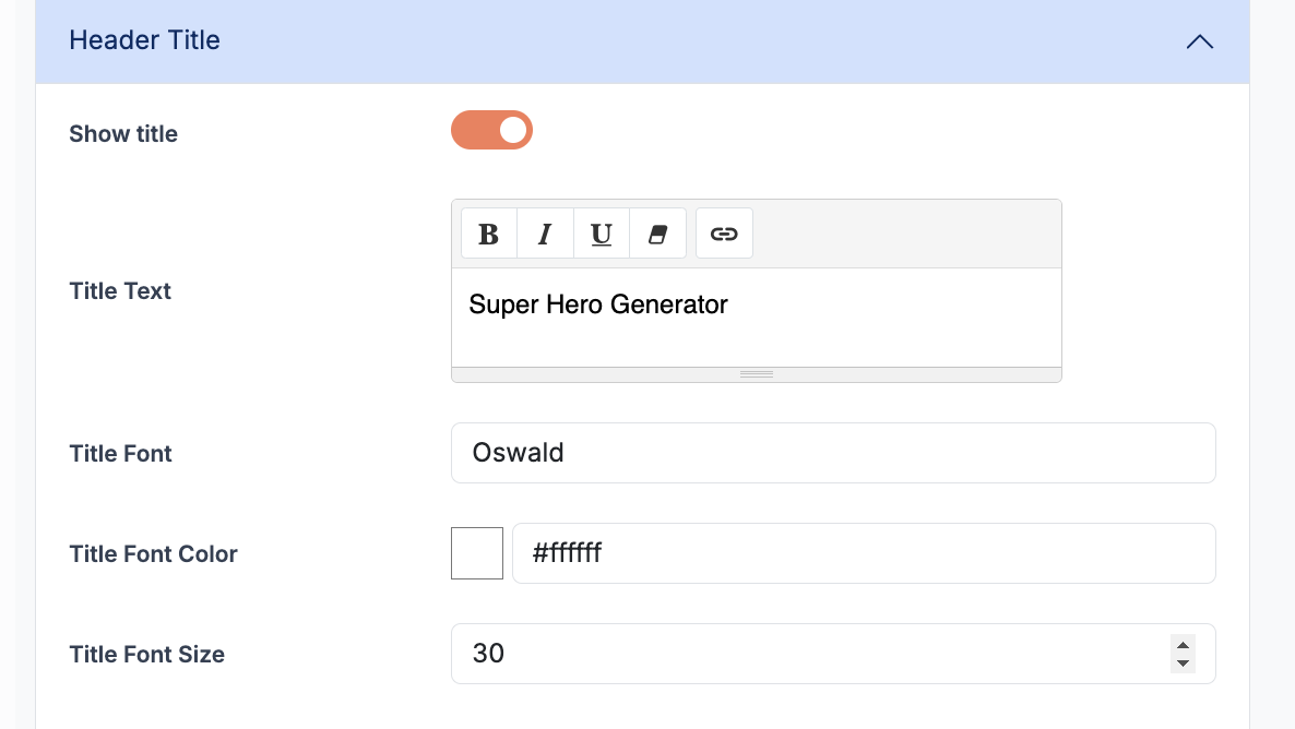
Header Title
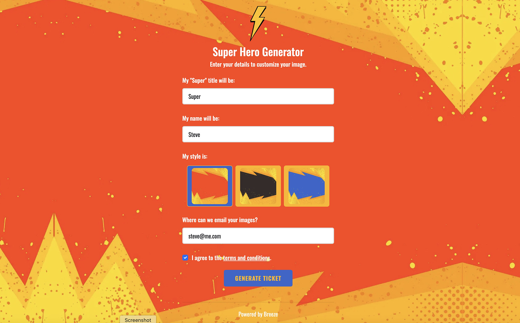
The Header Title is typically the same as the event name, but is not automatically set. The font type, color and size can also be adjusted.
| Option | Description |
|---|---|
| Show Header Title | Enable or Disable the Header Title |
| Title Text | Title of the QR Form eg: Super Hero Generator |
| Font | Set the Header font style |
| Font Color | Set the Header font color |
| Font Size | Set the Header font size |
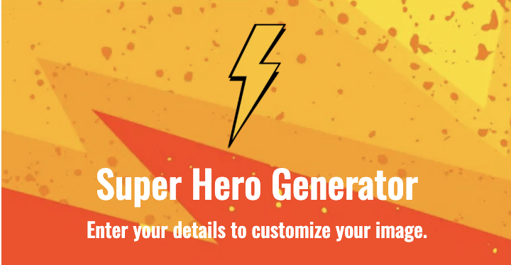
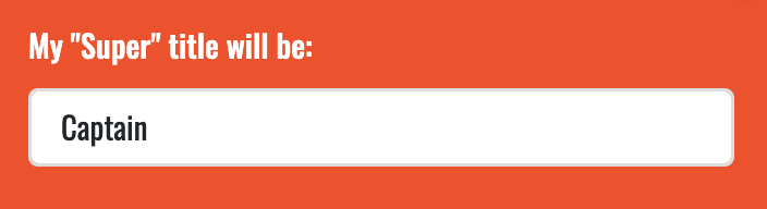
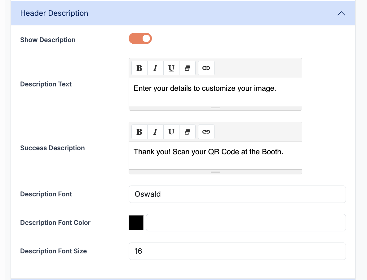
Description
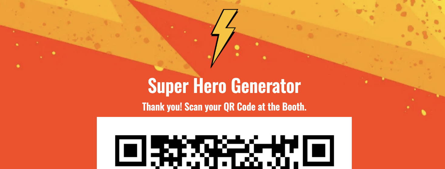
The Description is typically used to further explain what and how the QR code will be used. eg: Fill in your details to customize your image. The Success Description is displayed when when the QR code is generated, and typically explains what to do next. eg:_ Now scan your QR code at the photo booth_.
| Option | Description |
|---|---|
| Enable Description | Enable or Disable the Description |
| Description Text | Set the Description text on the form page |
| Success Description | Set the Description on the QR Success page |
| Font | Set the Description font style |
| Font Color | Set the Description font color |
| Font Size | Set the Description font size |
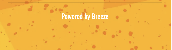
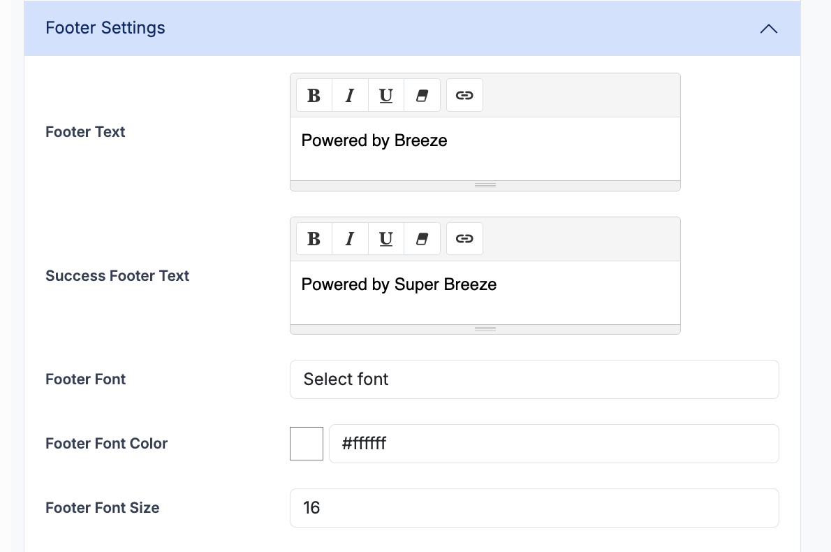
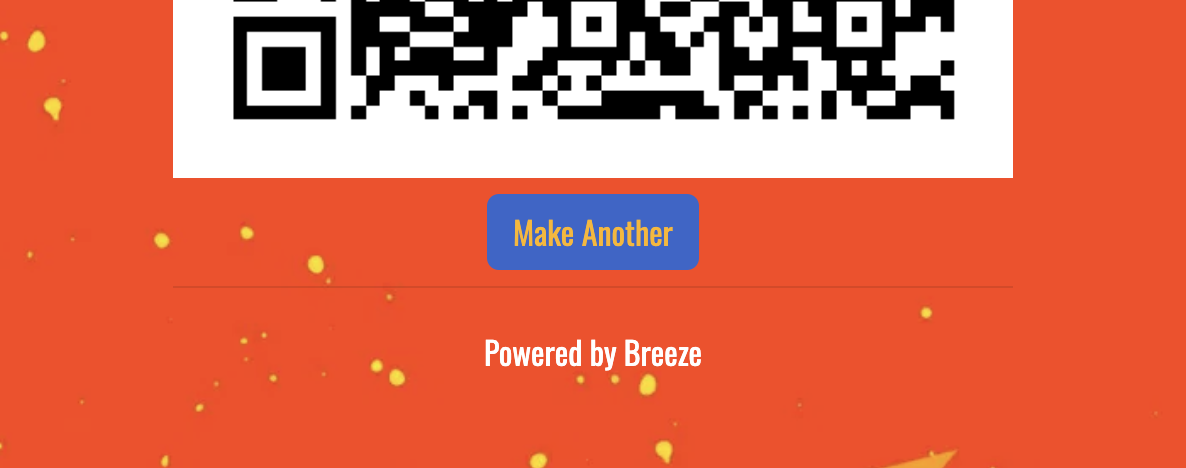
Footer
The footer appears at the bottom of the QR microsite. This is typically used as a “Powered by” link to promote the photo booth company. The font type, color and size can also be adjusted.
| Option | Description |
|---|---|
| Footer Text | Set the Footer text on the form page |
| Success Footer Text | Set the Footer text on the QR Success page |
| Font | Set the Footer font style |
| Font Color | Set the Footer font color |
| Font Size | Set the footer Font size |
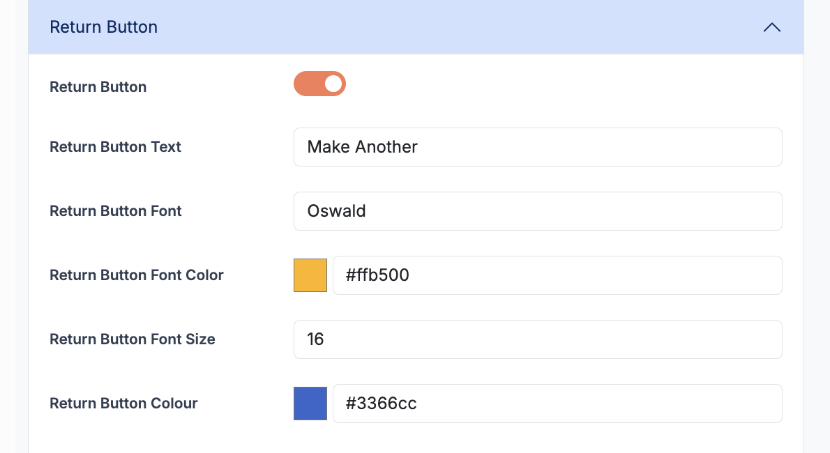
Return Button
The Return Button is an optional button that can be displayed on the page that shows the QR code. This is often used as a “Make Another” or a “Go Again” button.
| Option | Description |
|---|---|
| Enable Return Button | Enables or Disable the Return Button |
| Return Button Text | Set the Return Button Text |
| Return Button Font | Set the Return Button Font Style |
| Return Button Font Coloe | Set the Return Button Font Color |
| Return Button Font Size | Set the Return Button Font Size |
| Return Button Color | Set the Return Button Color |
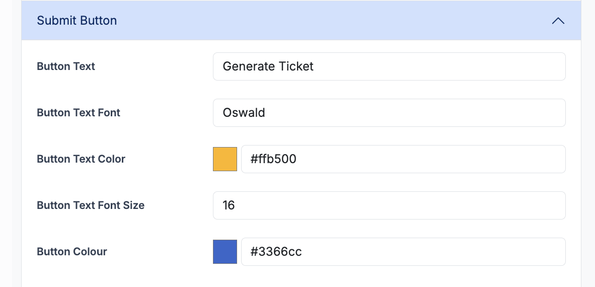
Submit Button
The submit button is displayed at the end of the QR form. Users select this to submit their options. On submission, they will be redirected to their QR code. The button color and font styles can be adjusted.
| Option | Description |
|---|---|
| Button Text | Set the Button Text eg: Generate QR |
| Button Font | Set the Button Font Style |
| Button Font Color | Set the Button Font Color |
| Button Font Size | Set the Button Font Size |
| Button Color | Set the Button Color |

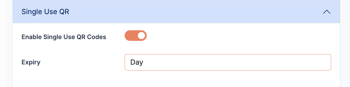
Single Use QR Codes
Single Use QR Codes are a special type of QR code that can only be used once at the photo booth. These are ideal when used in conjunction with payments, or sold as a “ticketed” experience. QR Codes can also be set to expire after 1 minute, 1 hour, 1 day, 1 week, 1 month or 1 year.
| Option | Description |
|---|---|
| Enable Single Use | Enable or Disable Single Use QR Codes |
| Expiry | Set the expiry length |
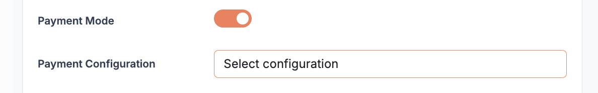
Payments
You can charge for generating QR codes by enabling Stripe Payments. When the user submits their QR form, they will be redirected to a Stripe checkout page. On successful payment, they will then be redirected to the “Success” page displaying the QR Code. When accepting payments, the QR code can also optionally be Single Use.
| Option | Description |
|---|---|
| Enable Payment | Enable or Disable Collecting Payments |
| Payment Configuration | Select the Payment Configuration |
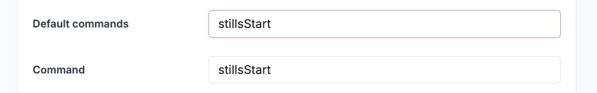
Commands
When the QR code is generated, you can optionally configure a touch screen action (command) to be sent to the booth. This is typically an action to start the countdown (eg: stillsStart or Photo Start) but could also be used to switch profiles or send any other touch screen action. You can select one of the predefined commands from the drop down list, or, manually enter the command in the Command field. Any spaces or capital letters will be automatically removed in the QR code.
| Option | Description |
|---|---|
| Default Command | Choose from list of available commands |
| Command | Manually enter the touchscreen command |