
Color grading effects are for giving your project a unique visual style.
Bleach Bypass
 Bleach Bypass is available in the Color: Looks Pack.
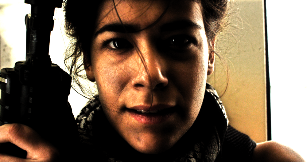
Bleach Bypass simulates the harsh, high contrast look of bleach bypass film processing. Often used for war movies. Bleach bypass takes its name from a technique used to develop color film stock. By skipping the bleaching step in the development process, the silver in the film emulsion is retained, resulting in a black-and-white image laid over the color image. The final image has reduced saturation, and increased contrast and graininess.
- Amount: The intensity of the Bleach Bypass effect applied to your source video.
- Brightness: Adjusts the brightness of the video. Actual film is typically shot 1 stop underexposed to prepare for bleach bypass processing, to compensate for the brightening that occurs during the process. This slider allows you to compensate for the brightness of your source video to get the result you want.
- Silver Source: You can change the source used to create the Silver map used by the bleach bypass here. Choose the Intensity of the image, the Luminosity of the image, or the Lightness of the image. This is a case where its best to just try the options, and see which one gives the most pleasing result.
Cine Style
Cine Style is available in the Color: Cine Pack.
Using an s-curve shift, cine style creates a cinematic, Hollywood-style look. It is a fast method for achieving a professional, high quality finish. While it offers a rapid grade, it still provides controls for fine tuning the appearance. Cine style includes built-in Grain, Vignette and Letterboxing features. These can be turned on or off independently, to create your desired final look.
- S-Curve: Adjusts the contrast of the image, by applying an s-curve based on the Curves effect.
- Color Adjustment: Controls the color shift applied to the image, which boosts contrasting colors, By default, it pushed toward the teal and orange palette popular in Hollywood blockbusters, but this can be changed using the Color Adjustment Settings below.
Color Adjustment Settings
- Shift: Adjusts the midpoint of the map used to apply the colors to the image.
- Hue: The primary hue toward which the color will be shifted.
- Exposure: Adjust the exposure of the image. Use this control and the S-Curve control to find the balance of contrast and brightness that you need.
- Saturation: Increases the color intensity within the image.
2.35:1 Letter Box
Cinematic films often use a wider aspect ratio than standard 16:9 video cameras. You can add a Letter Box to your video to give it a more cinematic look.
- Enabled: Toggles the letterbox on and off.
- Offset: Adjusts the vertical position of the video, so you can ensure the most important elements of the frame are visible within the letter box.
Grain
The film stock which was used traditionally on Hollywood films, and from which films take their designation, often has a characteristic grain which is often lacking in video. Adding subtle grain can help your video have a more filmic appearance.
- Enabled: Toggles the Grain on and off
- Amount: The intensity of the Grain effect.
- Size: The size of the grain. Grain is generally of a similar size, but its size relative to the frame will vary based on the size of the film. So grain in 8mm film will appear larger than grain in 35mm film. Adjust the size here to get the look you are after.
- Monochrome: Toggles between full color grain and grain that is black and gray only.
- Seed: Each seed gives a different random pattern to the grain.
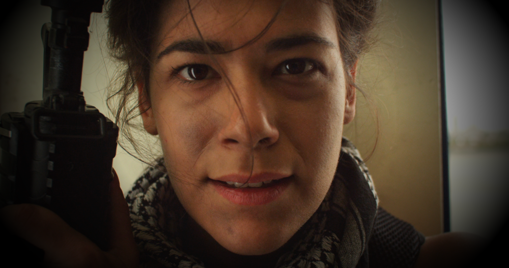
Vignette
Some camera lenses cause a vignette distortion which darkens the corners of the frame. These controls can be used to simulate that look, or simply to bring more focus to the center of the frame by darkening the edges.
- Enabled: Toggles the Vignette on and off.
- Center: Controls the positioning of the vignette over the frame.
- Position: By default the vignette is centered on the frame, but you can reposition the center anywhere within the frame
- Use Layer: This menu allows you to select any other layer on the timeline, and use its position coordinates as the center of the vignette.
- Horizontal Stretch: Adjusts the width of the vignette.
- Vertical Stretch: Adjusts the height of the vignette.
- Softness: Controls the width of the feather applied to the edges of the vignette.
- Curvature: Changes the radius used in the corners of the vignette effect
- Opacity: Adjusts the transparency of the image within the vignette
- Background: These settings control the generation of the vignette itself.
- Opacity: Adjusts the opacity of the vignette color applied to the image.
- Color: Select the color which will be used by the vignette. Black is the default.
Classic Cine Style
Classic Cine Style is available in the Color: Cine Pack.
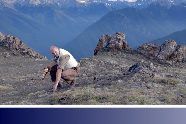
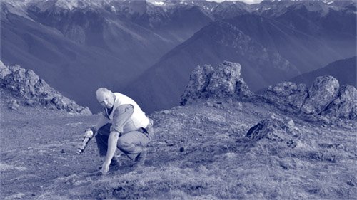
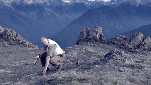
This effect is all about recreating retro film looks. It includes several presets and can also be fully customized. Here’s an example of a preset recreating the look from 1950 film Gentlemen Prefer Blondes:
Controls
- Preset: The built-in presets give you a variety of starting points, based on the look of classic films.
- 2-Strip – The Gulf Between (1917)
- 2-Strip – The Toll of the Sea (1922)
- 2-Strip – Kodak (1928)
- 3-Strip – On With The Show (1929)
- 3-Strip – Gentlemen Prefer Blondes (1950)
- 2-Strip – Aviator
- 3-Strip – Aviator
- *S-Curve:*Alters the contrast of the layer, based on a s-curve which alters the shadows and highlights more than mid-tones, while limiting clipping in the extreme values.
- Exposure: Allows you to brighten or darken the exposure of the layer.
- Saturation: Increase or decrease the color intensity of the layer.
- Black: The black point of the resulting image can be set using the color picker, or by manual selection.
- White: The white point of the resulting image can be set using the color picker, or by manual selection.
- Defocus Blur: blurs the image in a manner that replicates the look of a lens being out of focus.Subtle applications of defocus can help replicate the look of very old film.
Grain
Adds grain to the image to replicate film stock. Choose a preset as a starting place, then adjust the controls to fine tune its appearance.
- Film Size: The smaller the film, the larger the grain will appear in the image.
- 8mm
- 16mm
- 32mm
- Grain Strength: Increase the strength to make the grain more obvious. In most cases, relatively low settings are best.
- Seed: Change the Seed value to randomize the grain pattern.
Red, Green, Blue
Each channel can be adjusted individually using the following controls.
- Density: Increases the intensity of the relevant color channel.
- Hue: Shifts the hue of the relevant color channel around the color wheel.
- Hue Range: Increases or decreases the range of hues affected by the adjustment.
- Exposure: Brightens or darkens the relevant color channel.
- Gamma: Changes the luminosity of the relevant color channel using a nonlinear algorithm.
- Negative: Shifts the colors of the areas outside of the relevant color channel. By default the values here are the opposite of the color channel being edited, but you can change the color values to add color into those areas.
- Output Strength: Sets the overall strength of the relevant color channel, after all adjustments are applied.
Output Gamma
- Red: Adjust the balance between the three color channels in the layer. Values above 1.0 shift the image toward red.
- Green: Adjust the balance between the three color channels in the layer. Values above 1.0 shift the image toward green.
- Blue: Adjust the balance between the three color channels in the layer. Values above 1.0 shift the image toward blue.
Letter Box
- Enabled: Toggles the letterbox on or off.
- Ratio: Sets the size of the image inside of the letterbox. The value is the width, applied as a ratio to a height of 1.
- Offset: Shifts the visible image inside of the letterbox. If the ratio creates a pillarbox, with black bars on the left and right, then the image will be offset horizontally. If the ratio creates a letterbox with black bars at the top and bottom, the video will be offset vertically.
Vignette
- Enabled: Toggles the vignette on or off.
- Center: Sets the location of the vignette’s center.
- Position: Define the position of the center on the X ands Y axes.
- Use Layer: Select another layer from the timeline to use its position as the center. When a layer is selected here, the Position property above functions as an offset, based on the position of the selected layer.
- Horizontal Stretch: Adjusts the width of the vignette.
- Vertical Stretch: Adjusts the height of the vignette.
- Softness: Defines the distance from the center to the start of the feather.
- Curvature: Shifts the distance from the center to the mid-point of the feather. Lower values give a mire subtle effect.
- Opacity: Determines how opaque or transparent the layer itself is.
- Background: Defines the color fo the vignette
- Opacity: Determines how opaque or transparent the vignette areas are.
- Color: Choose the color of the vignette. You can use the eyedropper to choose a color from the layer, or click the swatch to open a color picker and choose any color you prefer. You can also manually enter the color values for the red, green, and blue channels.
Color Cycle
Color cycle loops the color palette. Adjusting the phase shift will cause the colors to cycle. Each color can be adjusted individually, including adjusting its alpha transparency. This can therefore be used to generate mattes based on specific color ranges. It includes numerous Cycle Presets for quickly generating specific looks, such as this hue cycle:
Input Phase
- Phase From: Select which channel from the source is used to map through the color cycle.
- Add Phase: And additional phase shift can be added, based on a second layer on the timeline.
- Layer: choose the layer to be used as a source for the added phase shift.
- Phase From: Select which channel from the selected layer is used to map through the color cycle.
- Mode: Choose the mode used to combine the Add Phase with the primary Input Phase.
- Phase Shift: Adjusting the phase shift will cause the colors to cycle.
Cycle
- Cycle Preset: Choose from a number of predefined presets that create specific looks.
- Number of Colors: Choose the number of colors used in the cycle. The default is 4. There will be controls displayed below for as many colors as you set in this property.
- Color 1: The number of colors you see controls for will correspond to the value in the Number of Colors property above. The controls for each will be the same.
- Phase: Set the number of degrees by which the colors will be shifted around the color wheel.
- Color: Choose the color to be used as the basis for this stage of the cycle
- Alpha: Set the opacity of the color. Lower values make the color more transparent.
- Color 1: The number of colors you see controls for will correspond to the value in the Number of Colors property above. The controls for each will be the same.
- Cycle Repetitions: Set the number of times the defined color cycle will be applied to the selected channel.
- Interpolate Palette: When enabled, this property allows for gradual transitions between colors. When disabled, there will be a harder transition from one color to the next.
Output
- Channels: Select the channel or channels that will be displayed in the output. Only one option from the menu can be selected at a time, but some options include multiple channels.
- Alpha: Select how the original alpha of the image will be combined with the alpha generated by the effect.
- Composite Over Layer: Enabling this option places the results of the Color Cycle above the source layer before calculating the final values.
- Blend With Original: Adjusts the intensity of the final effect.
Masking
- Masking Mode: Select the option used to define how the results will be masked onto the original source layer.
- Pixel Distance: Allows masking based on the colors present within the image. Selecting this option opens the Pixel Distance controls below.
- Layer: Allows masking based on another layer on the timeline. Selecting this option opens the Layer Selection controls below.
- Both: Combines Pixel Distance and layer masking. Selecting this option opens both the Pixel Distance and Layer Selection controls below.
- Pixel Distance
- Color: Select a color to which the color cycle will be applied.
- Tolerance: Higher tolerance values will include a greater range of colors surrounding the selected Color value.
- Softness: Higher values soften the edges of the selected range, so the transitions are softer.
- Mode: Choose between RGB or Hue modes for different results.
- Layer Selection
- Layer: Choose another layer on the timeline to be used as the source.
- Channel: Select which channel from the selected layer is used to map through the color cycle.
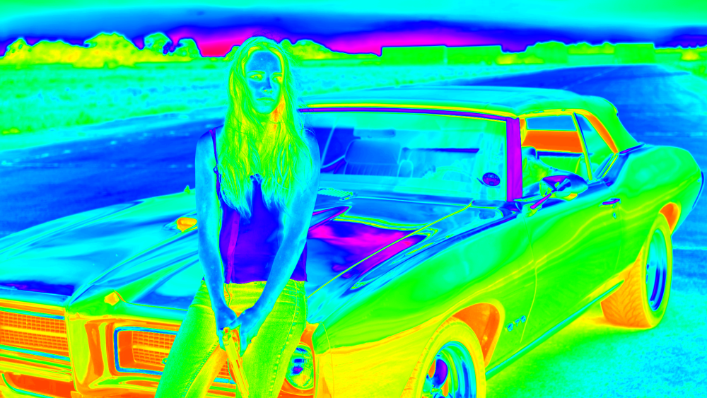
Color Map
The color map effect can be used to apply a color range from one layer to another layer. This is most commonly used with a color gradient. In the following example we will use this image, and color gradient:
The images below show the result of mapping the color gradient onto the image.
The left image shows the full effect of the color map, with the original colors mapped to the new blue gradient. The right image shows the color mapped version blended back onto the original to create an appealing color grade. This was done by applying the Color Map to a grade layer, and reducing the transparency of the grade layer.
- Color Map: Choose the layer whose contents will be used to generate the color map.
The X axis and Y axis property groups define how the color map source is mapped onto the layer. The X axis controls take the colors found in the selected layer from left to right and map them onto the target image. The Y axis controls take the layers found in the selected layer from top to bottom and map them onto the target image.
X Axis
- Coordinates From: Choose the channel whose values will be used to map the color source onto the target image.
- Clip Black: Increasing the Clip Black value darkens the shadow areas of the image.
- Clip White: Reducing the Clip White value brightens the highlights of the image.
- Target Black: Increasing the Target Black value lightens the shadow areas of the image.
- Target White: Reducing the Target White value darkens the highlight areas of the image.
Y Axis
- Coordinates From: Choose the channel whose values will be used to map the color source onto the target image.
- Clip Black: Increasing the Clip Black value darkens the shadow areas of the image.
- Clip White: Reducing the Clip White value brightens the highlights of the image.
- Target Black: Increasing the Target Black value lightens the shadow areas of the image.
- Target White: Reducing the Target White value darkens the highlight areas of the image.
Color Phase
Color Phase is available in the Color: Starter Pack.
Each color channel can be phased, shifting it to a different color range. The controls rotate the phase around the color wheel, based on the angle value you specify.
- Red Phase: Shifts the hue of the red channel, without affecting the green or blue channels.
- Green Phase: Shifts the hue of the green channel, without affecting the red or blue channels.
- Blue Phase: Shifts the hue of the blue channel, without affecting the red or green channels.
- Overflow: Defines how out of range colors are handled.
- Wrap: The color spectrum functions as a circle, and when the end is reached, it wraps back to the beginning.
- Solarize: Out of range values are inverted.
Color Vibrance
Color Vibrance is available in the Color: Looks Pack.
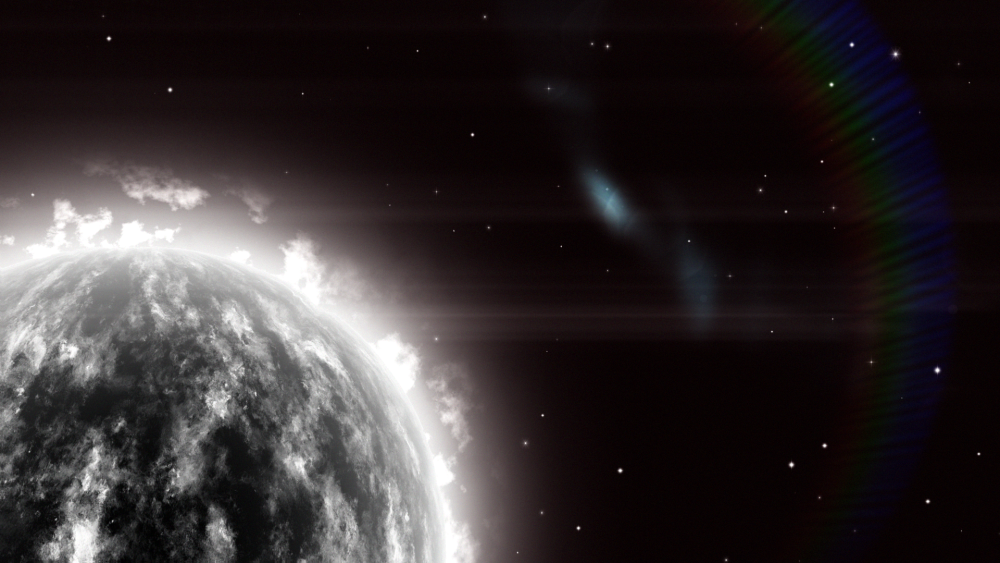
This effect is ideal for adding color to greyscale, procedural effects such as particles and textures. Here is a grayscale fiery planet created using a combination of fractal noise and sphere effects inside HitFilm:
Here’s the same shot with color vibrance applied:
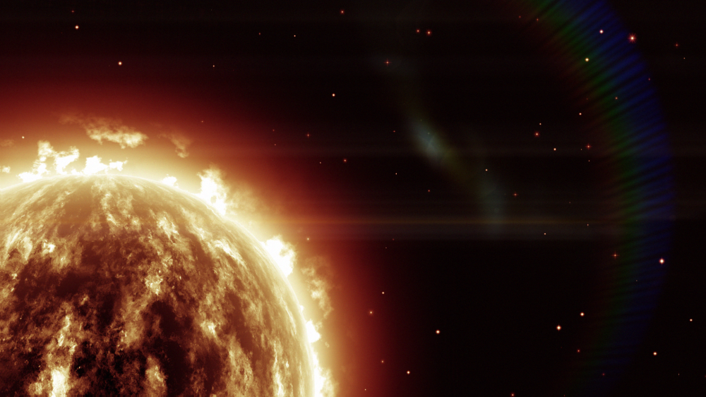
Color vibrance is particularly effective at retaining detail in bright areas without creating excessive bloom. The strength of the vibrancy and the luminance preservation can be adjusted, as can the color and phasing of the effect.
- Preset: Several presets are provided which can be used as starting points for your adjustments.
- Color: Select the base color which will be applied to the layer.
- Vibrance: Sets the intensity of the colorization.
- Phase: Shifts the hue of the colorization.
- Preserve Luminance: Defines how much the total luminance of each pixel is affected by the colorization. Higher values retain more of the original luminance, while lower values allow the added color to alter the luminance value if necessary.
- Exposure: Brightens or darkens primarily the highlights of the image, with minimal effects on the shadows.
- Offset: Brightens or darkens the shadow areas of the image, with minimal effects on the Highlights. Start with minor adjustments, as excessive changes here can create unnatural results.
- Gamma: Brightens or darkens the midtones of the image.
- Invert: Inverts the color values of the colorized image.
- Generate Matte: Creates a matte based on the colorization.
Day for Night
A quick way to convert a shot filmed in the day to having the appearance of being filmed at night. Day for Night applies a gradient based on the Horizon property, with separate controls for the near and far areas.
- Horizon: Sets the position of the horizon line, dividing the Near colorization and Far colorization of the image.
Near
The Near controls are used to set the appearance of your subject and foreground; the area below the horizon line, which will often have a blue cast for a night scene.
- Red Gamma: Defines the amount of red in your foreground.
- Blue Gamma: Defines the amount of blue in your foreground.
- Brightness: Increases or decreases the brightness of your foreground.
- Saturation: Adjusts the intensity of the color in the affected image.
Far
The Far controls alter the area above the horizon, which should usually be quite dark for a convincing night scene.
- Gamma: Adjusts the darker areas of the background.
- Brightness: Adjusts mainly the brighter areas of the background.
- Hue: Selects the hue toward which the background will be tinted.
Duo Tone
Duo Tone is available in the Color: Looks Pack.
Creates a two tone look, based on two specified colors. A gradient from one color to the other is mapped onto the tonal range of the image.
- Preset: Choose from a variety of preset color combinations.
- Color 1: Choose the color to be mapped onto the highlights of the image. Click the swatch to open a color picker and chose any color. You can also use the eyedropper to select a color from the Viewer, or manually enter the RGB values for your desired color.
- Color 2: Choose the color to be mapped onto the shadows of the image. Click the swatch to open a color picker and chose any color. You can also use the eyedropper to select a color from the Viewer, or manually enter the RGB values for your desired color.
- Invert: Inverts Color 1 and Color 2. If you realize you need to swap the colors, you can do so easily with this toggle.
- Threshold: Shifts the mid-point of the gradient, to adjust the location of the color split in the image’s brightness range.
- Softness: Adjusts the overall contrast of the altered image.
- Blend With Original: Combines the duo tone effect with the original colors of the image. The percentage indicates how much of the original image is included.
- Brightness Used: Select the channel that will be used to determine the brightness and map the Duo Tone onto the original image. Choose between Intensity, Lightness, or Luminosity.
Grading Transfer [Layer Only]
Grading Transfer is available in the Color: LUT Pack.
Matches the look of one layer to another layer. This is a quick way to grade based on an existing source. The transferred grade can then be further customized, either globally or within specific tonal ranges.
Global Transform
Adjusts the entire layer as a whole, affecting all tonal ranges equally.
- Brightness Shift: Controls how much of the selected layer’s brightness is transferred.
- Chrominance Shift: Controls how much of the selected layer’s color data is transferred.
Shadow Transform
Adjusts the darkest values of the layer, without altering the mid-tones or highlights.
- Brightness: Controls how much of the selected layer’s brightness is transferred in the shadow areas.
- Chrominance: Controls how much of the selected layer’s color data is transferred in the shadow areas.
Midtones Transform
Adjusts the middle tonal values of the layer, without altering the shadows or highlights.
- Brightness: Controls how much of the selected layer’s brightness is transferred in the mid-tone areas.
- Chrominance: Controls how much of the selected layer’s color data is transferred in the mid-tone areas.
Highlights Transform
Adjusts the brightest values of the layer, without altering the shadows or mid-tones.
- Brightness: Controls how much of the selected layer’s brightness is transferred in the highlight areas.
- Chrominance: Controls how much of the selected layer’s color data is transferred in the highlight areas.
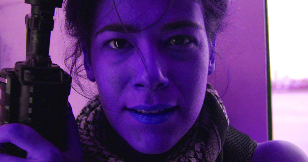
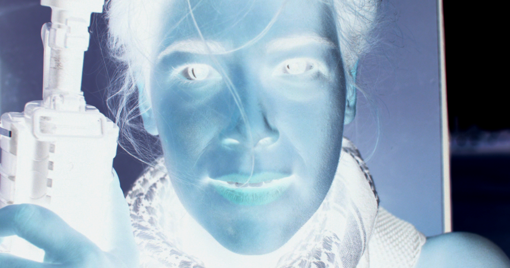
Hue Colorize
Applies a single user-selected hue to the layer. The tonal value of each pixel is retained, and only the hue is adjusted.
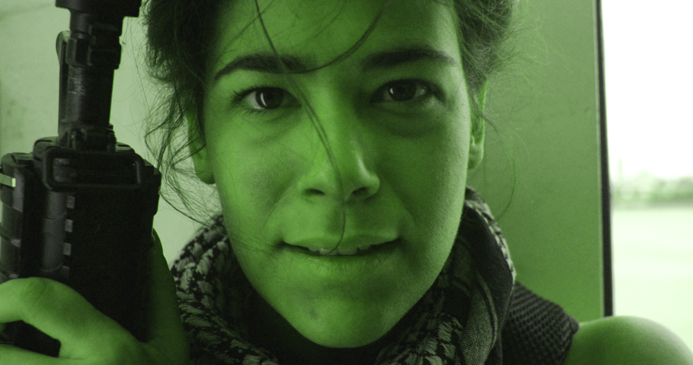
- Preset: Choose from a variety of hue presets as a starting point.
- Hue: Select any hue on the color wheel, by shifting the angle of the wheel.
- Hue Strength: Adjust how far the original color is shifted toward the selected hue.
- Saturation: Changes the color intensity of the colorized image.
- Lightness: Changes the lightness of the colorized image.
Hue Shift
Moves the entire color spectrum of the layer through different hues.
- Preset: Choose from a variety of hue presets as a starting point.
- Hue Shift: Adjust how far the original colors are shifted around the color wheel.
- Saturation: Changes the color intensity of the colorized image.
- Lightness: Changes the lightness of the colorized image.
Invert
Inverts the colors. There are no controls; just toggle the effect on or off to control the inversion.
LUT
LUT is available in the Color: LUT Pack.
LUT files are used to transform color values, which helps to ensure accurate color correction across multiple software and hardware setups. LUT also provides a powerful way to provide a one-click grade, simulating specific film stocks and processing techniques. Applying a LUT to flat footage can produce high quality results very quickly.
The LUT effect can import .cube LUT files.
Take a look at this comparison:
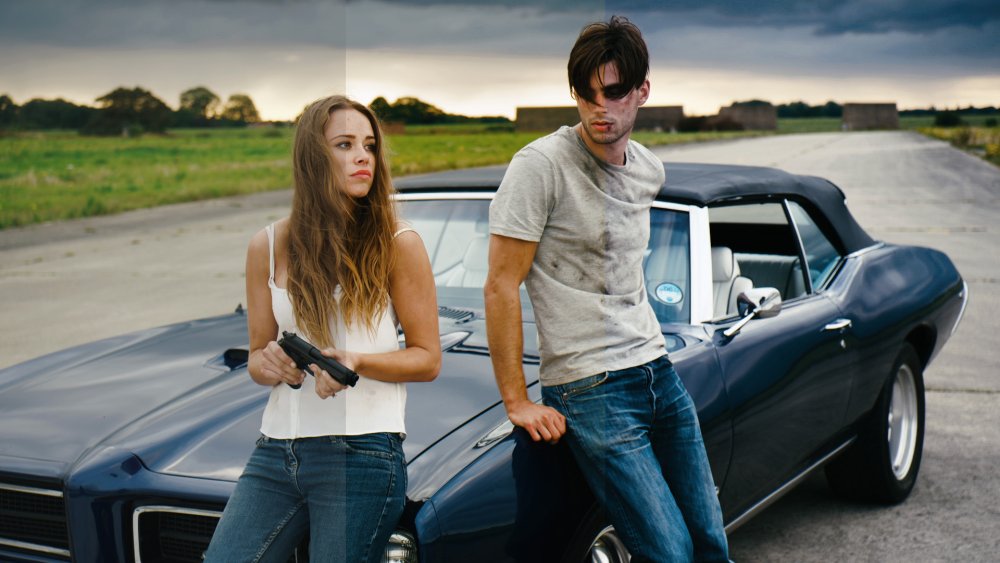
On the left is the original footage, which was purposely shot to be ‘flat’, providing a neutral starting point for the grade.
The middle image is using a LUT designed to mimic the look of KODACHROME film. The only additional alteration that has been made is to slightly reduce the saturation. In about 10 seconds you can got from a basic flat look to a highly dramatic and filmic grade.” Find out more about KODACHROME and grab the LUT here.”:https://frankglencairn.wordpress.com/2014/01/15/everything-looks-better-on-kodachrome-k-tone-lut/
The image on the right is using a Kodak 2393 emulation LUT, Again, you can achieve a good film look with literally a couple of clicks, and note how different this look is to the KODACHROME. You can download several film emulation LUTs and find some great behind-the-scenes info here.
Using LUTs
1. Add the LUT effect to your layer, from the Effects panel.
2. In the controls for the LUT effect, click the Folder icon  to the right of the LUT File property.
3. In the File browser that opens, navigate to the .cube file that you wish to use, and select it.
The LUT will be applied to your layer, and the path to its location will be shown in the effect controls.
Shadows & Highlights
Shadows & Highlights is available in the Color: Starter Pack.
Provides fine control over the visible detail in the extremes of the layer’s tonal range.
- Shadow Amount: Raises the tonal value of the shadow areas, to reveal detail that is hidden in the shadows.
- Highlight Amount: Lowers the tonal value of the highlight areas, to reveal detail that is blown out.
Shadow
- Tonal Width: Determines the range of tones that will be included in shadow adjustments. Higher values will include more midtones and brighter areas.
- Radius: Defines how many surrounding pixels will be averaged in when adjusting shadow areas.
- Black Clip: Pushes all areas at or below the selected tonal value to pure black.
Highlight
- Tonal Width: Determines the range of tones that will be included in highlight adjustments. Higher values will include more midtones and darker areas.
- Radius: Defines how many surrounding pixels will be averaged in when adjusting highlight areas.
- Black Clip: Pushes all areas at or above the selected tonal value to pure white.
- Color Correction: In areas where colors are pushed to high levels of saturation by the adjustments, this brings the colors down toward more natural values.
- Midtone Correction: Shifts the midtones of the image to make them brighter (right) or darker (left).
- Blend With Original: Combines the adjustments with the original colors of the image. The percentage indicates how much of the original image is included.
Three Strip Color
Simulates the three strip Technicolor film process commonly used in the early days of color film, resulting in richer, deeper colors.
- Preset: Use the menu to choose from several preset starting points.
- Red Strength: Adjusts the intensity of the Red channel of the image.
- Green Strength: Adjusts the intensity of the Green channel of the image.
- Blue Strength: Adjusts the intensity of the Blue channel of the image.
Two Strip Color
Simulates the two strip Technicolor film process. More information on the process can be found in this article on Wikipedia
In the original process, a black and white negative was used, and a prism beam-splitter behind the camera lens exposed two consecutive frames simultaneously, one behind a red filter, the other behind a green filter.
After development, each print was dyed to a complimentary color of the filter used: red for the green-filtered images, cyan for the red-filtered ones. The highlights would remain clear, dark areas would be strongly colored, and intermediate tones were colored proportionally. The two prints, made on film stock half the thickness of regular film, were then cemented together back to back to create a projection print. This process is simulated in the Two Strip color effect.
- Preset: Several presets are included as starting points.
- Red Filter: Choose the color of the red prism.
- Green/Blue Filter: choose the color of the green prism.
- Red Dye: Choose the color of the dye applied to the image created by the green prism, which should be complimentary and is Red by default.
- Cyan Dye: Choose the color of the dye applied to the image created by the red prism, which should be complimentary and is Cyan by default.
- Brightness: Adjusts the overall brightness of the modified image.
- Saturation: Adjusts the color intensity of the modified image.
- Offset Darks: Slide left to intensify shadows, or shift right to lessen the shadow intensity.
Vibrance
Vibrance is available in the Color: Starter Pack.
Adds pop to your image, emphasizing edge detail by increasing local contrast. To generate the result, the effect first generates a temporary copy of your image with inverted colors. Then, this inverted image is blurred and mixed with the original. The result of that mixing is then applied to the original image using a ‘soft light’ blend mode.
- Radius: Sets the radius of the blur applied to the inverted copy.
- Intensity: Adjusts the mix ratio of the original image and the inverted copy. Higher values use more of the inverted copy, lower values use more of the original image.
- Iterations: The number of times the effect is applied. Higher values intensify the results.
Vignette
Adds a colored overlay to the edges of the layer. You can customize the color, shape and softness of the vignette.
- Preset: Several presets are available as starting points of varying intensity.
- Vignette Center: By default the vignette is centered in the frame, but you can reposition the center if you wish.
- Position: Sets the exact location of the vignette center, using X and Y values.
- Use Layer: Select any other layer on the timeline to use it’s position as the center of the vignette. When a layer is selected, the Position property above functions as an offset from the selected layer’s position.
- Width: The width of the vignette’s bright center, in pixels.
- Height: The height of the vignette’s bright enter, in pixels.
- Horizontal Stretch: Adjusts the width of the vignette.
- Vertical Stretch: Adjusts the height of the vignette.
- Softness: Defines the distance from the center to the start of the feather.
- Curvature: Shifts the distance from the center to the mid-point of the feather. Lower values give a more subtle effect.
- Strength: Sets the intensity of the vignette.
- Color: Choose the color used for the surrounding area that creates the vignette.
- Alpha: Adjusts the opacity of the vignette color.
- Color: Choose the color to be used for the vignette. Click the swatch to open a color picker and chose any color. You can also use the eyedropper to select a color from the Viewer, or manually enter the RGB values for your desired color.
Vignette Exposure
This alternate vignette effect adjusts the exposure of the edges of the frame, instead of applying an overlay. This can produce a subtler and more natural vignetting result. The vignette can also be pushed brighter, which creates a halo effect or can be used to counteract unwanted vignetting in the source footage.
- Amount: Sets the exposure of the vignette. Positive values brighten the exposure, and negative values darken the exposure.
- Mid-point: Sets the distance from the center of the effect to the mid-point of the gradient.
- Center: By default the vignette is centered in the frame, but you can reposition the center if you wish.
- Position: Sets the exact location of the vignette center, using X and Y values.
- Use Layer: Select any other layer on the timeline to use it’s position as the center of the vignette. When a layer is selected, the Position property above functions as an offset from the selected layer’s position.
Stretch
- Global: Adjusts the overall size of the gradient.
- Horizontal: Adjusts the width of the vignette.
- Vertical: Adjusts the height of the vignette.
- Rotation: Rotates the vignette from its default angle.