
The app provides statistically generated charts and graphs from the entries you’ve added to your logbook.
From the “Settings” option on the screen, you can choose which charts to display and select the period for the entries.
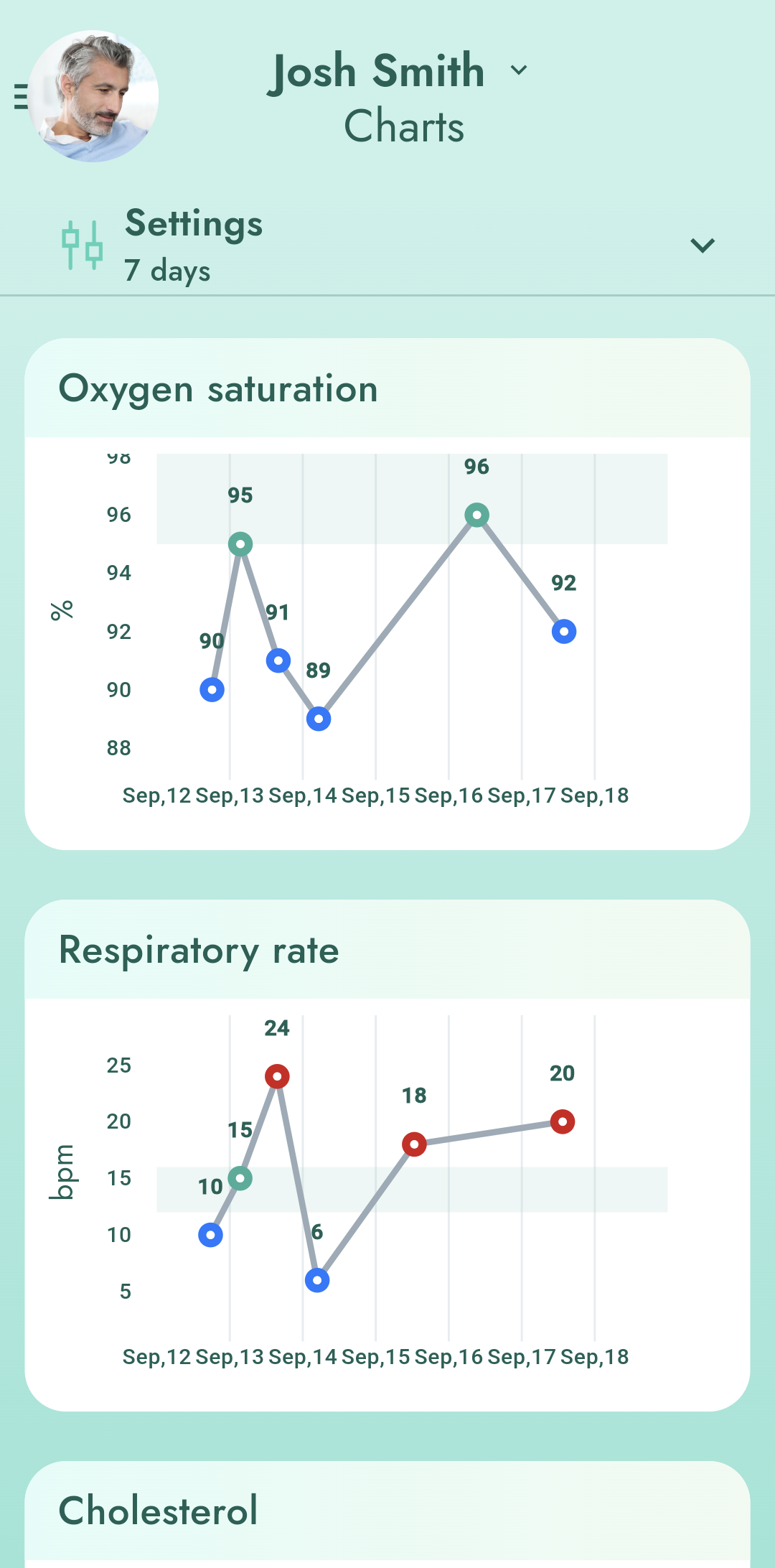
The following charts are available:
- Temperature – shows your temperature and the specific day it was measured.
- Blood Pressure – shows the history of all blood pressure and pulse measurements for the selected period. Target ranges are calculated according to age. When blood pressure is above or below acceptable levels, the line is colored red.
- Blood Sugar
- Weight
- Height
- Ketones
- Hydration
- Urine pH
- Oxygen Saturation
- Respiratory Rate
- Cholesterol
- HbA1c
- Peak flow
- Menstruation