
Timeline
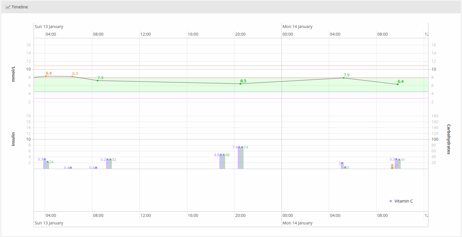
This screen displays all the entries as a graph/timeline. You can scroll it left and right to see a particular time interval depending on the selected scale. You can zoom in/out in order to see a bigger or small time interval.
The timeline can also be expanded on full screen.
*The graph is important because it shows you all viable information distributed by short periods of time. You can easily find patterns in your daily medications/insulin intakes and your foods intakes. You can also analyze how different actions affect your body, for example exercises, insulin injections or bigger/lower food intakes.
The timeline shows the following items:
- Glucose – glucose entries connected to each other in order to make a graph
- Medications – medications intake is marked on the bottom side of the timeline
- Carbs – shown as a bar colored in green
- Proteins – shown as a bar colored in orange
- Fats – shown as a bar colored in dark purple
- Bolus insulin – shown as a bar colored in light purple
Need more help with this?
Don’t hesitate to contact us here.