
Charts
The charts in the Analytics are separated in a few categories. The Analytics web application shows the same charts like the mobile applications with a few differences.
The charts here are with individually controlled time ranges, meaning that every chart on the page can show a different time period. Also every chart can be expanded on full screen.
The categories in which the charts are split are:
- Summary – includes the pie charts showing the glucose distribution by targets for the last 7/14/30/90 days and for each category during the day
- Glucose – shows the charts mostly related to glucose levels – Glucose hourly overlay, Glucose history, Glucose week overview, Glucose overlay
- Insulin – shows insulin related charts – Insulin daily totals and Carbs/insulin averages by meal
- Meal – shows meal related charts – Meal daily totals, Carbs/insulin averages by meal
- Injection/test sites – shows the injection/test sites images
- Advanced – includes the charts for Insulin sensitivity/Carbohydrates ratio chart and the Metabolic control chart
- Other – shows the charts related to other parts of the diabetic treatment like HbA1c history, Cholesterol history, Weight history, Blood pressure/Pulse history
Each of the charts targets a different view of the diabetes treatment.
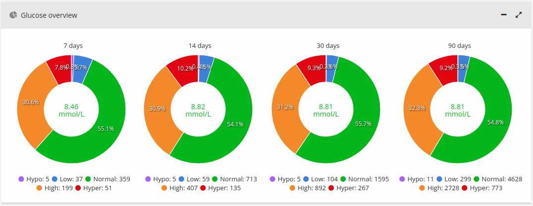
Distribution by days and chart interval selection
These pie charts show your blood glucose distribution according the target limits you entered in the settings.
You can select the time interval for the other charts as tapping on the corresponding pie chart. Its border will be highlighted.
They are useful because you can see easily what your glucose levels averages were in the last 7/14/30/90 days and check how you were doing in the near past.
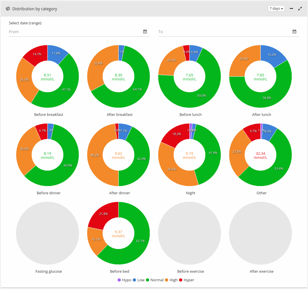
Distribution by category for the selected interval
These pie charts show your blood glucose distribution per time category as night, before meal, after meal or other if the reading appears in other time.
In those charts you can find if you have problems in some time of the day, for example if your glucose before bed was usually higher than it needs to be or you’re not measuring your glucose enough in some time of the day.
Such strange things about your glucose measurements can be seen easily on those charts.
Time categories are:
- “Night” – between 21:00 to 07:00 in the morning
- “Before” meal – 1 hour before the meal
- “After” meal – 2 hours after the meal
- “Other” – all other hours and categories as “Snack” and “Fasting Glucose”
Meal hours as breakfast, lunch and dinner are specified in the Settings screen.
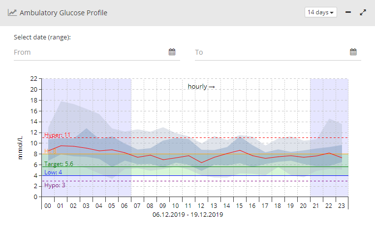
Ambulatory Glucose Profile (AGP)
Ambulatory Glucose Profile (AGP) is a chart for interpreting a patient’s daily glucose and insulin patterns. AGP chart provides graphic characterizations of daily glucose patterns. It shows the 10%-90% and 25%-75% percentiles zones and 50% median line of all the glucose readings for the selected interval during 24 hours. This helps to see for which hours you glucose varies the most.
More information about how to interpret the chart can be found in the article "AGP Core Curriculum – AGP Clinical Academy" by Prof. Roger Mazze and Dr. Iain Cranston at https://static1.squarespace.com/static/5a4cf19e51a5840a334adcfd/t/5a8b45ae71c10b58453cf148/1519076808390/AGP+Core+Curriculum+02-2018.pdf
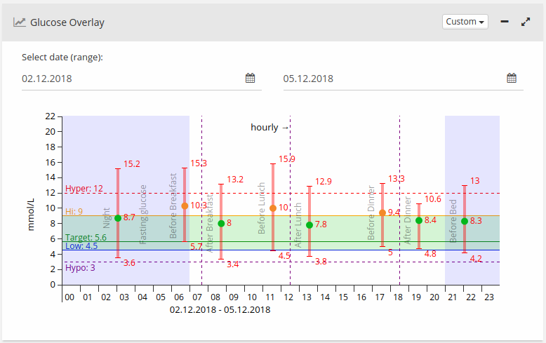
Glucose Overlay for the selected interval
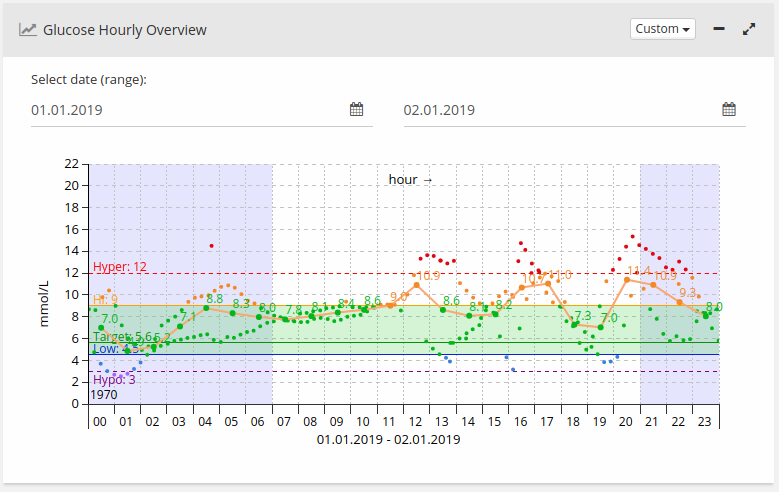
This chart shows the distribution of all the glucose readings for the selected interval during 24 hours. This helps to see for which hours you don’t have enough information. Usually all the readings are clustered around the meal hours but it is good to know what are the values for our blood glucose during the whole day. You can also find some patterns in some hours of low/high glucose levels through the day.
Glucose Week Overlay for the selected interval
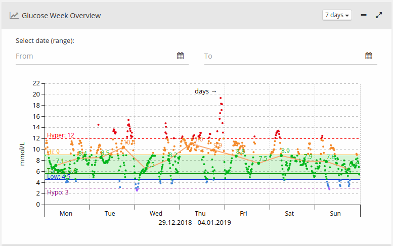
This chart shows the distribution of all the glucose readings for the selected interval during the week. It can help you find strange glucose level readings by day, for example you may find out some day of the week you have lower/higher glucose levels and you can than think about why this happens and find some actions or events in that day that affect your glucose levels.
For every day the averages are calculated for the first and the second half of the day. For every day there are two averages from 12:00 am to 12:00 pm and from 12:00 pm to 12:00 am.
Glucose History for the selected interval
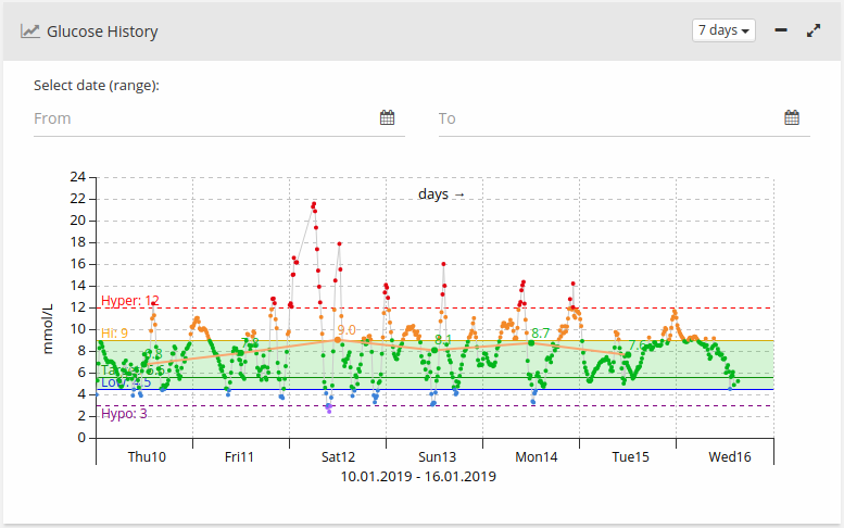
This chart shows the history of all the glucose readings for the selected interval. Averages are calculated per day. You can find out how some events affected your diabetes management, for example if you were on a vacation for a few days, you can see those days averages here.
Averages by meal for the selected interval
This chart shows the minimum, maximum and average values of blood glucose per meal categories. The chart can help you find if you have too big deviations of the blood glucose during the day. Usually you may have good average glucose values, but if you have big deviations it’s not a good sign for your diabetes management.
Insulin daily totals for the selected interval
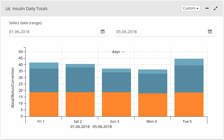
This chart shows the insulin daily totals for the selected interval. Bars show the ratio between basal (orange), bolus (light blue) and correction bolus (dark blue) insulin totals.
It can help you find out if your insulin injections are similar through the day or if you have too many corrections, which may be a bad sign.
Description
Orange – used basal (slow acting insulin) for the period
Light blue – used bolus (fast insulin) for the period
Dark blue – calculated additional bolus, for example if your blood glucose was above normal and the app calculated that you need more than usual bolus insulin
Carbohydrates and insulin averages by meal for the selected interval
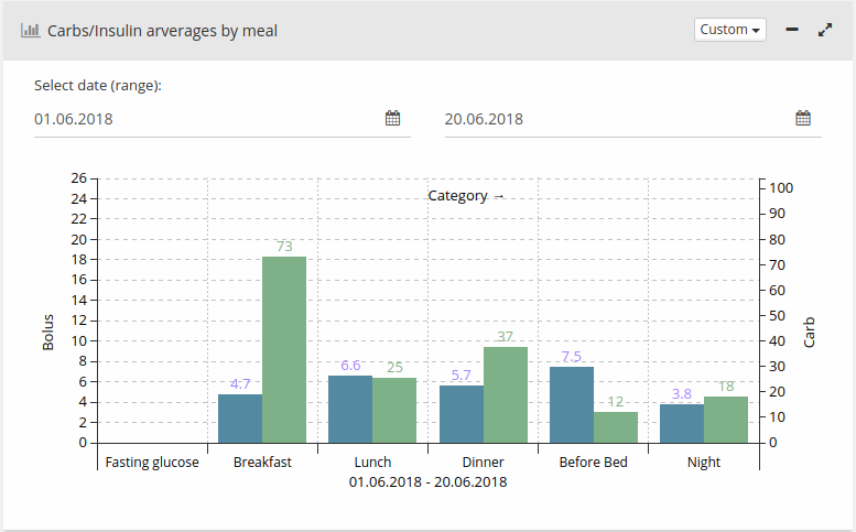
This chart shows the average insulin and carbohydrates by periods of the day – night, breakfast, lunch, dinner, before bed.
It can help you to see your average carbohydrates intake and your average insulin intakes by time of the day. This way you can find how different carbohydrates amounts affect your insulin intakes and the opposite.
Food nutrition data and grams intake for the selected interval (Meal daily totals)
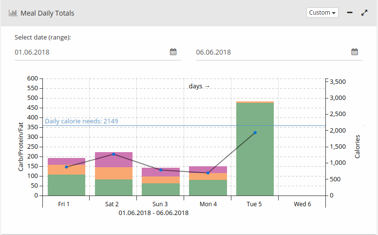
This chart shows carbohydrates (green), proteins (orange) and fats (purple) of the food you take over the selected period of time, distributed by times of the day. Also it shows calories count (the black line with dots), needed calories and food’s weight.
Metabolic control for the selected period
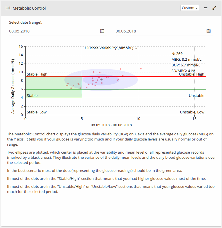
This chart shows the glucose variability and average daily glucose. It tells you if your glucose is varying too much and if your daily glucose levels are normal. In the best scenario most of the dots (readings) should be in the inner circle.
If most of the readings are in the inner circle it means that your glucose was stable and didn’t vary too much.
Insulin Sensitivity/Carbohydrate Ratio (Figure 12)

This chart shows calculated carbohydrate ratio and insulin sensitivity based by the information during the selected interval. Diabetes:M tries to identify patterns in the data you entered with which it can calculate some insulin sensitivity and carbohydrates ratio. If you have enough entered and correct data, those values should almost match your insulin sensitivity and carbohydrates ratio.
Description
- Insulin sensitivity bar (blue)
- Carbohydrate ratio bar (orange)
- Average value calculated for the hour (over the bars)
- Count of the successful calculations for the hour. The hour average is calculated using these values (in the brackets)
In the chart description at the bottom of the chart you can see the total averages for these values based by all successful calculations.
Calculation basics
To calculate carbohydrate ratio successfully there must be a glucose reading, insulin dose and carbohydrate entry and there must be at least one glucose reading during the second, third or fourth hour after the first reading.
To calculate insulin sensitivity successfully there must be a glucose reading below or above the target and insulin dose entry but NOT a carbohydrate entry. There must be at least one glucose reading during the third, fourth or fifth hour after the first reading.
Weight history

This chart shows the history of all the weight recordings for the selected interval.
Blood Pressure & Pulse history
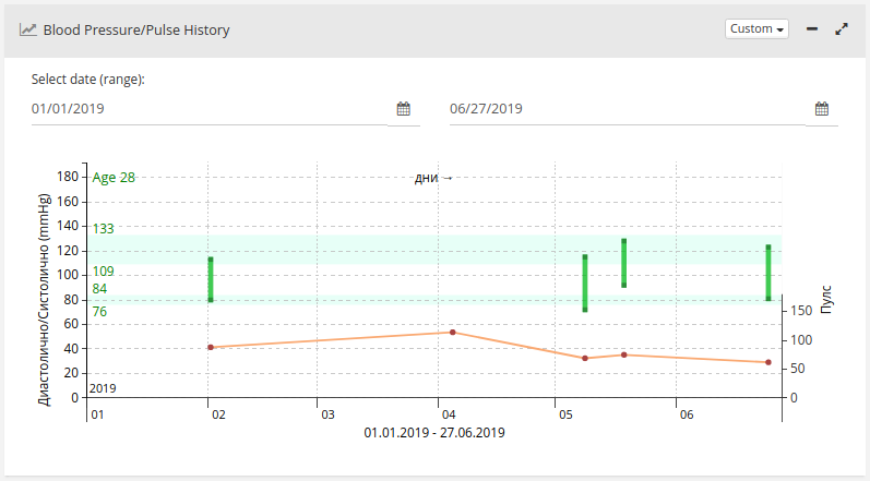
This chart shows the history of all the blood pressure and pulse recordings for the selected interval.
The target zones are calculated depending by the age. When pulse pressure is above or below the safe range the bar is in red.
HbA1c history for the last 2 years

This chart shows the history of all the HbA1c recordings for the last 2 years.
Cholesterol history for the last 2 years
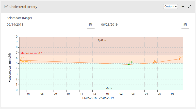
This chart shows the history of all cholesterol recordings for the last 2 years.
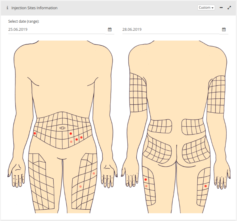
Injection and test sites
Those graphics show the insulin injection sites and glucose test sites on the hands. The most frequently used spots (and most recent spots) are with darker color. Spots color decays in time and disappear in some time if not used again.

Need more help with this?
Don’t hesitate to contact us here.