
Text layers feature an additional section in the layer sidebar labeled Font, which gives you full control over the styling of the layer’s contents.

Font settings
These settings define the shape and size of the text, as well as the spacing between the letters and lines of text.
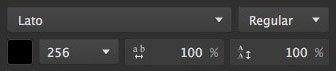
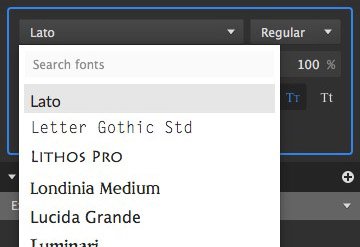
- Font Menu: The font menu provides access to all fonts installed on your system. Choose a font from this menu to apply it to the text. The selected font will be applied to all text contained in the layer, including all content variations.
![]()
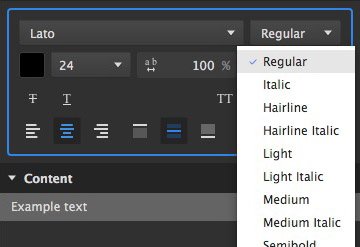
- Weight: If the Selected font includes multiple weight variations, you can choose between them in this menu.
![]()
![]() Color: Click the color swatch to open a color picker and choose the color for your text. The image here shows black as the selected color, but the color of the swatch will vary based on your currently selected color.
Color: Click the color swatch to open a color picker and choose the color for your text. The image here shows black as the selected color, but the color of the swatch will vary based on your currently selected color.![]() Size: Sets the size of your text, in points. A variety of size options are available in the menu, or you can type in any specific size you need.
Size: Sets the size of your text, in points. A variety of size options are available in the menu, or you can type in any specific size you need.![]() Kerning: Adjusts the vertical space between lines of letters. Each font has a default kerning value, which is defined as 100%. Setting percentages above 100% increases the space between lines, while percentages lower than 100% brings the lines of text closer together.
Kerning: Adjusts the vertical space between lines of letters. Each font has a default kerning value, which is defined as 100%. Setting percentages above 100% increases the space between lines, while percentages lower than 100% brings the lines of text closer together.![]() Leading: Adjusts the horizontal space between the individual letters. Each font has a default leading value, which is defined as 100%. Setting percentages above 100% increases the space between letter, while percentages lower than 100% brings the letters closer together.
Leading: Adjusts the horizontal space between the individual letters. Each font has a default leading value, which is defined as 100%. Setting percentages above 100% increases the space between letter, while percentages lower than 100% brings the letters closer together.
 Color: Click the color swatch to open a color picker and choose the color for your text. The image here shows black as the selected color, but the color of the swatch will vary based on your currently selected color.
 Size: Sets the size of your text, in points. A variety of size options are available in the menu, or you can type in any specific size you need.
 Kerning: Adjusts the vertical space between lines of letters. Each font has a default kerning value, which is defined as 100%. Setting percentages above 100% increases the space between lines, while percentages lower than 100% brings the lines of text closer together.
 Leading: Adjusts the horizontal space between the individual letters. Each font has a default leading value, which is defined as 100%. Setting percentages above 100% increases the space between letter, while percentages lower than 100% brings the letters closer together.
Styles
You can further control the styling of the text using various toggles, to turn different style options on or off. The four style options on the right side control the case of the text, and which characters are upper case and which are lower case. Only one of those four options can be enabled at a time.

Compare this example text with each of the styles below to see the effects they have.
![]() Strikethrough: adds a horizontal line through the center of the text.
Strikethrough: adds a horizontal line through the center of the text.
![]()
 Strikethrough: adds a horizontal line through the center of the text.
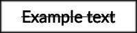
![]() Underline: Adds a horizontal line below the baseline of the text.
Underline: Adds a horizontal line below the baseline of the text.
![]()
 Underline: Adds a horizontal line below the baseline of the text.
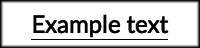
![]() All capitals: Displays all characters in the text as capital letters, regardless of the case in which they were entered.
All capitals: Displays all characters in the text as capital letters, regardless of the case in which they were entered.
![]()
 All capitals: Displays all characters in the text as capital letters, regardless of the case in which they were entered.
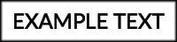
![]() All lowercase: Displays all characters in the text as lowercase letters, regardless of the case in which they were entered.
All lowercase: Displays all characters in the text as lowercase letters, regardless of the case in which they were entered.
![]()
 All lowercase: Displays all characters in the text as lowercase letters, regardless of the case in which they were entered.
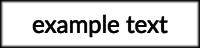
![]() Small capitals: Capital letters in the source remain unchanged, and all lowercase letters in the text are changed to capital letters at a smaller size.
Small capitals: Capital letters in the source remain unchanged, and all lowercase letters in the text are changed to capital letters at a smaller size.
![]()
 Small capitals: Capital letters in the source remain unchanged, and all lowercase letters in the text are changed to capital letters at a smaller size.
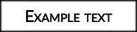
![]() First letter capitalized: The first letter of each word is capitalized, regardless of whether it was typed in uppercase or lowercase.
First letter capitalized: The first letter of each word is capitalized, regardless of whether it was typed in uppercase or lowercase.![]()
 First letter capitalized: The first letter of each word is capitalized, regardless of whether it was typed in uppercase or lowercase.
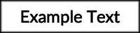
Alignment
Use these toggles to adjust the horizontal and vertical alignment of the text within its bounding box.

The first three options control the horizontal alignment of the text, from left to right. The last three options control the vertical alignment, from top to bottom. There will always be two options enabled; one for the horizontal alignment, and one for the vertical alignment.
![]() Align left: Aligns the left edge of the text with the left edge of the bounding box.
Align left: Aligns the left edge of the text with the left edge of the bounding box.
 Align left: Aligns the left edge of the text with the left edge of the bounding box.
![]() Center horizontally: Aligns the center of the text with the horizontal center of the bounding box, so there is even spacing on the left and right sides.
Center horizontally: Aligns the center of the text with the horizontal center of the bounding box, so there is even spacing on the left and right sides.
 Center horizontally: Aligns the center of the text with the horizontal center of the bounding box, so there is even spacing on the left and right sides.
![]() Align right: Aligns the right edge of the text with the right edge of the bounding box.
Align right: Aligns the right edge of the text with the right edge of the bounding box.
 Align right: Aligns the right edge of the text with the right edge of the bounding box.
![]() Align top: Aligns the top edge of the text with the top edge of the bounding box.
Align top: Aligns the top edge of the text with the top edge of the bounding box.
 Align top: Aligns the top edge of the text with the top edge of the bounding box.
![]() Center vertically: Aligns the center of the text with the vertical center of the bounding box, so there is even spacing on the top and bottom.
Center vertically: Aligns the center of the text with the vertical center of the bounding box, so there is even spacing on the top and bottom.
 Center vertically: Aligns the center of the text with the vertical center of the bounding box, so there is even spacing on the top and bottom.
![]() Align bottom: Aligns the bottom edge of the text with the bottom edge of the bounding box.
Align bottom: Aligns the bottom edge of the text with the bottom edge of the bounding box.
 Align bottom: Aligns the bottom edge of the text with the bottom edge of the bounding box.
Need more help with this?
Don’t hesitate to contact us here.